A Market Timing Report based on the 1-25-2013 Close published Sunday January 27th, 2012
UPDATE 1-28-2013 @ 9:49 pm ET: The VIX failed to maintain its fall below support at 13.30 today, but is barely above it as this chart shows. It needs to fall again below that level for the rally to be sustained. A rising VIX means investors are starting to hedge their positions in the market and have an eye on the exit.
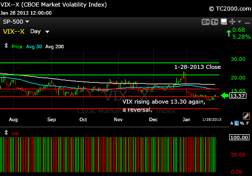
The volatility index rose above the low of 13.30 again, which is bearish.
Now for this week’s issue. I begin it by discussing the dichotomy between winners and losers during this earnings season…
Such has been the theme since earnings season began. The market is happy to go up while individual stocks like Apple are punished. The SP500 Index (SPX, SPY) has maintained its breakout and made it a few points above 1500 on Friday despite Apple’s (AAPL) 12.4% plunge on Thursday followed by another 2.4% drop on Friday. That is a 37.6% loss from the all time high pointing out yet again the need to preserve profits and that being a stubborn investor, either eternally Bearish or Bullish has its consequences. The VIX (volatility index) has in parallel to the SP500 rally maintained its breakdown to lows below the 2012 lows. It needs to stay there. If it doesn’t, the rally will turn into a correction.
The SP500 Chart Link and the rest of the charts are at the link:
Market Timing Charts for Sunday’s Issue (opens separate window so you can access all the charts at once)
What I call the “Chart cheap” markets are the markets that have a lot of upside potential and are coming off of big bases, but they are in pause mode. I’ll be watching early this week to see if they move into correction mode as some are close to important support, such as VWO. Remember when you look at the actual index that currency is an important issue to consider with any foreign ETF that represents the given stock market index if that ETF is not fully hedged against the currency of that nation vs. the US dollar if you are buying in US dollar terms. Most are not hedged, so look at the dividend corrected chart of the ETF you are buying in addition to the index chart and where it stands.
The gold miners (GDX,HUI) turned out to be a flop on the charts along with the Commodity Research Bureau (CRB) index, the latter failing to maintain a recent breakout. The GDX (HUI) broke support on Thursday and you could have sold sooner than I was able to sell. The new thesis seems to be that the world has been saved for now, so gold was repelled at the 50 day moving average and the gold miners broke down even more. I would stand clear of both for now at least for trading positions.
I do believe that the Eurozone is not done with its series of crises, so I’ll let my prediction of one last hurrah for gold stand. I believe it will run up to or beyond the prior high before the financial crisis ends, meaning I believe it is not yet over. Nevertheless, there is nothing wrong with exiting your long term gold positions where you see fit. The moves in gold have been so extreme over the years that “long term trading” at least a portion of your long term gold position may be warranted.
I realize that some feel having a gold position may be part of their “unexpected disaster insurance policy.” Yet going back down to zero profit does not appeal to me after an “Apple-sized” gain! I will likely use an arbitrary stop of 25% from the last high and let you know if and when I exit. The last low took us to -20.1% from the intraday all time high for GLD. Using a tight stop does not work well with long term trading positions in gold. You need to let them breathe a bit due to the volatile swings that are common.
The gold ETF chart is at the link above.
The drug stocks (DRG) are still a place to invest if you have no exposure, because they have not made any progress since 2001. The drug index has come a long way from the March 2009 bottom as other sectors have, but if you look at the long term chart, there is a massive base in place going back to 2001. A failure of the most recent breakout above the 2007 high would be a reasonable stop to use.
Let’s discuss bonds. Interest rates are moving back up again. Corporate bonds broke important support this week (LQD). The initial breakout failed, but this one may succeed and drive the 10 year Treasury Note back up to 2.39% at a minimum. This may start to dampen the enthusiasm for housing stocks by raising the cost of home ownership. The housing market might anticipate higher rates than actually appear. It is not likely in my view that rates will skyrocket up through that 2.39% level during this bond sell off. The chart is at the Bonus Chart of the Week link (see link above).
This may finally contribute to a shift to stocks from bonds adding sufficient liquidity to propel the SP500 Index back to the 2007 high. If bond investors start seeing their previous gains being erased, they could panic out under CNBC conditioning starting liquidity issues for bonds, which as many of you recall were not pretty in 2008. The bond market is not as liquid as you think. Bond funds are like roach traps in a panic out of bonds, because of that liquidity issue.
Municipal bonds (PZA) have sold off a bit along with corporate bonds but munis have held up a bit better due to the higher Obama tax rates on the wealthy. But as the bond market sells off, municipal bonds will suffer too, bringing yields to more attractive levels. I’d wait for those better rates unless you want to start laddering in at long durations.
What about sentiment at this point where the SP500 is above 1500? Sentiment this week according to the American Association of Individual Investors (AAII) is about where it was on 1-5-2012. The Bulls are at 52.34% and the Bears at 24.27% with the spread at 28.1%. This can go on for a while as it did last year. It could continue bopping around at similar levels until April per the record last year. Bullishness can persist. What would concern me is seeing multiple markets giving up their prior breakouts one after another.
Standard Disclaimer: It’s your money and your decision as to how to invest it.
The above is the text from this week’s free report. To receive future reports ahead of publication of the text shown above AND much more market timing information, please subscribe for free here:
Free Subscription to My Weekly Newsletter
All Charts are courtesy of the Worden Brothers TC2000 Charting system, which I love and have used since April 19th, 2001 and it’s continually improving: My Charting System
If you “liked” this post, would you please “Like” it at the “Share” arrow below? Thanks very much!
And to follow my Buys and Sells and up to the minute insights, please follow and bookmark my Twitter feed here: Join Me on Twitter
Copyright © 2013 By Wall Street Sun and Storm Report, LLC All rights reserved.
