SP500Tracker™ for 6-16-13 Based on 6-14-2013 Close:
VIDEO UPDATE for 7-04-2013:
CHART UPDATE for 6-28-2013 Close: The second failure point on the chart below did not hold the latest rally. The rally is based on the 10 Year Treasury rallying from the recent high in yields. I believe it will continue, but if it doesn’t, I believe the SP500 Index will sell off in a very significant way. The summer, at least the first part, may involve multiple ups and downs that try investors’ patience and not much fun for Bulls or Bears unless they get the turns right. More in the monthly report out this Sunday (free subscription link below).

SP500 Index between nearby support and nearby resistance.
UPDATE for 6-21-2013 @ 2:43 pm: The market is simply going sideways today with a falling VIX volatility index, which means fear is dropping a bit. Although this could support a bounce, the more likely scenario is shown below in the May 2012 chart which shows how we broke important support at the horizontal red line BELOW the 50 day moving average and then were stretched to the downside. Then what happened? We went sideways to relieve the oversold condition of the market, and then the market fell to the next level down.
Down, pause, and down again. That’s what today looks like so far in the context of this week. Yesterday we were down; today is the pause.
Anything can change. If Dr. B. comes out with all speakers blazing talking up the markets, maybe there could be a bigger bounce than we’ve seen today. My belief is that we will go lower before I’ll need to rebuy. Up to 1600 is a crap shoot. It could test there one more time I suppose, but it did not happen today and I’m not waiting for Monday to find out. I’m now at 35% maximum exposure to equities as I am walking my talk of “passive shorting.” See the main website (“passive shorting” on blue bar to left at SunAndStorm.com) for more on that or Google that term that I coined a while back. It has nothing to do with being short. It’s about reducing your long exposure (selling so you can re-buy lower).
I’d still sell in steps if you sell, but I leave that to you and your own risk management. Sometimes I sell slowly, sometimes faster. Or buy slowly, buy faster. Remember that the market can reverse from these declines abruptly and then, as the 2012 chart below shows, the gains don’t always stick and turn into meaningful rallies .
The bottoming process could take up to several months to complete. Or the Fed could suddenly decide to become very aggressive on Monday and drive rates well below 2.4% and scare the heck out of the bond market, inducing a stock rally.
Make your own decision please and be willing to reverse course if you are wrong. Notice I did not say if “I am wrong.” It’s your money and your decision once you weigh the facts. I am sharing one viewpoint. You’ll be a better investor if you take 100% responsibility for your decisions. And now for the chart:
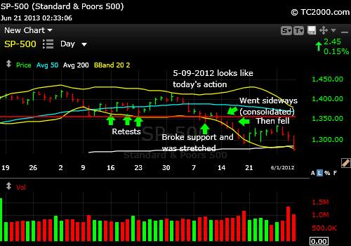
SP500 Index market timing: Down, pause, down upon breaking support back in May 2012.
UPDATE for 6-19-2013 @ 8:15 pm: The breakout above the top aqua line in the chart below is NULL and VOID for now. That can of course change daily when the market is as volatile as it’s been. The SP500 Index fell after traders decided that despite the Fed had told them everything before, they needed to hear it one more time. Well maybe. Many times the first reaction to Fed speak is wrong.
The threat they did not like most was that the Fed will reduce bond purchases later this year, perhaps in September and end them by mid 2014. Dr. B. actually said that they would be flexible and may not do so if circumstances warrant, but the markets did not believe him. Ending QE by then is soon for the bond market that sold off harshly along with all interest rate sensitive stocks like REITs and utilities. Emerging markets were also hit hard. I would stay clear of them until there is a sustained reversal.
The SP500 Index must maintain support at the first red line beneath here on the chart shown below. If not we’ll probably fall quickly to the bottom red line support level, which means failing at the 50 day moving average. That break would cause another significant leg down in my opinion, although 1598.23, the prior low COULD hold the market. I just don’t have confidence it will this time.
Could the SPX bounce again at ANY of the red lines shown in the chart or from the 50 day moving average? Yes, but if any such rally is real, it should top the prior resistance at 1648.69. Above there, the Bulls regain the ball. For now, they’ve lost it and the best they can hope for is a retest.
The worst of the current range is the base at 1598, but as I said, a move below the 50 day moving average could cause the full 3rd wave down to materialize.
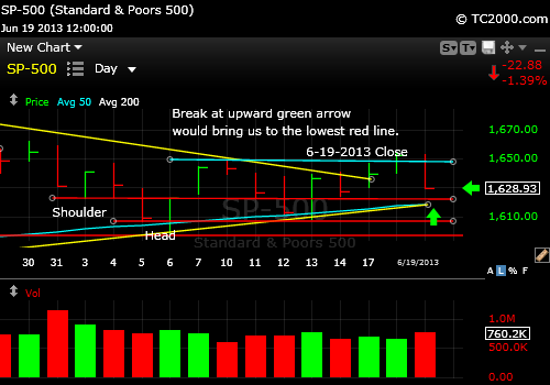
SP500 Index responds negatively at least initially to the Fed comments today. The breakout has been voided for now.
UPDATE #2 for 6-17-2013 @ 7:20 p.m.: The SP500 Index made some progress today and then gave too much back in my opinion to sustain the rally. Here’s the chart (note that you’ll be able to see the rest of the white text in the chart below this one):

SP500 Index is above the triangle mentioned this morning, but below the high from Friday.
The aqua horizontal line marks the high from Friday. We closed just below that line which is negative, because it sets up a head and shoulders formation on the chart with the “left shoulder” occurring on the 14th, the high earlier in the day being “the head.” UNLESS we move above that aqua line tomorrow, we will head down again and test the support mentioned below in the main text.
The Bulls could argue that the fact that we’re above the yellow line on the chart, which forms the upper line of a pennant or triangle is positive, so tomorrow will give us the answer. With the Fed speaking on Wednesday, the market could swing wildly over the next couple of days.
UPDATE for 6-17-2013 @ 9:44 a.m.: The positive this a.m. is the move over the yellow down trend line forming the top of a triangle or pennant formation on the following 15 min chart of the SP500 Index. Realize there is immediate resistance above here at 1648.69 and a move above there would be a more convincing buying point. This does represent progress for the Bulls, who will point to “holding the 50 day moving average support.”
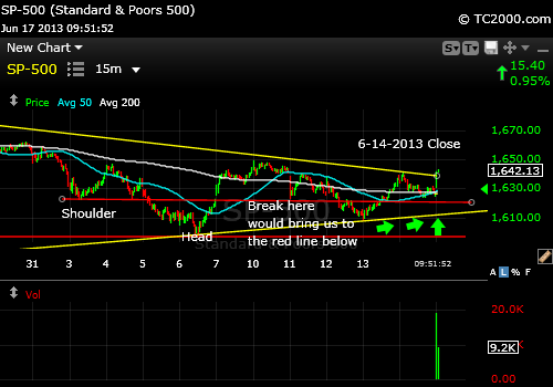
15 minute chart showing the triangle formed by the yellow up and down trend lines.
And now for the original update mapping out the week ahead…
I’m lucky to be able to write about the SP500 Index chart (SPX, SPY) this week. Why? Because there is a richness to the chart that you don’t often see in terms of all the teaching points. So let’s get started.
This week the market attempted to hammer out a market timing support level that you can see on the following chart. I’m going to go through it in detail, so you can see exactly what I’m seeing. The first chart is low magnification and the second is at a higher magnification.
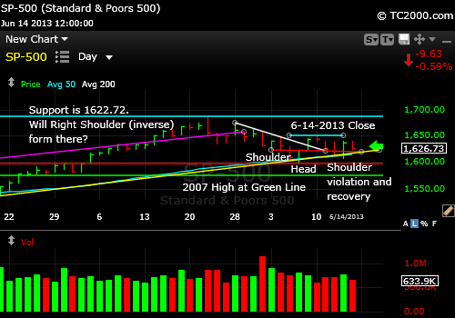
SP500 Index attempting to hammer out a support level just above the 50 day moving average.

Market timing the SP500 Index. This is a higher magnification of the previous chart. It shows how the SP500 is holding support just above the 50 day moving average at the lowest aqua line.
The top aqua line is the all time high of the SP500 Index, and represents the point at which we’d say the market has re-topped, if the Bulls regain control in the coming weeks.
The upward sloping bright pink line most visible in the 1st chart is the top of the prior upward channel the SP500 was following.
I wrote just before the selling began that the blow-off top above that channel line meant that a correction was due, and I was fortunately dead on with that call: How Blow-off Tops Can Make You a Fortune.
The next lower horizontal aqua line is the immediate overhead resistance. There may be a slightly lower level of resistance marked by the highs of the past three days, because the high price on Friday seemed to respect that resistance, but the next bigger goal is that horizontal aqua line just above.
The curved aqua line near the bottom is the 50 day moving average, which is behaving like support at the moment.
The straight upward sloped yellow line is the up trend line on the daily chart. It is nearly coincident with the 50 day moving average, which provides even more support at this level.
The top horizontal red line represents the left shoulder of the reverse head and shoulders formation that formed last week.
The head of that formation is at the green line just above the word “Head.”
The right shoulder held on the 11th, broke on the 12th, and was followed by a reversal above it on the 13th. The break is below the lower red line.
So the Bulls may feel encouraged by the fact that a support level has held, but if you go back to the prior “Market Timing Brief” (Here’s How Prior Retests Worked Out), it’s worth looking at the statistics of how often retests of the 50 day moving average held up. It’s uncommon that they do. Almost always, these retests result in failure EVEN IF the market rallies strongly after the retest. Yes, it’s still a statistical game and it could be different this time; it’s just not likely to be different.
As much as days like Thursday are tempting to participate in, the pain for the Bulls returned on Friday with the market down 0.59%. Thursday’s rise turned out to be humorous. I heard CNBC asking analyst after analyst why the market was rallying and they were speechless. They had no clue. When they have no clue you get the same headline day after day; they simply change it from positive to negative:
On a good day: “The market rose on expectations that the Federal Reserve will continue to buy US debt.”
On a bad day: “The market fell on expectations that the Federal Reserve will not continue to buy as much US debt as before.”
This is a symptom of what’s called volatility and we’ve experienced levels of volatility higher than this in prior summers. When the market is volatile, it does not seem to make much sense. That means that you will see a lot of strong days up and down that individually seem to say the market knows where it wants to take stock prices and then it dashes that false clarity away. What it says is that the fear level has risen and market participants no longer know what forces will win in the battle over stock prices.
If the Japanese experiment is already failing due to significant inflation, what will that mean to the world economy? Is the worldwide economy slowing in a way that will lead to stagflation? Most of us certainly feel as though the government’s pronouncements about inflation are not accurate as we see the size of our Nabisco boxes shrinking as the prices rise.
If the economy is slowing and that means lower earnings, price earnings ratios will go up due to lower E’s and stock prices will fall to bring them back to the mean. Or is the consumer strength seen in the past month the hint that things are getting better? Is the housing crisis really over or are low interest rates simply hiding the problem? Bonds are falling and some of that money has been going into stocks and there is still room for that to expand. Emerging markets have been tanking and now the gains in Japanese stocks are vaporizing. So are things good or bad or simply confusing?
You see that you can construct both a bullish and a bearish view from the current data, which is why fear is going up. Confused investors become afraid. Fearful investors leave markets.
So if you step back from the chart this week and look at it, it looks as though the market fell a bit and then jumped up and down for the past 11 trading days. When you compare this chart to that of April 2012, it looks very similar (see chart in last Market Timing Brief; link above or to the upper right). If that precise playbook unfolds, which is not guaranteed of course, we could re-bottom at around 1600 (1598.23 was the low) and then bounce quite high meaning back to the top aqua line or even re-top at the all time high and come right back down again without pausing at the 50 day moving average the next time.
We are in the “Go Away in May” period that could extend into October. It is the one market timing method that actually works by the way. I wrote a previous article to see how it’s been working in the past decade which is here: Market Timing: When to Go Away and When to Come Back. The time to come back varied tremendously.
Key Takeaways this Week:
1. The SP500 could rally from what is acting like current support and we could meet or exceed the prior high, but only if the news flow becomes much more positive. The “risk” to the Bears is that Bernanke will goose the market at 2 pm on Wednesday when the Fed makes it’s announcement on FOMC policy.
I doubt he’ll do this, because the market is due a correction and he does not want to be accused of creating bubbles. Stock prices are reasonable at this point vs. earnings. Five percent down from here would not be a crisis for the Fed.
2. If the news remains confusing and the Fed avoids saying much to further reassure the markets, this retest will fail and we’ll reach a significant new low at least 50 points below the 50 day moving average (prior Market Timing Brief has the data on the depths of these corrections). The completed correction will be at least 10% below the prior high. The current news flow favors this option, not #1.
3. Any close below the prior low at 1598.23 will signal the next wave down.
4. The Elephant in the Room is the bright green line seen only on the Top Chart, the 2007 high (1576.09). Below that we’ll have a major reversal below an important nominal high (non-inflation adjusted), which the market will take note of with further selling. Any breach there must be brief, or there will be a sharp bout of selling.
Standard Disclaimer: It’s your money and your decision as to how to invest it.
To receive future reports and reminders that charts are ready to be viewed, subscribe for free here:
Free Subscription to My Newsletter
I only recommend what I pay for myself. My Charts are all courtesy of Worden Brothers. I use this software every trading day to make my decisions about the markets: My Chart Source
If you “liked” this post, would you please “Like” it at the “Share” arrow below? Thanks very much!
And to follow my Buys and Sells and up to the minute insights, please follow and bookmark my Twitter feed here: Join Me on Twitter
Copyright © 2013 By Wall Street Sun and Storm Report, LLC All rights reserved.
