A Market Timing Report based on the 4-26-2013 Close published Sunday April 28th, 2013
UPDATE 5-06-2013: QQQ, the Big Tech Index (NDX) has broken out again and is a bit stretched relative to the 50 day moving average, but is on its 3rd breakout day which is positive. Likely more to come, but once an index is stretched, the risk of a temporary setback rises. Investors will likely add on dips. Here is the chart:
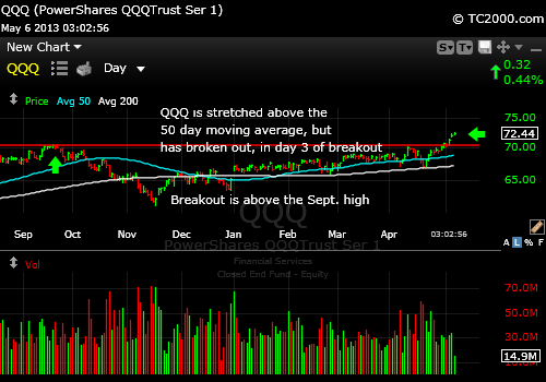
QQQ breaking out, a bit streched now.
I thank Worden Brothers for the charting system. If you want to know more about the charting system I use every day, go to my “Other Resources” page here:
My Chart Source
UPDATE 5-04-2013: I’ll do a further update in this week’s issue out Sunday night (sub link at base), but we are now right on the line. Although there was a successful breakout above the last series of highs, we came right up to the top of the wedge (white lines on chart below) that I pointed out last week. We need more gains next week to avoid the consequences of a downside breakout below the base of the wedge.

We are at the top of the wedge and need to break out.
UPDATE 5-01-2013: OK it’s May, so go away. Well, we will see if it works again this week or whether one of the other patterns noted below prevails. But the chart just below is what I’m more concerned about. There is a Bearish rising wedge on the SP500 Index weekly market timing chart and it does not look good. Wedges show decreasing buying interest as a market moves up and that is why they are bearish. We could easily fall about 7.35% (may have changed slightly since ISM number came out) to 1475ish on the chart below. That would be a typical 7-10% correction.
Are we due? Or is the “Great Rotation” of investors from bonds into stocks now starting? What is actually happening some have reported is that investors are buying BOTH bonds and stocks whereas previously they had bought only or mostly bonds. For now, we face the upward wedge below, which classically but not invariably leads to a correction back to the base of the wedge. I’d say it won’t go as far as the base of the wedge, but I could be wrong. What changes the picture? Breaking up and out of the wedge negates the signal. That’s the “way out.”

SP500 Index looks worse when we examine the weekly chart above with a Bearish Upward Wedge.
Now for this week’s issue…
We will get to that data in a bit. It’s extremely interesting, but first, let’s talk gold. Gold (GLD) bounced from the depths it had fallen to after slicing below 2011 and 2012 support. It’s hard to catch a falling knife they say, and the fact that gold has now bounced does not mean that the fall is over. Commonly there is a rally back during a fall to about the 50% point in the fall. That has already happened. Now is the place either the Bulls or the Bears will prevail. The market will show us the way.
Gold may be a speculative buy, but it is not a technical buy, because it failed an important level, so short of scaling that again in the near future, gold must form a bottom first before becoming a technical buy again. If it’s true as the gold Bears say that the economy is recovering and there is no risk of another recession despite the recent slowing of the economy, one would assume that central bank interventions will subside, interest rates will rise ahead of inflation and gold will fall much further than it already has.
If the gold Bulls are right that central banks will overdo things with loose money, then the inflation rate will run ahead of interest rates, resulting in the negative real returns on money that have driven gold up for years. Is there yet another explosion of gold buying left? No one can answer that question definitively, because central banks have never done what they are doing now, never in the history of this world. We are part of Dr. B’s experiment with his monetary science kit. My guess is that they will overdo things and won’t keep up with inflation. Where gold goes in between now and then is another issue.
As you may guess, I favor the gold Bulls, but will sell more GLD if gold goes still lower. There is no such thing as a “good investment.” Paraphrasing William O’Neill’s statement on stocks, “They are all bad.” Bad unless they are acting “good.” Despite the fact that gold may correct significantly more, I expect it will at least meet the prior high in the next few years. How high that is depends on how high inflation flies above the prevailing interest rates. The chart showing where we are in the bounce is shown via the following link:
The SP500 Index (SPX, SPY) is still above the 2007 breakout and the longer it stays up there, the greater the chances of yet another breakout. But then again, it is soon to be May and those of you on Twitter have seen multiple comments by me about the “sell and go away in May” trading pattern that has prevailed over the past three years in classic form. But what are the statistics especially the most recent history? Note from the list below, that over the past 10 years, there were a couple of times when the pullbacks were shallow and selling would not have done much good.
Go Away Time Come Back Time
2003 Mid June Early August (could have just stayed in)
2004 Early March Mid August
2005 Early March Late April
2006 Early May June or July
2007 July or October Mid August or March 2008 for a trade only
2008 Mid May March 2009 (The Big Bear: Earlier buys tough to time)
2009 Early May Early July (could have just stayed in)
2010 Late April Early July
2011 Late April Early October
2012 Early April Early June
2013 ? ?
So where are we are now? We’ll know by mid-May whether the “go away” scenario will occur this time around, but for now, have a look at the SP500 Index chart at the link above.
So where is the “secret signal” at this point? Over the last few weeks I’ve pointed out that the 10 Year Treasury Note (TNX, TLT) has been rallying when it should be falling (OR rising in yield as in yield up/bonds down). As an economy recovers, interest rates should be rising, because the successful businesses put pressure on the sources of funding as they compete for loans. That is not happening yet.
The Bonus Chart of the Week at the above link will show you where the Treasury signal is this week.
Notice on the chart that the 10 Year Treasury yield is below the 4-17-2013 low but not below the 4-23-2013 low of 1.643%. If we drop below there, the SP500 Index will likely be breaking down and may herald in the “go away in May” period.
The VIX is down but has room to fall for at least another market week, so it’s not very helpful at this point. It could rise from here as easily.
What about investor sentiment? In the AAII Suvery of Individual Investors, the Bulls rose very minimally from 26.85% to 28.29%, but Bears dropped much more from 48.22% to 38.82%, bringing the spread between Bulls and Bears to -10.5% from -21.4%. That means that there is plenty of room for the Bears to rise now. There is a precedent for this at least in approximate terms. I told you two weeks ago that there was no precedent with a -35% spread, but there was one that was at least a cousin if not a sibling and that occurred near the 2007 high. Bearishness then maxed out 11-29-2007 at 56.12% and the spread at -28%, which is not nearly as impressive as -35.2% from 2 weeks ago, but it is suggestive of a parallel. It at least shows that we can at times see fairly high levels of Bearishness at market tops (and therefore a high negative spread between Bulls and Bears). AND IT OCCURRED IN 2007, which is the high above which we are now testing.
Here is the chart back in 11-2007 (Recall the massive Bear market that followed?):

Sentiment can be very negative at some tops.
(see my “Other Resources” page at SunAndStorm.com for the chart source; I’ve been using them for years)
What happened back in 2007 as it is now is that the spread narrowed a bit toward zero as it has this week and then shot up again as the selling commenced in earnest. That time in 2007 the sentiment spread got all the way back to +12% before the market sold off in mid December. The big difference in the chart then is that the market had sold off hard earlier in October and was rallying back to resistance and had formed a lower high when sentiment hit that -28% spread. This time, we have had no preceding sell-off of note. My conclusion is that we can at least take from this that markets can be quite high and still show negative sentiment. Extremely negative sentiment does not only occur at bottoms and may be paradoxically NEGATIVE for stocks not positive as we’d think. Sentiment is usually a CONTRARY indicator. Individual investors are usually wrong about the direction of the market when it’s about to pivot, overly bullish at tops and overly bearish at bottoms.
Finally, as you’ll note in the table below (available to free subscribers only; see link below to sign up), some markets are particularly strong, such biotech stocks (BTK) and are outperforming the SP500 lately. Drug stocks have been very strong too, but just weakened a bit.
Key Takeaways for the Week:
1. There is an approximate parallel between sentiment back near the 2007 high and today. The breakout above the 2007 high has yet to be reversed.
2. Gold may not have finished its fall despite the bounce.
3. The correct time to “go away” and take your money out of the market over the past 10 years has varied from early (March) to late (July) and 2 of 10 times it did not pay to exit, as the market did not correct enough to matter.
4. The Treasury rally is negative at this time in the cycle and means a longer wait for a strong economic recovery.
Have a great week investing and/or trading!
Standard Disclaimer: It’s your money and your decision as to how to invest it.
The above is the text from this week’s free report. To receive future reports ahead of publication of the text shown above AND much more market timing information, please subscribe for free here:
Free Subscription to My Weekly Newsletter
If you “liked” this post, would you please “Like” it at the “Share” arrow below? Thanks very much!
And to follow my Buys and Sells and up to the minute insights, please follow and bookmark my Twitter feed here: Join Me on Twitter
Copyright © 2013 By Wall Street Sun and Storm Report, LLC All rights reserved.
