A Market Timing Report based on the 5-10-2013 Close published Sunday May 12th, 2013
UPDATE for 5-20-2013 @ 12:51 pm: This chart shows why silver is a better buy than gold, but both are buys on a trading basis WITH a stop in place. See my tweets for more to right side of this page (see link). More tonight… Here is the chart:
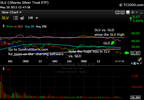
Why Silver is the Better Buy Over Gold
UPDATE for 5-15-2013 8:14 pm: Gold Slide
Here’s the market timing chart for GLD:
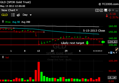
Gold may revisit the prior low at the downward arrow on the chart.
It does not mean that GLD has to stop at that prior low. The valuation of gold is impossible to calculate precisely as is commonly the case with metals and commodities. The cost of gold production varies but the average production cost of gold is $1200/oz. according to recent estimates. Following the chart is often the biggest clue.
And now for this week’s issue in which you will learn how to spot a stretched market with higher risk…
When a market rises too far above its 50 day moving average, it can mean that a correction is imminent. Take a look at the most stretched market I found this week, the US Real Estate Investment Trust Index (RMZ, VNQ, RWR):

US REIT Index is stretched.
REITs were probably the most stretched of the major indices I follow. Note the vertical white lines that measure the degree of stretch from the 50 day moving average represented by the aqua line. Note also that the degree of stretch from the upwardly curving white line, representing the 200 day moving average expands all the way across the chart. Eventually markets revert to the gentler up slopes that these averages represent even if the Bull market continues. Pullbacks are a normal event in a Bull market and when they don’t occur, as they have not been, the risk level rises for the later and later entry points. There is a stretch premium that is built into many indices right now.
There is another observation about these trends that is important. Did you notice that the distance between the price and the 50 day moving average (aqua) can expand to a point and then stop expanding and just remain somewhat elevated? And then the degree of stretch can stay at about the same level for a while as the REITs have since early April – well at least with only very minor corrections. There was a slight pullback on 4-15 that then allowed the index to keep marching up to the present time with only one minor “blip” down on 4-25 (hidden by one of the white lines but that was the minor low in the up trend).
Big Tech (QQQ, NDX index) is also stretched as the chart shows:

Big Tech is in an up trend, but is stretched.
To compare, bring up the SP500 Index (SPX, SPY) chart here:
Market Timing Charts for Sunday’s Issue (opens separate window with all charts)
You see that the SP500 Chart is not quite as stretched.
This verifies that in terms of RECENT history that is true. The green arrow points at the Big Tech (NDX, QQQ) index, while the yellow line tracks the daily closes of the SP500 Index.

Comparison of Big Tech vs. SP500 Index (yellow line)
So recently, big tech is moving up faster than the SP500, but what if we look back farther to November 2012 on a weekly market timing chart?
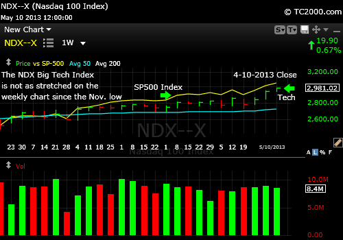
Big tech (NDX, QQQ) vs.SP500 Index
You see that tech is actually trailing the SP500 since that low and has been catching up.
Beyond the “stretch factor,” what do the other indicators say this week about the likelihood of a pullback?
The volatility index is back at tremendous support, so there is room to rise. Of course, we could still head down to the March low. The potential is there. I’d say the VIX by itself gives the edge to the Bears.
Commodities (CRB, DJP) are tipping down a bit, although possibly making a reverse head and shoulders formation, which is bullish. Gold fell last week, but it did close above the May 1st low. It was a new recent closing low though, so more downside is still possible. What is positive in the charts? With the gold miners attempting to form a higher low, gold may just hang on. So I’d still say gold is a crap shoot short term. Long term I still suspect another strong rally possibly to higher highs or just a re-topping. We will know within a couple of days at most if the current consolidation will hold. It’s wise in my opinion to use stops on any new buys at these levels. The chart of GLD is at the link above.
Remember that the last time gold fell fast, the entire market fell with it, and that could happen again.
Sentiment has room to rise still, per the AAII Survey data (www.aaii.com), although it has recovered from the lows that occurred near the HIGHS of the market; I’m referring to the 2007 highs. The easy part of the rally is over. The Bull Bear spread (difference in percentage) is up to 13.4% up from -4.9% last week and Bulls are back up to 40.79% with Bears at 27.44%. Those numbers are in the middle, so they are less predictive at this point. Markets can remain Bullish for prolonged periods, so the survey data should not make the Bears much more comfortable.
Interest rates rose dramatically on Friday as the chart shows at the link above (see the “Bonus Chart” link of the 10 Year Treasury Note [TNX, TLT]).
This gives room for more movement out of bonds and into stocks as investors finally get the message that interest rates won’t stay down forever – not if the economy is recovering. With employment rising due to job creation rather than decreased participation rates, the momentum may be up at this point. Even the European data is getting less bad, which is why I’ve overweighed my portfolio in the direction of foreign stocks.
An early warning sign is that margin interest is running at an all time high per Bloomberg. This means investors are taking on more risk than they likely should, believing that markets cannot come down. The issue is that as they unwind their positions in a decline, the decline gets worse and worse as margin calls come in and they must sell more stock to cover their losses. The market falls more and they have to cover more by selling more and it snowballs. This gambling makes corrections worse than they would otherwise be. The bright side is that there are better bargains at the lows of the corrections!
Key Takeaways for the Week:
1. Many indices are stretched, which raises the risk of purchases at these levels.
2. Despite the stretch, the trends are up and can continue. The indices may rise more and then pull back still leaving some investors behind.
3. The bond to stock switch may get stronger now with rates rising again. Bond investors are headed toward losses for the quarter unless the stock market corrects. That will provide more ammo for the Bulls. They need it to expand PE’s further or else we’ll correct when the “new” money runs out.
4. Margin interest is at all time highs, so any correction that occurs will be amplified and create greater bargains.
5. Foreign stocks are more attractive on a valuation basis than US stocks, because US stocks are considered safer. Emerging markets were starting to correct a bit on Thursday and Friday, so they are a hold for now. Preserve profits where you must.
6. Gold is attempting to form a bottom but must hold the recent low or we’ll at least retest the prior low during the big swoon.
Have a great week investing and/or trading!
Standard Disclaimer: It’s your money and your decision as to how to invest it.
The above is the text from this week’s free report. To receive future reports ahead of publication of the text shown above AND much more market timing information, please subscribe for free here:
Free Subscription to My Weekly Newsletter
I thank Worden Brothers for the charting system. If you want to know more about the charting system I use every day, go to my “Other Resources” page here:
My Chart Source
If you “liked” this post, would you please “Like” it at the “Share” arrow below? Thanks very much!
And to follow my Buys and Sells and up to the minute insights, please follow and bookmark my Twitter feed here: Join Me on Twitter
Copyright © 2013 By Wall Street Sun and Storm Report, LLC All rights reserved.
