A Market Timing Report based on the 5-17-2013 Close published Sunday May 19th, 2013
UPDATE for 5-23-2013 @ 1:42 pm: Survey Says! Why I am Starting to Take Some Profits. I am slowly taking some profits because of the individual charts and sentiment in combination. I am still 77.1% invested vs. my maximum equity exposure as a reference point. IN most cases, I’m trimming rather than eliminating profitable positions. I would like to have some cash just in case the market does not simply plow higher. The reason is sentiment this week plus the negative chart formations (see Twitter for more to the right).
I usually save my sentiment comments for the weekend, but this time, it cannot wait. Yes, there could be positive seasonality (upside bias) in the trading leading up to the holiday as is commonly the case, so that is the upside risk on a trading basis, but here is the sentiment info you need.
Investor Sentiment 5-23-2013: Sentiment is not good news this week the AAII survey and individual investors shows a 27.4% spread between Bulls and Bears. Investors are getting a bit too bullish.
It’s interesting to compare this to the October 2007 high, namely the one that was marginally above the previous July 2007 high (you can view the data at AAII.com). Sentiment then ALSO showed a spread of 27% with 51.81% bowls and 25.30% Bears. This time we are at 48.97% bowls and 21.58% bears which is still a significant spread and a significant number of Bulls at a new all-time high. So sentiment says to watch out and preserve profits. Sentiment here matches that at the 2007 high reasonably closely.
The Caveat? Positive sentiment can persist for a while, but the data is at least saying to be cautious and err on the side of preserving profits, PROVIDING you are willing to rebuy lower OR higher. If not, what is the point? Read my passive shorting page if you haven’t yet. It’s on the main website – see the “About” tab above. How deep this correction goes depends on the Federal Reserve and what they make public about their discussions. There are a lot of leaks happening lately. I’ll have more this weekend in the regular issue, which is out by Monday night.
UPDATE for 5-20-2013 @ 11:42 pm: This chart shows that silver (the silver ETF, SLV) and gold mining stocks (GDX) have tracked together very closely since the silver ETF all time high and have both done similarly poorly vs. gold (GLD). They could be better buys than gold if this bounce is real!

Silver vs GLD (gold ETF) vs GDX (gold mining stock ETF)
Check out my Twitter feed to the right side of this page and on Twitter if you want to see them all (see Twitter “Follow” button). The full issue gives you my entire table of 35 index calls for the week (see link at bottom). Lastly, I thank Worden Brothers for the charting software I use every single day (see my Other Resources page on the main site).
And now for this week’s issue…in which you’ll learn how to identify blow-off tops and blow-off bottoms (capitulations).
The market keeps moving higher, up, up and away as the song goes. It’s the Bernanke balloon. Of course, balloons go only so high and then they pop. Last week I demonstrated how you can tell when a market is stretched to the upside. Compared to last week the degree of stretch has increased and yet, even my “example market” stretched even further to the upside last week. This is why it is not very smart to sell a market just because it’s “high.” We generally do not appreciate how high a market can run. And yes, even I have gotten out early as I did a while back with utilities. If you get out early, you need to decide to get back in, even when you are behind. That is the way to address an early exit. Admit it and re-enter and pat yourself on the back for having the discipline to reverse course. Pride and stubbornness are the greatest killers of capital and opportunity as I have said many times before.
I’ve been adding to my banking exposure lately because of this chart:

Banking stock market timing breakout.
The Green Line is at the 2010 high of 58.83 over which the breakout occurred over the past market week. The breakout was on Tuesday, 5-14-2013. There is a reverse head and shoulders formation on the chart which predicts a new target of 111.17 or thereabouts.
Here it is:

Banking Stocks coming up out of a reverse head and shoulders formation, which is positive.
As far as the SP500 is concerned, notice the last fit of buying at the end of the week on the chart? Review both the text and the SP500 Index chart at the link here:
Market Timing Charts for Sunday’s Issue (opens separate window with all charts)
Why is there more risk this week in the market than last week? Because the degree of stretch in the market took it above the prior up trend line. There was a bit of a rush to buy compared to the trend. It’s much more subtle for big stock indices, but it’s there. Here is an example of a little “blow-off” top from September 2012:
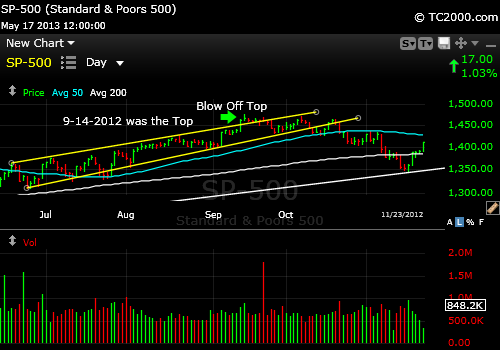
Small blow-off back in Sept. 2012 was enough to lead into a correction.
What a “Blow-Off Top” means is that the quality of buying has gone down. Investors are beginning to panic into the market afraid they’ll miss something. Now we are not that far above the trend, but it’s the first level of warning. I’ve learned not to fire before seeing the whites of their eyes so to speak. Otherwise you will tend to leave a lot of silly profits on the table. Silly because the late buyers are made to look silly.
What about the gold top? Was it a classic “blow-off”? Yes indeed it was:

Gold ETF (GLD) Market Timing Blow-Off Top in 2011.
You’ll note the entire top was lost quickly after it was made. The market became “exponential” following the trajectory of an exponential curve. Notice that you still would have kept the lion’s share of your profits had you left after the second top occurred. What about the current gold chart? Has there been a “blow-off” bottom? Yes there has been:

The Current Set-up Looks like a Blow-off Bottom (Capitulation). Could it get worse?
Commodities tend to do this much more often than stodgy stock indices, the exponential part that is of both blow-out tops and bottoms. Capitulation is another term you could use for a “blow-out bottom.”
We can say that there has been “too much selling” for now. See the fall BELOW the channel? There is a “risk” of a bounce from support that held on the Friday close. There is one reason I don’t recommend going for the gold yet. I want to see gold stocks reverse upward from their latest breakdown last week. Gold could be bought with a stop, but it is risky and a bad chart can always get worse. Buy more as we rise and get out with a profit if you achieve one and it tanks again. Longer term we still don’t know where gold will be in say one year’s time. We assume that the world’s Central Banks will screw everything up and that gold will have at least one more grand run at a new high or at least the prior high, but there are too many unknowns to be sure.
The close up chart of the gold trade this week is at the above link on the GLDTracker™ page.
Interest rates are still set to rise some more I believe unless there is a “left field” issue that pops up. See the Bonus Chart of the Week at the above link as well.
There are several ways that a significant correction could begin:
1. There will be an “incident” in the news that provokes it. Can’t defend ourselves against this other than to have some cash on hand.
2. The buyers will exhaust themselves. The cash ready to be traded will simply not be enough.
3. Earnings will deteriorate more and revisions will drive down stock prices as investors pay more attention to earnings. That seems unlikely at this point in the cycle. Things are slow but getting a bit better.
4. The Fed will raise interest rates. Not happening any time soon.
Survey Says! What? Sentiment is not in the way of the rally in stocks with the spread only at only +9.2%, Bulls (38.5%) leading Bears (29.3). You can review all the data at the AAII website (Google AAII). Lastly, the VIX (volatility index) is low but can go lower to the April or March low.
Key Takeaways for the Week:
1. The market is now “above channel” and more vulnerable since last week, but the trend is UP.
2. Sentiment is supportive of more gains in stocks.
3. Gold has had what could suffice for a “blow-off” bottom and may be done falling for now. Gold stocks (HUI, GDX) need to reverse their last breakdown for gold to be a buy I believe. Gold has failed multiple false bottoms on the way down.
4. Investors give themselves away in forming these blow-offs. They just cannot help themselves. It’s easier to buy when everyone else is.
5. Buy the cheaper looking markets like Europe and the Emerging markets and US banks. The US Bank stocks just had a multi-year breakout with a target of 82% gains. No guarantees, but it is a strong chart. I’ll admit that the banks are a little stretched just after this last breakout, so average in as we rise and retest lower. Stick to the strongest of the foreign markets like Germany in the case of Europe. I prefer the basket for emerging markets because the risk is higher, but I have been buying India separately for value.
Have a great week investing and/or trading!
Standard Disclaimer: It’s your money and your decision as to how to invest it.
The above is the text from this week’s free report. To receive future reports ahead of publication of the text shown above AND much more market timing information, please subscribe for free here:
Free Subscription to My Weekly Newsletter
If you “liked” this post, would you please “Like” it at the “Share” arrow below? Thanks very much!
And to follow my Buys and Sells and up to the minute insights, please follow and bookmark my Twitter feed here: Join Me on Twitter
Copyright © 2013 By Wall Street Sun and Storm Report, LLC All rights reserved.
