A Market Timing Report based on the 2-23-2018 Close, published Sunday, February 25th, 2018…
I deliver focused comments on market timing once or twice a week. These are supplemented with daily “Tweets/StockTwits” (see links below).
1. SP500 Index Market Timing: Is the market timing retest risk entirely gone? I cannot say that, but I’ll show you this week that although volatility rose in an unprecedented way (fastest weekly drop in the stock market on record), it has also dropped in an equally impressive way, which may have largely negated the retest risk. Any outside event like a move by Special Prosecutor Mueller on Trump himself could derail the bounce. We cannot fall asleep on our positions, no. But we can sleep at night.
Let’s look at the most powerful view of the VIX ramp up and down by looking at the ratio of the Deceleration Rate to the Acceleration Rate. What you see is the Deceleration Rate : Acceleration Rate ratio for the VIX during what I’m calling “Flash Crash 3” (the recent one) was over EIGHT times that we saw in 2010 and over 5 times that seen in 2015’s Flash Crash. That is what I’m calling a “VIX Implosion.”
| Date | VIX / Day (Accel) |
Decel/Accel | vs 2010 | vs 2015 |
| 1/4/2018 | 1.254 | 1.561 | 8.626 | 5.135 |
| 4/12/2010 | 0.845 | 0.181 | 0.116 | vs 2018 |
| 8/6/2015 | 2.356 | 0.304 | 0.195 | vs 2018 |
Here is the VIX DECELERATION DATA:
| VIX Deceleration | |||
| VIX/Day | vs 2010 | vs 2015 | |
| 2/6/2018 | -1.958 | 12.794 | 2.733 |
| 5/21/2010 | -0.153 | 7.82% | |
| 8/24/2015 | -0.716 | 36.59% | |
Given the much faster decay of the VIX to levels I pointed out on social media are similar to points far into the 2010 and 2015 recoveries (near the SP500 Index high prior to the fall of the market or beyond….see the social media links), and VIX moved to a new recent low on Friday , I was convinced of enough of a shift in the market to increase my SP500 Index exposure further. I share my exposure levels on social media, and you can find them at the links just below (adjust to taste).
We also can see that the trend is still up. The last significant low was in August 2017 and we stayed far above that even on this pullback. We are back above the prior channel line, so what I’ve called the “Tax Bill Reset” is back. I am staying long with above average exposure for now to the U.S. markets.
We are also just above the 50 day moving average, which is not a useful trading signal by itself, because it flashes on and off so much, but it’s a goalpost investors consider. “Being above it is helpful” is saying enough.
The next market timing step is to climb to a new high above the prior intraday highs of this consolidation. We are at the top of a sloppy consolidation, which is my remaining hesitation, that along with the lack of good volume on Friday in SPX (S&P500 Index), which was lower than the volume on every other day of the bounce, including down days.
Monday must show further follow through to the upside above the recent range. That’s the main catch on the shift to the “maybe no retest after all” hypothesis, and the reason that I have a bit of extra cash vs. prior without reducing my exposure too much. It is because I expect the market to run higher as it works through this period of higher volatility, retest or not.
Keep up-to-date during the week at Twitter and StockTwits (links below), where a combined 33,400+ people are joining in…
Follow Me on Twitter®. Follow Me on StockTwits®.
SP500 Large Cap Index (click chart to enlarge; SPX, SPY):

Retest risk has fallen, though not to zero. was
Survey Says! Sentiment of individual investors (AAII.com) showed a Bull minus Bear percentage spread of +21.86 vs +27.11% last week.
That is still a fairly high Bullish number to see so soon after the fastest 10% correction in stock market history. This is one more bit of evidence that investors really never changed their overly Bullish stripes during this correction. By being the fastest correction ever and now becoming the fastest VIX Implosion in a years (can’t say more simply because I did not go back prior to the Flash Crashes), there is some residual risk of not having enough skeptics and Bearishness in the individual investor side of the market.
| AAII.Com Individual Investor Sentiment Poll | ||
| Bulls | Neutrals | Bears |
| 44.65% | 32.56% | 22.79% |
| Thurs. 12 am CT close to poll | ||
2. U.S. Small Caps Market Timing: The small cap bounce has been sub-par compared to large so far as the chart below shows. I don’t want to have IWM exposure with it’s implicit banking exposure as rates fall from here, my favored scenario as detailed before. IWM is just 0.07 points above the 50 day moving average. It will take a rise above the consolidation high on 2-21-2018 and then a move above the left shoulder at 155.41 to greatly increase the odds of a return to the prior market timing high.
Russell 2000 U.S. Small Cap Index (click chart to enlarge; IWM, RUT):

Small caps still weaker than large.
3. Gold Market Timing: The US dollar rose last Tuesday and gold fell in response, as I indicated it would. Since then, the move has been a sloppy sideways move by GLD, which means a consolidation. I favor that rates move down from here, which would further hurt the US Dollar and help gold. If rates do the opposite and make a new recent high, gold and the dollar will move accordingly (down/up). It’s not too complicated at the moment. The only time we tend to see dollar up/gold up is in full on financial crisis and that is because the U.S. Dollar and specifically Treasuries are considered a safe haven. At least in 2018 they are! China is actively trying to change that.
Gold ETF (click chart to enlarge the chart; GLD):

Gold down as the dollar bounces a bit, a move that may NOT continue.
4. Interest Rate Market Timing – U.S. 10 Year Treasury Note Yield (TNX): I said last week : “Rates will come down from here or from 3% as an outside possibility.” The Bearish upward market timing wedge was broken by TNX on Friday as the chart shows you. I believe the 10 Year Yield will now retest that green line at 2.621% at least. The “Rate Shock” was the reason for the high volatility correction in my view as expressed in the issue HERE. Read that issue if you have not, as you won’t know what hit you if rates move up again, instead of down. That is NOT my preferred scenario, but we always want to be prepared to think clearly if things move in the opposite direction to the analysis.
The 10 Year Treasury Yield must descend below and then stay below my “Secret Number” which I revealed in the issue HERE, which is just above the green line on the chart below. Above that number, the market will continue to perceive the risk of DEFLATION due to an economy being crushed by high rates, which is just as bad as an inflationary spiral.
Here’s another key insight: As rates fall, the main stream media will start talking about how we are entering a “Goldilocks Period.” They love “Goldilocks.” 😉 It’s one of their favorite stories. Here’s the trick up her sleeve though. Even Goldilocks knows that if rates go too low, the market is actually fearing DEFLATION, not the INFLATION we were told to fear earlier. This can occur if the slowing already being detected in Europe and China is imported into the US. For now, the US is better positioned, which is why I moved more of my exposure to the U.S. The “world economy” is no longer so wonderful. As one example, you can see by the data Germany’s economy is NOT growing much and may in fact be contracting: HERE.
U.S. 10 Year Treasury Note Yield (click chart to enlarge; TNX, IEF, TYX,TLT,TBF):
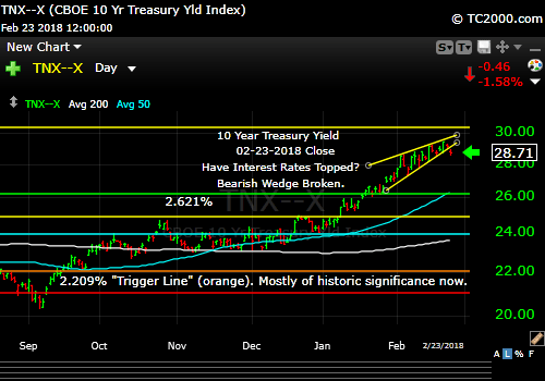
Rates falling again. Wedge broken.
Now let’s review the three market timing signals together….
Do not use these signals as a trading plan. They are rough guidelines. I currently share my signals on social media (links above).
MY SIGNAL SUMMARY for a Further U.S. Stock Market Rally with Low Inflation:
Stock Signal YELLOW with SP500 Index Neutral
I will change this to green when the new high occurs above the current consolidation range for BOTH SPX/SPY and RUT/IWM. I favor UP over down at this point, but have some extra cash as said. My exposure level is given on the social media streams (links above).
Note: I’ve updated my criteria for the equity signal for a further U.S. stock market rally to the following: GREEN = Bullish, YELLOW = Neutral, RED = Bearish.
Explanation: Note that a RED signal does not mean we should not buy. A GREEN signal does you cannot sell some exposure. It depends on what is going on in the economy and how oversold/overbought the market is at a given point whether the Bearish signal is to be sold, sold on the next bounce, etc. and whether a Bullish signal is to be bought or profits should be taken. YELLOW does not mean the end of the Bull or Bear. It means look for possible entry points within the existing trend, Bull or Bear, but preserve capital if the entry fails. Our strong intention is to buy low and sell high. By the way, I will keep showing the prior orange “Trigger lines” in the charts for now as reference points only; they have historical value for us from the post-election period.
Gold Signal GREEN in a Bullish Gold Trend
Remember GLD is being used as an indicator for the ECONOMY here. Gold coming off a major high is GREEN for the economy. The signal is NOT a gold signal here. A great economy should mean higher rates, dollar up, and gold down except when inflation is not being headed off by the Fed. Then gold can rise despite the stronger economy. I suspect gold will start rising again and the signal will turn red as rates FALL. The signal will be back to RED when GLD makes a new recent high.
Rate Signal YELLOW with a Bullish 10 Year Yield Trend. Remember this too is a signal for a “further stock market rally” as it’s being used here. The Bearish wedge break shown above is critical here and that’s where the “yellow” signal arises. Rates are falling for the short term at least in my view. Remember “Bullish” for yields is Bearish for bonds. For the near term move, the bond signal is Bullish due to the wedge break. Longer term, I expect rates to gradually rise as the recovery matures and the fiscal stimulus either wears off or forces the Fed to raise rates repeatedly due to inflation finally increasing.
Thank you for reading. Would you please leave your comments below where it says “Leave a Reply”… or ask a question… Pay it forward too by sending the link to MarketTiming.Blog (that link will immediately connect them to this webpage) to a relative or friend. Thanks for doing that.
Be sure to visit the website for more general investing knowledge at:
Standard Disclaimer: It’s your money and your decision as to how to invest it.
I thank Worden Brothers for the charting system I use to post these charts. If you want to know more about the charting system I use every day, go to my “Other Resources” page here: Other Resources It makes it much easier to follow along with me if you can see the charts and manipulate them on your own computer. It’s a great investment to have an excellent charting system. Check it out with a free trial at the link above.
Copyright © 2018 By Wall Street Sun and Storm Report, LLC All rights reserved.
