A Market Timing Report based on the 9-20-2013 Close published Sunday September 22th, 2013
The SP500 Index is back testing the last breakout after reaching the top of the longer term up channel last week at 1729.44, just below my target of 1730 mentioned in last week’s video (see Market Timing Show™ post). I thought the upper line forming the long term channel would hold the SPX (SPY) and it did.
Investors reacted very positively on an initial basis to the Fed announcement that it would forgo the reduction of QE that the market had predicted for September’s meeting in the range of 10-20 billion. Wall St. was dead wrong. What I knew beforehand was what I Tweeted – that the market would react very positively, that is stocks and metals, if the Fed did less than a 10 Billion dollar reduction of QE. It did zero and metals and stocks initially flew!
The Fed had the audacity through its Chair, Bernanke, to suggest that it was not its problem that the market over-interpreted its comments. I would ask “What is the value of a transparency policy if you mislead the market or do not correct it when you see it is off course? ”
Then Bullard of the St. Louis Fed blabs that they might actually taper in October, which has caused the retest of the prior breakout and the metals to sell off sharply. Some transparency! We must now hold above the last breakout for the SP500, or we will likely slide back into a more significant correction. I’ve already begun trimming a bit by selling my natural gas position on Friday. I may trim again on Monday. Follow my twitter comments to follow this discussion in the most timely way.
Unless you are willing to rebuy lower, selling probably does not make sense, although you may have to watch a 5-10% correction occur. I suspect that the market will do OK on a longer term basis as long if the Fed moves slowly to reduce QE AND the economy continues to improve.
Eventually we’ll be left with JUST THE ECONOMY to justify Price: Earnings ratios on stocks. If the E drops due to sluggish consumption and sluggish economic growth, the PE will have to come down via selling in the stock market to lower prices. The moment the stock market feels that the Fed is doing TOO MUCH QE reduction, it will sell off.
The fact that Bullard immediately corrected the bounce in the metals and stock markets after the Fed meeting by saying that they could move as soon as October to reduce Quantitative Easing likely means that the Fed is very close to reducing QE.
Because of the fear surrounding QE reduction, we should see somewhat lower prices in the near term followed by another rally to higher highs if the slow economic recovery continues and retail performs well into the fall. There are tangible signs of recovery, but the momentum must continue.
SP500 Index back testing last breakout.
Now let’s look at interest rates and see what our working range is. Within what range of rates will the market do OK? I’ve plotted the SP500 against the 10 Year Interest Rate (TNX) (in yellow). First look at the chart and then I’ll go over it:
SP500 Index against 10 Year Treasury (TNX) Interest Rate (yellow line)
Rates should not disturb stocks too much as long as they stay in the range of perhaps 2.46% and 3.00%. The lid in the chart above is just below 3%. My feeling is that stocks may sell off a bit if rates exceed 3% in the near term. Only if economic growth is higher, will higher rates make sense to the markets.
You see in the chart that the SP500 Index was able to rally despite a rise in rates. If the stock markets correct further following a break of the prior high, rates will probably drop some more toward that 2.46% level.
Bonds may not benefit as much as they did in the past, as investors are now being brainwashed to avoid bonds, so there will be a build up of cash which will rush back into stocks as soon as there is a sense that the Fed is not going to mess things up that badly after all.
My opinion is that investors should be selling bonds into the coming mini bond rally and buying stocks back at lower levels for the next rally. I’ll rebuy stocks lower with the cash I raised on Friday and more that I may raise early next week.
Note that this cycle of selling will INCREASE the amount of money going into stocks on the next move up as money moves from bonds to cash and back into stocks.
See the GLD gold ETF post as well, which will be published soon.
Standard Disclaimer: It’s your money and your decision as to how to invest it.
I thank Worden Brothers for the chart system I use to post these charts. If you want to know more about the charting system I use every day, go to my “Other Resources” page here: Other Resources It makes it much easier to follow along with me if you can see the charts and manipulate them on your own computer, so it’s a great investment to have an excellent charting system.
To receive future reports and reminders that charts are ready to be viewed, subscribe for free here:
I thank Worden Brothers for the chart system I use to post these charts. If you want to know more about the charting system I use every day, go to my “Other Resources” page here: Other Resources It makes it much easier to follow along with me if you can see the charts and manipulate them on your own computer, so it’s a great investment to have an excellent charting system.
The next full issue will be out on Sunday, October 6, 2013 for free subscribers. The prior report can be read on the
“WSSSR Access” page. Look also for comments on Twitter (link above).
To receive future reports and reminders that charts are ready to be viewed, subscribe for free here:
I am doing updates on Twitter and on the private WSSSR Access page on the main site (use link above to get there). The video below will help orient you to my recent thinking on the SP500 Index (SPX, SPY).
I thank Worden Brothers for the chart system I use to post these charts. If you want to know more about the charting system I use every day, go to my “Other Resources” page here: Other Resources It makes it much easier to follow along with me if you can see the charts and manipulate them on your own computer, so it’s a great investment to have an excellent charting system.
To receive future reports and reminders that charts are ready to be viewed, subscribe for free here:
The next full issue will be out on Sunday, October 6, 2013 for free subscribers. The prior report can be read on the
“WSSSR Access” page. Look also for comments on Twitter (link above).
A Market Timing Report based on the 8-02-2013 Close published Sunday August 4th, 2013
UPDATE for 8-26-2013: All charts on the “Key Charts” page (see tab at top) were updated last night. There is also lots of detailed commentary on the markets including which ETFs are being favored in this bounce available to free subscribers at SunAndStorm.com.
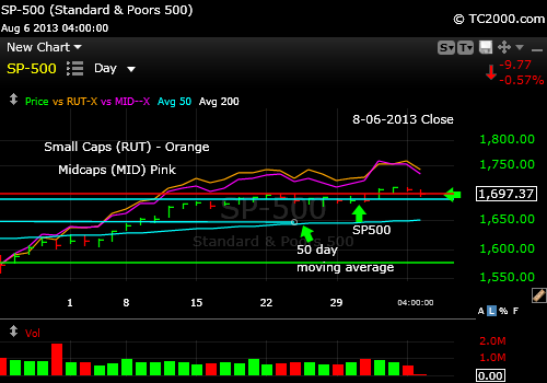
UPDATE for 8-06-2013: Small Cap and Mid Cap Stocks have further to fall as this comparison chart to the SP500 Index (Large Caps) shows. At the left side of the chart, they are plotted from the same point on 6-24-2013. Since then, the small and mid caps have outperformed the SP500 as noted by the gap created:
Small caps and mid caps are more stretched on the chart than the SP500 Large Caps.
UPDATE for 8-05-2013: The SP500 Index did in fact pull off another day above the breakout point, so I added just before the after hours close.
And now for the text from the new issue…
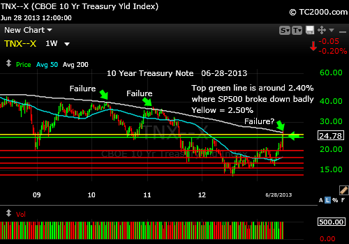
There is still one big thing we need to be following in the coming months. And that is the interest rate on the U.S. 10 Year Treasury Note. The rise in yields has caused a major shift in what is safe vs. what is unsafe over the coming months as rates presumably rise higher and higher until they reach more “normal” levels at perhaps 4-5% if we’re lucky. So far, the jawboning of the Federal Reserve chairman, now on his way out, has not worked to keep rates down. This week at the Fed meeting, the main theme was that economic improvement is not coming as quickly as was hoped, so the Fed believes that interest rates as well as the Quantitative Easing Program can be kept as is for a period of time.
The interesting thing is that the bond market has decided that QE is going to be curtailed in September. It has ignored Dr. B. If QE ends then, interest rates will undoubtedly climb further, even though they failed a breakout above the June high on Friday. The thing is, without QE, the stock market was stuck and interest rates were still too high, which means if we reverse that by dropping QE, it will have the same effect as raising the Fed Funds rate. In the past, statistics show that rising rates initially expand stock market multiples, so I’d prefer to follow the market rather than speculate.
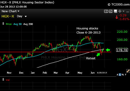
Why are rates so important? To see the impact look at ETF’s like VNQ, the REIT ETFs and mortgage REITs like NLY. Also look at corporate bonds (LQD) and municipal bonds (PZA) to see how they’ve fallen. There is still more pain ahead, if QE is going to disappear. Housing stocks have also retrenched, but seem to have at least temporary support here (HGX, ITB).
I’m going to digress a moment and discuss the value of housing in an environment of rising rates. What happens is that as rates rise, the cost of housing goes up for buyers. At the low end, that prevents some people from even buying a home, while for those higher up in the economic ranks, they get nervous and bid up the prices of existing homes. So housing continues to do well in a period of rising rates, unless rates go up too steeply and shut off the flow of reasonable mortgage funding.
The other thing we have operating in the current market is that perhaps a third of houses that have been bought during the crisis were bought by investors, who are either going to rent those homes or resell them to home buyers. But with higher rates, the number of people who can now afford these investment homes has shrunk. This should take some of the buying pressure from investors off the market and moderate things perhaps.
What to do? If you’ve been looking for a time to buy a home and are stably employed, it may be time to pull the trigger. Some are predicting a second dip in housing, but I would not count on it with the Fed rigging the game.
If we believe the above scenario, then after the initial shock, the housing stock market should do well for a while until rates become too punitive. If you buy housing stocks though, use a stop. We may be above support, but if rates rise too quickly, they may break down again.
What about the SP500 Index? Should we expect another 5-10% by year end? The market is now 2 days above the breakout of 1698.78. I usually like to see 3 days for confirmation even though I’ll start buying on day 1 as I did (see Twitter). Marginal new highs can be formed and then fail as happened back in 2007. Here’s the updated chart along with the other two chart updates with this issue:
The VIX has hit support again, so it could rise as easily fall to the March low. The VIX does not help except to say that the easy money is bagged. And the Bulls could point out that we could still see the VIX fall to retest the 2007 lows, when the stock market was at a high.
And investor sentiment? According to AAII.com, the spread of Bulls – Bears indeed fell to 10.6% from 22.6% and the market moved UP, not down. That on the face of it is Bullish, because we expect investors to be eager to buy stocks at new highs as they’re joining the party late, which is their usual practice. Being more negative at a peak means there’s room to expand to more Bullish sentiment and higher highs in the SP500 before a pullback. The main change was that “neutrals” increased, not Bears that only went from 22.56% to 25%. So the confused investors are probably still holding on, not selling yet. After all, their positions are still rising in value.
I also re-bought half of my XLF position in financial stocks. Remember that this was one of my 2013 themes covered in my early January report. There is room for banks to make a lot of money as interest rates rise. Their returns improve as rates rise. There is more room between what money costs them to borrow and what they can loan it for.
Gold seemed as though it was going to recover a bit as the Fed kept jawboning its case for reducing QE only as warranted by the economic data. The Fed says it will not get in the way of economic recovery. It’s a Fed with a brain; at least they think they have a brain. Rates did pull back on Friday quite a bit after the sluggish employment data were released. 198K jobs were expected and only 162K jobs were delivered by the economy in July. But despite the pullback in rates, gold actually slipped by 0.20%. It should have rallied, so that does not say much for the demand for gold. GLD has been slipping down its 50 day moving average for 10 trading days. If it moves above 128.97, it could be a buy again. See the GLD chart update at the link above.
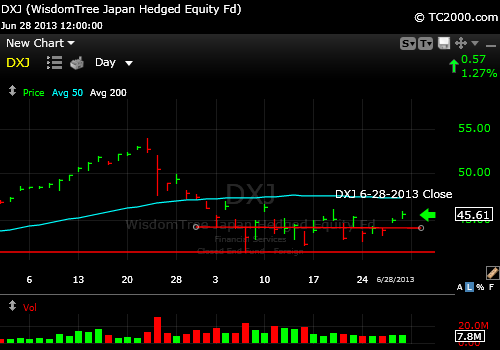
Emerging markets look about as good as gold. Meaning they have been in a slump. They are particularly sensitive to rising interest rates, as it slows their growth, which is their lifeblood, not to mention the lifeblood of US multinationals. To me DXJ looked better this past week, so I’m partially back in. Europe (VGK) is a buy on a dividend corrected basis, now over the 5-2011 high. Germany (EWG) on the other hand is lagging a bit and still below the 27.04 dividend corrected 5-2011 high. To find out even more, subscribe below. Once you’ve subscribed, you will be able to access my private notes on the “WSSSR Access” page. The notes I posted this am (8-06-2013) are important.
Have a great week investing and/or trading!
Note: The long term signals have been updated in this week’s issue (subscribe below).
Standard Disclaimer: It’s your money and your decision as to how to invest it.
I thank Worden Brothers for the chart system I use to post these charts. If you want to know more about the charting system I use every day, go to my “Other Resources” page here: Other Resources It makes it much easier to follow along with me if you can see the charts and manipulate them on your own computer, so it’s a great investment to have an excellent charting system.
To receive future reports and reminders that charts are ready to be viewed, subscribe for free here:
The next full issue will be out on Sunday, 6-30-2013 for free subscribers. Look for updates on the main chart tracking pages this week as I feel they are needed and comments via Twitter.
I am doing updates on the private WSSSR Access page on the main site (use link above to get there). The video below will help orient you to my recent thinking and the private notes will fill you in on my most current take on the markets.
What’ s in the video? The SP500 index is in rally mode and about to retop at the prior high, interest rates are cooperating a bit, but I point out why they could continue higher from here and squash not only the stock market rally, but the gold (GLD) rally as well.
Now let me explain my title this week. The Fed Chairman, Dr. Bernanke, spoke after the market was closed saying that the market’s idea that the QE taper was definitely going to start in September was wrong. He SHOULD have made this statement by the light of day during normal trading hours and there should be a regulation in place preventing all Fed comments on monetary policy at meetings held after the market close. The market is very susceptible to being manipulated when the volumes are lower, so the same thing could backfire as a big sell-off next time. The fact that the market rose doesn’t matter.
The fact that the Fed still sees the need to intervene with QE when a recovery is underway is perverse. Dr. Bernanke even complains that Congress is not doing enough. So the Fed must act is the argument.
This is a grotesque distortion of the U.S. Constitution. Our founding fathers certainly did not intend to create a private institution like the Fed to control our economy, an institution which is unelected, and which now directly and indirectly controls prices in every market causing stocks, currencies and gold to jerk up and down with their every proclamation. What we are experiencing is the “tyranny of monetary policy.”
If you agree, contact your Congressman/woman and Senators (Google “contact senator” and “contact congressman”) and tell them that:
1. The Fed should be restricted to giving speeches during normal market hours and
2. The Fed should not be a vehicle through which the employment rate is adjusted. Their primary focus should be the stability of the monetary system, preventing runs on banks and other financial institutions, and controlling the rate of inflation by monitoring interest rates.
Congress was meant to act with the President to support economic recovery and growth, not unelected Fed officials. Some would even argue about that. The economic dictatorship that the Federal Reserve has established in the name of stability must be reversed. It is un-American.
This week our founding fathers rolled over several times while the Fed Chairman was setting off an after hours rally, committing what should be a federal crime.
Have a great week investing and/or trading!
Standard Disclaimer: It’s your money and your decision as to how to invest it.
I thank Worden Brothers for the chart system I use to post these charts. If you want to know more about the charting system I use every day, go to my “Other Resources” page here: Other Resources It makes it much easier to follow along with me if you can see the charts and manipulate them on your own computer, so it’s a great investment to have an excellent charting system.
To receive future reports and reminders that charts are ready to be viewed, subscribe for free here:
The next full issue will be out on Sunday, August 4, 2013 for free subscribers. In the meantime, I’ve been commenting on the “WSSSR Access” page at SunAndStorm.com on my trading thoughts on many days. Look also for comments on Twitter (link above).
A Market Timing Report based on the 6-28-2013 Close published Sunday June 30, 2013
There’s just “one thing.” That’s the line from City Slickers right? Well at this juncture in the market, and it’s impacting EVERY market around the world, the one thing that matters most is the interest rate on the U.S. 10 Year Treasury (TNX). You can follow it using the symbol TNX. And if you want to play it more directly, TLT and TBT are the ETFs that most traders appear to favor. But the reason it’s so important is that stocks and bonds are valued relative to one another. When rates are low, investors favor stocks, so when the Federal Reserve even HINTED at less monetary easing, first by pulling back on Quantitative Easing perhaps starting as early as September, the markets panicked.
I was fooled by the bump up in the market on Tues. 6-18-2013 the day prior to the Fed announcement. I felt that the market would not have broken above resistance on the chart at 1649.69, which represents the 6-10-2013 high, if the Fed were not going to “soothe” the market appropriately. That turned out to be wrong. The Fed scared the market into higher interest rates until it started to re-educate the market this week saying that the markets had reacted inappropriately. It has been rare in the past that the Fed would ever comment on the precise level of interest rates, so they must have been concerned.
They should have been concerned! What it meant to have interest rates soar to above the 2.397 – 2.407 (prior TNX highs), is that the bond market was suddenly IGNORING the Fed’s comments, while it’s been held in line more or less since 2009. In other words, it was a sign of a lack of trust in the Fed to do its job in keeping interest rates low enough to allow the recovery of the economy to proceed.
That is why the current beginning of a stock market rally, which is coinciding with rates falling from the recent high, may continue. Rates need to keep falling. Otherwise, the Fed has ZERO credibility with the bond market, and the bond market is going to take this Fed by the nose and lead it as it used to do when the “Old Normal” was operative.
So what do I expect? I expect Fed action along with more Japan and China buying (per Bond King Bill Gross’ rumor sources, they started helping the Fed again) to sustain this Treasury market rally from the recent high in yields to the 2.0 to 2.2% level, the latter chosen as the “preferred level” by Bill Gross. I think Bill will be right this time, although he’s been wrong at times during the past year, because the Fed’s reputation is at stake. If the Fed loses this, they risk undermining all the progress they’ve made to date. And the stock market will sell off and quickly reach that 1494 target I mentioned last month. But if rates continue easing off now, we could have seen a temporary low in the stock AND bond markets. That’s why I picked up a couple of muni bonds at the end of the week. Not great buys perhaps, but OK on a relative basis. I stuck with 5 year maturities.
Take a look at the current SP500 Index “Tracker” Chart via the main chart link here: Charts for Sunday’s Issue (opens separate window with all charts) And the 10 Year Treasure Chart is at the same link on the prior Bonus Chart page.
If you want to get an even better feel for what was going on last week, see my private trading notes on the WSSSR Access page at the top just under the WSSSR issues (get the password first by signing up for the newsletter below): http://www.sunandstorminvesting.com/market-timing-tips.html
If you prefer the broad strokes, continue reading here.
What I did last week was to re-enter both the US (SPY, SPX) and Japanese (DXJ) stock markets as the 10 Year Treasury yield fell. Those positions are still in the green.
I also entered ITB as a proxy for HGX housing stocks, which it tracks fairly well. ITB was very weak on Friday, erasing the gains from the prior day, so it’s a bit more toward neutral until it rises back above 22.75. My ITB position is slightly in the red after that pullback. Note that while HGX is slightly below the 200 day moving average, ITB is slightly above it. But they both survived the last retest. A second failure at the red line and certainly at the recent low will not likely be taken well (as it wasn’t for gold either!). This trade is at the very center of the Fed adjustments so consider it a higher risk trade.
Housing Stocks bouncing from support.
I will continue to add exposure to U.S. stocks, Japanese stocks, and U.S. housing particularly if:
1. Treasuries continue to fall in yield.
2. The SP500 Index confirms the move.
Last month I warned that there was nothing very promising about gold. We closed our trading position much higher. Gold was pummeled again and again over the past month and I commented on the chart here where the chart has been updated: http://wp.me/p14gPd-zkGold has a lot of room to rise from the latest low and Bears are probably due a licking to remove some of their pride. The problem with gold as an investment here is that it could rise to the 50 day moving average and continue to fall again. We won’t know until we get there.
I’d say that if you own no gold, this might be an averaging in spot, but THERE IS NO TECHNICAL BUY SIGNAL. Here’s the scoop though: If I’m right about rates, real interest rates are now going to fall again and gold will rise. That is the sole reason gold perked up on Friday from it’s most recent near death experience. Personally, I’ll be selling more at lower prices (if we see them) to preserve profits.
What else could make gold (GLD) rise further? The Fed, because it has never been able to take us out of recessions without stimulating some inflation. Inflation is the only other thing that can cause a huge gold rally assuming we don’t go into another slump where the Fed is still buying debt en mass. And guess what? There has clearly been some food and oil inflation since the lows in oil prices a few years ago, but other pricing besides housing has been fairly stable. So inflation is not a problem yet.
If the Fed actually pull off what it would like to and end it’s QE and easy money policies without inflation, gold may be well below $1000/oz. If the TNX continues to make new highs, gold will plummet another notch. I doubt that, but never say never in trading and investing. Protecting profits is smarter. The most conservative way to play gold would be to buy it in steps but then sell if it closes below a certain stop for each new position. That way, you can preserve profits on earlier positions and avoid big losses on your capital. I would not buy without stops personally. Some do and call it insurance, but your insurance may lose value. No one can tell you what gold is really worth although some say $1200 is the marginal cost of production. Below there, mines will shut down is the claim so gold prices will stabilize higher. So gold may have reached a temporary low based on both interest rates and reaching the approximate cost of production.
Remember that there are limits on the Fed here. They don’t want to overdo their buying of debt. The reason they’ll act here is not to drive rates back to the prior lows, which would help gold in a major way; it’s to stabilize rates at a workable level. They don’t need gold to be at $1900. The housing market has heated up enough that gently rising rates will lead to higher home prices as they have in past cycles. If rates get out of control, housing would be crushed again, but that is not likely in the near future (at least for a couple of years perhaps). The Fed does not have to buy mortgages in the market when the housing market is doing well. That’s why they are shutting down QE starting in September most likely (that’s the date the market “likes”). Fed funds rates won’t rise for much longer, but it was QE and direct Treasury buying that had the big impact on rates.
One caution sign on gold: Commodities (CRB index; DJP) hit a new recent low on Friday. No inflation there! And it implies a weak world economy, bad for price earnings ratios. Earnings are coming up and could throw a wrench into the market, not this Monday, but the next when Alcoa reports.
This week, if rates don’t keep falling, I’ll likely be kicked back to the sidelines on all recent stock market buys. If the retest Friday was enough, things will work out better. Where to exit this swing will be the next issue. When volatility rises as it has, if you are not trading the market, you are probably not going to do as well and it’s not easy to catch every swing correctly. Staying on the sidelines until the air clears is another way to handle it, if you prefer not to trade. I would have protective stops on all profits though, as you never know how low we’ll go. If you sell, you must be willing to re-enter if your exit point is proven wrong.
But this weekly chart says rates may have just peaked. See the prior failures? We’re now POTENTIALLY failing at a similar chart point:
Another failure of rates to rise above the 200 day moving average?
My pessimistic target so to speak based on a rate failure is at 1494 for the SP500 Index, 7% below here.
What about the immediate future for U.S. Stocks? Check out the Sp500 Index chart at the link above as I give you the details.
We’ve already tested and failed initially at the 50 day moving average. Yes, sometimes obvious technical points work, but at other times rallies slice right through the 50 day moving average to the upside. That failure might have marked the end of this swing, but due to the fall in rates, I don’t believe that will be the case. That is my thesis, right or wrong. Decide for yourself. What it means is that if you bought on this swing, it’s not a sell yet, but if you have not bought, it’s not a buy yet. That’s call a HOLD! ; )
When I reviewed prior retracements from failures at the 50 day mav, I found that they ranged from about 30-70% of the prior swing up, and 70% is a lot to give up I realize. Then they swing up through the 50 day moving average very often. My trading will depend on rates. I may start to exit a swing lower in stocks if rates rise above 2.5% in a meaningful way. If rates hold up well, I’ll probably just sit tight. Decide on your own stops of course. I’ll tweet when I issue any market timing notes during the day. Those will be posted on the subscribers only page.
The VIX and investor sentiment don’t help much this week. Both could fall or rise and are in neutral positions.
And here is why I like Japan, particularly the currency hedged ETF, DXJ:
Hedged Japanese Equity fund (if yen goes down, it does not effect the value directly).
There seems to be support building with higher lows and a nice base. If the base fails, you won’t want to stick around, but as I said when Japan was falling, it’s unlikely that the swing up in Japan will just be one big move. I think this is the second move up that we’re about to see. But it has not happened yet beyond the upward tone you see.
One month ago I wrote: “It may be worth buying such a pullback this time provided the 10 Year rate is contained at 2.4%.” I believe we’re now going to reverse back below that level to lower rates, which would support a further rally in stocks. So the TNX is an important number to watch. All of my recent buys will work out if rates continue falling.
Have a great week investing and/or trading!
Note: The long term signals have been updated in this week’s issue (subscribe below).
Standard Disclaimer: It’s your money and your decision as to how to invest it.
I thank Worden Brothers for the chart system I use to post these charts. If you want to know more about the charting system I use every day, go to my “Other Resources” page here: Other Resources It makes it much easier to follow along with me if you can see the charts and manipulate them on your own computer, so it’s a great investment to have an excellent charting system.
To receive future reports and reminders that charts are ready to be viewed, subscribe for free here:
The next full issue will be out on Sunday, 6-30-2013 for free subscribers. Look for updates on the main chart tracking pages this week as I feel they are needed and comments via Twitter.
There were lots of big bad breaks in markets this week. The market timing bells were going off all over the world and in every area of investment. Stocks down, bonds down, gold down, and one thing up, the US dollar (UUP, USDX). The reason is that the 10 Year Treasury (TNX, TBT) went up in yield above my 1st target of 2.4% in yield (see Bonus Chart post link to upper right to catch up).
Suddenly the liquidity is being shut off is what the market thinks despite the protestations of “not quite yet,” by Dr. B. “Not quite yet” is not “sometime in the distant future” in market speak, so the markets did the opposite of what they have done over the past few years which was previously to INFLATE.
Deflation of all assets is what you saw this week, which I have to add to my prior PDF as the “Sell everything Panic Scenario.” Previously bonds were still a “safe place,” or so the market thought. But that was AFTER 2008. Bonds crashed in 2008, which many have forgotten. This is a 2008-style “sell everything” panic.
Yes, it’s just the beginning, but the drop of bonds since this started has been dramatic. Gold has been collapsing in stages as you know. Now stocks are coming along for the ride down the hill. Set your mental stops. Preserve your profits and be prepared to buy everything back at lower prices. That’s my take on it.
US Large Caps Broken (SP500 Index below support):
SP500 Index Broke support this week. Down we go, even if a bounce occurs.
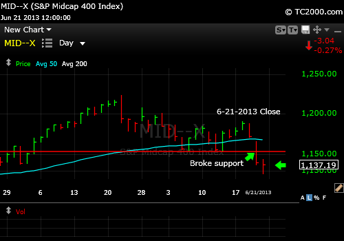
US Mid Caps Broken:
US Mid Cap Stocks break support.
US Small Cap Stocks Down and Just Below the Break Point
Small caps broke too, but barely.
Gold (GLD) Broken:
Gold broke again. Better value or more drops to come?
We may actually see gold start to find a true bottom before stocks. And in 2008 bonds bottomed before gold. The bottoming order was bonds, gold, and then stocks in 2008.
Bonds (LQD) had three separate big declines in 2008 with a failure of the first reversal attempt above the first low. Go back and review the 2011 summer carnage in the markets. It could get as bad this time too. It’s not likely to get as bad as 2008, because the central banks have too many tricks up their sleeves.
But once again, if you sell, you must be prepared to re-buy either lower or higher or do not bother selling. We must have the fortitude to re-buy lower when others don’t want to buy, even if we risk capital to find the bottom at times. If that happens, we simply sell and take our losses like grown-ups and re-enter still lower or wait for higher highs.
I was forced to do this when the market did a head fake and failed a breakout this past week. My thesis was that the new high would not have occurred ahead of the Fed unless the market had already decided what the outcome of the Fed meeting was going to be. I was wrong. Fortunately, I quickly saw that the slight breakout was becoming a pivot point (see my Twitter posts to see the flow of my thoughts), and exited in two steps.
I think in this case, a one step exit was justified, because the buys were based on my breakout thesis which was proven wrong. Hedging that failure did not serve me.
Getting out quickly following the Japan tsunami, which we did, was very effective for example, because at times the market falls slowly before falling faster. We could be moving into a “falling faster” phase in the current sell-off going this week.
It’s also important to recognize that we won’t always catch the bottoms and must have the strength to admit we’re wrong and re-buy higher if that is the case.
The later you sell, the greater the risk of a bounce. I saw this decline lining up several weeks ago, as my posts show. The markets provided excellent examples of massive stretching in many markets, especially the REITs that are interest rate sensitive. They plummeted after I highlighted them in previous Market Timing Briefs.
In the SP500 Index, a bounce could take us somewhat above the 50 day moving average, although I favor a further fall within the next few days, even if Monday goes sideways. Sometimes a market will rise back to the break point such as the prior lows or the 50 day moving average and then fail again.
If a bounce occurs early this next week on anything but an interest rate reversal BELOW the 2.4% level, it will be suspect. Be careful of buying small bounces, as I bit too early as prices rose above the prior high on 6-18-2013, the day before the Fed announcement, and had to book losses on that early bite as mentioned. Fortunately I was buying in stages, so the bite back was not that horrible, but it isn’t fun! Remember that I was buying back after selling much more at higher prices, so I am still well ahead in this sell-off over the buy and hold strategy.
As a reminder of where this 3rd wave of stock selling could take us, the post is here: My Stock Market Timing Target with the 10 Year Rate Above 2.4%It is possible that a bounce may occur at the retest of the breakout point at the 2007 high of 1576.09, but I believe the low will much lower than that.
I thank Worden Brothers for the chart system I use to post these charts. If you want to know more about the charting system I use every day, go to my “Other Resources” page here: Other Resources It makes it much easier to follow along with me if you can see the charts and manipulate them on your own computer, so it’s a great investment to have an excellent charting system.
To receive future reports and reminders that charts are ready to be viewed, subscribe for free here:
The next full issue will be out on Sunday, 6-30-2013 for free subscribers. Look for updates on the main chart tracking pages this week as I feel they are needed and comments via Twitter.
SP500Tracker™ for 6-16-13 Based on 6-14-2013 Close:
VIDEO UPDATE for 7-04-2013:
CHART UPDATE for 6-28-2013 Close: The second failure point on the chart below did not hold the latest rally. The rally is based on the 10 Year Treasury rallying from the recent high in yields. I believe it will continue, but if it doesn’t, I believe the SP500 Index will sell off in a very significant way. The summer, at least the first part, may involve multiple ups and downs that try investors’ patience and not much fun for Bulls or Bears unless they get the turns right. More in the monthly report out this Sunday (free subscription link below).
SP500 Index between nearby support and nearby resistance.
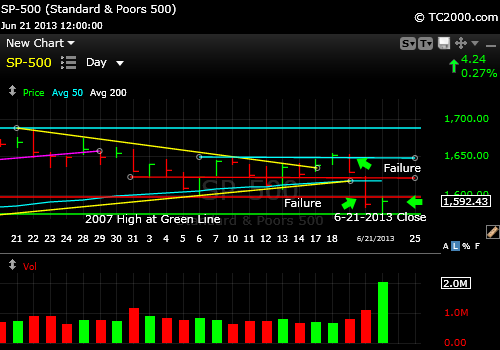
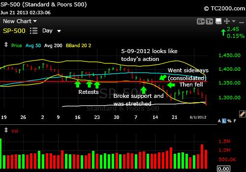
UPDATE for 6-21-2013 @ 2:43 pm: The market is simply going sideways today with a falling VIX volatility index, which means fear is dropping a bit. Although this could support a bounce, the more likely scenario is shown below in the May 2012 chart which shows how we broke important support at the horizontal red line BELOW the 50 day moving average and then were stretched to the downside. Then what happened? We went sideways to relieve the oversold condition of the market, and then the market fell to the next level down.
Down, pause, and down again. That’s what today looks like so far in the context of this week. Yesterday we were down; today is the pause.
Anything can change. If Dr. B. comes out with all speakers blazing talking up the markets, maybe there could be a bigger bounce than we’ve seen today. My belief is that we will go lower before I’ll need to rebuy. Up to 1600 is a crap shoot. It could test there one more time I suppose, but it did not happen today and I’m not waiting for Monday to find out. I’m now at 35% maximum exposure to equities as I am walking my talk of “passive shorting.” See the main website (“passive shorting” on blue bar to left at SunAndStorm.com) for more on that or Google that term that I coined a while back. It has nothing to do with being short. It’s about reducing your long exposure (selling so you can re-buy lower).
I’d still sell in steps if you sell, but I leave that to you and your own risk management. Sometimes I sell slowly, sometimes faster. Or buy slowly, buy faster. Remember that the market can reverse from these declines abruptly and then, as the 2012 chart below shows, the gains don’t always stick and turn into meaningful rallies .
The bottoming process could take up to several months to complete. Or the Fed could suddenly decide to become very aggressive on Monday and drive rates well below 2.4% and scare the heck out of the bond market, inducing a stock rally.
Make your own decision please and be willing to reverse course if you are wrong. Notice I did not say if “I am wrong.” It’s your money and your decision once you weigh the facts. I am sharing one viewpoint. You’ll be a better investor if you take 100% responsibility for your decisions. And now for the chart:
SP500 Index market timing: Down, pause, down upon breaking support back in May 2012.
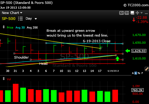
UPDATE for 6-19-2013 @ 8:15 pm: The breakout above the top aqua line in the chart below is NULL and VOID for now. That can of course change daily when the market is as volatile as it’s been. The SP500 Index fell after traders decided that despite the Fed had told them everything before, they needed to hear it one more time. Well maybe. Many times the first reaction to Fed speak is wrong.
The threat they did not like most was that the Fed will reduce bond purchases later this year, perhaps in September and end them by mid 2014. Dr. B. actually said that they would be flexible and may not do so if circumstances warrant, but the markets did not believe him. Ending QE by then is soon for the bond market that sold off harshly along with all interest rate sensitive stocks like REITs and utilities. Emerging markets were also hit hard. I would stay clear of them until there is a sustained reversal.
The SP500 Index must maintain support at the first red line beneath here on the chart shown below. If not we’ll probably fall quickly to the bottom red line support level, which means failing at the 50 day moving average. That break would cause another significant leg down in my opinion, although 1598.23, the prior low COULD hold the market. I just don’t have confidence it will this time.
Could the SPX bounce again at ANY of the red lines shown in the chart or from the 50 day moving average? Yes, but if any such rally is real, it should top the prior resistance at 1648.69. Above there, the Bulls regain the ball. For now, they’ve lost it and the best they can hope for is a retest.
Theworst of the current range is the base at 1598, but as I said, a move below the 50 day moving average could cause the full 3rd wave down to materialize.
SP500 Index responds negatively at least initially to the Fed comments today. The breakout has been voided for now.
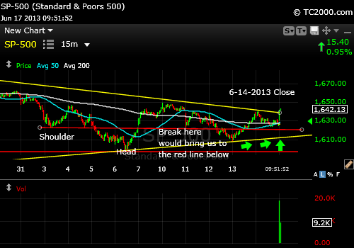
UPDATE #2 for 6-17-2013 @ 7:20 p.m.: The SP500 Index made some progress today and then gave too much back in my opinion to sustain the rally. Here’s the chart (note that you’ll be able to see the rest of the white text in the chart below this one):
SP500 Index is above the triangle mentioned this morning, but below the high from Friday.
The aqua horizontal line marks the high from Friday. We closed just below that line which is negative, because it sets up a head and shoulders formation on the chart with the “left shoulder” occurring on the 14th, the high earlier in the day being “the head.” UNLESS we move above that aqua line tomorrow, we will head down again and test the support mentioned below in the main text.
The Bulls could argue that the fact that we’re above the yellow line on the chart, which forms the upper line of a pennant or triangle is positive, so tomorrow will give us the answer. With the Fed speaking on Wednesday, the market could swing wildly over the next couple of days.
UPDATE for 6-17-2013 @ 9:44 a.m.: The positive this a.m. is the move over the yellow down trend line forming the top of a triangle or pennant formation on the following 15 min chart of the SP500 Index. Realize there is immediate resistance above here at 1648.69 and a move above there would be a more convincing buying point. This does represent progress for the Bulls, who will point to “holding the 50 day moving average support.”
15 minute chart showing the triangle formed by the yellow up and down trend lines.
And now for the original update mapping out the week ahead…
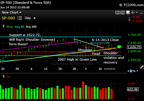
I’m lucky to be able to write about the SP500 Index chart (SPX, SPY) this week. Why? Because there is a richness to the chart that you don’t often see in terms of all the teaching points. So let’s get started.
This week the market attempted to hammer out a market timing support level that you can see on the following chart. I’m going to go through it in detail, so you can see exactly what I’m seeing. The first chart is low magnification and the second is at a higher magnification.
SP500 Index attempting to hammer out a support level just above the 50 day moving average.
Market timing the SP500 Index. This is a higher magnification of the previous chart. It shows how the SP500 is holding support just above the 50 day moving average at the lowest aqua line.
The top aqua line is the all time high of the SP500 Index, and represents the point at which we’d say the market has re-topped, if the Bulls regain control in the coming weeks.
The upward sloping bright pink line most visible in the 1st chart is the top of the prior upward channel the SP500 was following.
I wrote just before the selling began that the blow-off top above that channel line meant that a correction was due, and I was fortunately dead on with that call: How Blow-off Tops Can Make You a Fortune.
The next lower horizontal aqua line is the immediate overhead resistance. There may be a slightly lower level of resistance marked by the highs of the past three days, because the high price on Friday seemed to respect that resistance, but the next bigger goal is that horizontal aqua line just above.
The curved aqua line near the bottom is the 50 day moving average, which is behaving like support at the moment.
The straight upward sloped yellow line is the up trend line on the daily chart. It is nearly coincident with the 50 day moving average, which provides even more support at this level.
The top horizontal red line represents the left shoulder of the reverse head and shoulders formation that formed last week.
The head of that formation is at the green line just above the word “Head.”
The right shoulder held on the 11th, broke on the 12th, and was followed by a reversal above it on the 13th. The break is below the lower red line.
So the Bulls may feel encouraged by the fact that a support level has held, but if you go back to the prior “Market Timing Brief” (Here’s How Prior Retests Worked Out), it’s worth looking at the statistics of how often retests of the 50 day moving average held up. It’s uncommon that they do. Almost always, these retests result in failure EVEN IF the market rallies strongly after the retest. Yes, it’s still a statistical game and it could be different this time; it’s just not likely to be different.
As much as days like Thursday are tempting to participate in, the pain for the Bulls returned on Friday with the market down 0.59%. Thursday’s rise turned out to be humorous. I heard CNBC asking analyst after analyst why the market was rallying and they were speechless. They had no clue. When they have no clue you get the same headline day after day; they simply change it from positive to negative:
On a good day: “The market rose on expectations that the Federal Reserve will continue to buy US debt.”
On a bad day: “The market fell on expectations that the Federal Reserve will not continue to buy as much US debt as before.”
This is a symptom of what’s called volatility and we’ve experienced levels of volatility higher than this in prior summers. When the market is volatile, it does not seem to make much sense. That means that you will see a lot of strong days up and down that individually seem to say the market knows where it wants to take stock prices and then it dashes that false clarity away. What it says is that the fear level has risen and market participants no longer know what forces will win in the battle over stock prices.
If the Japanese experiment is already failing due to significant inflation, what will that mean to the world economy? Is the worldwide economy slowing in a way that will lead to stagflation? Most of us certainly feel as though the government’s pronouncements about inflation are not accurate as we see the size of our Nabisco boxes shrinking as the prices rise.
If the economy is slowing and that means lower earnings, price earnings ratios will go up due to lower E’s and stock prices will fall to bring them back to the mean. Or is the consumer strength seen in the past month the hint that things are getting better? Is the housing crisis really over or are low interest rates simply hiding the problem? Bonds are falling and some of that money has been going into stocks and there is still room for that to expand. Emerging markets have been tanking and now the gains in Japanese stocks are vaporizing. So are things good or bad or simply confusing?
You see that you can construct both a bullish and a bearish view from the current data, which is why fear is going up. Confused investors become afraid. Fearful investors leave markets.
So if you step back from the chart this week and look at it, it looks as though the market fell a bit and then jumped up and down for the past 11 trading days. When you compare this chart to that of April 2012, it looks very similar (see chart in last Market Timing Brief; link above or to the upper right). If that precise playbook unfolds, which is not guaranteed of course, we could re-bottom at around 1600 (1598.23 was the low) and then bounce quite high meaning back to the top aqua line or even re-top at the all time high and come right back down again without pausing at the 50 day moving average the next time.
We are in the “Go Away in May” period that could extend into October. It is the one market timing method that actually works by the way. I wrote a previous article to see how it’s been working in the past decade which is here: Market Timing: When to Go Away and When to Come Back.The time to come back varied tremendously.
Key Takeaways this Week:
1.The SP500 could rally from what is acting like current support and we could meet or exceed the prior high, but only if the news flow becomes much more positive.The “risk” to the Bears is that Bernanke will goose the market at 2 pm on Wednesday when the Fed makes it’s announcement on FOMC policy.
I doubt he’ll do this, because the market is due a correction and he does not want to be accused of creating bubbles. Stock prices are reasonable at this point vs. earnings. Five percent down from here would not be a crisis for the Fed.
2. If the news remains confusing and the Fed avoids saying much to further reassure the markets, this retest will fail and we’ll reach a significant new low at least 50 points below the 50 day moving average (prior Market Timing Brief has the data on the depths of these corrections). The completed correction will be at least 10% below the prior high. The current news flow favors this option, not #1.
3. Any close below the prior low at 1598.23 will signal the next wave down.
4. The Elephant in the Room is the bright green line seen only on the Top Chart, the 2007 high (1576.09). Below that we’ll have a major reversal below an important nominal high (non-inflation adjusted), which the market will take note of with further selling. Any breach there must be brief, or there will be a sharp bout of selling.
Standard Disclaimer: It’s your money and your decision as to how to invest it.
To receive future reports and reminders that charts are ready to be viewed, subscribe for free here:
I only recommend what I pay for myself. My Charts are all courtesy of Worden Brothers. I use this software every trading day to make my decisions about the markets: My Chart Source
If you “liked” this post, would you please “Like” it at the “Share” arrow below? Thanks very much!
And to follow my Buys and Sells and up to the minute insights, please follow and bookmark my Twitter feed here: Join Me on Twitter
Market Timing Bonus Chart of the Week: The “Old Normal” Continues
UPDATE for 6-29-2013: Rates are headed in the right direction. See the private trading notes from the end of the week on the free subscription page (sign up at the link below). More also in this Sunday’s issue by email. (For now, it might be best to ignore the long red line on the chart for Friday below. I am betting that is an error on the system, but I’ll verify it with Worden Brothers. It does show up on the Yahoo charts as well, so we’ll see. I’ve seen these blips corrected many times, except during the “Flash Crash” a couple of years ago. That one was real.)
10 Year Treasury below 2.50% is a good beginning for a rally in bonds, which will help stocks.
UPDATE for 6-26-2013 @ 9:47 am: A fall of rates back below 2.50% you see on the chart below could potentially energize a further fall in rates back below 2.4%, which would potentially allow the stock market to re-top or at least make a significant lower high at least. Continually falling rates would be helpful to the metals as well and but may, on a relative basis at least, hurt the regional banks that have been rallying and indeed breaking out today (KRE) based on higher rates.
Below 2.50% the 10 Year Treasury could rally back below 2.41%, which would be a big positive for stocks.
UPDATE for 6-12-2013 @ 12:03 pm: There are some interesting cross-currents in the market today. Rates are rising due to the fact that the Fed is indicating it will back off of its mortgage buying spree soon.
On the other hand, as stocks sell off, money is likely being shifted to Treasuries, so rates are experiencing a push down. The net today is rates did NOT stay above the prior high of 2.211%. That is why the housing stocks are doing better than the market today after a steep sell-off beginning on 5-22-2013.
Over time after the SP500 Index finds its bottom, rates will likely slowly rise up to the 2.4% target at least. Above there, stock prices may be pressured even more and housing may reach a new recent low.
6-09-2013 The 10 Year Treasury chart was in a steady up trend in yield, which swooned a bit on Thursday and then recovered as stocks may have completed a mild correction (see the prior Brief on the list to the right).
Now what? Stocks can tolerate sideways rates, but most often, we’re not that lucky. So rates are likely to inch up a bit more from here, unless the Fed is working behind the scenes to cap this move. We can’t know that for sure, so we have to follow the charts to see it. We will know what the Fed is doing or not doing by watching the 10 Year Treasury chart.
Market Timing Treasuries (TNX, TLT, TBT)
06-07-2013 Close
It used to be that when rates went up too much or too fast, stocks went down. Why? Because bonds are supposed to compete for investors money vs. stocks when rates rise and become more attractive than stocks, which are considered riskier. Debt is always paid before shareholders are paid in the “Old Normal.”
Why then did the stock market and yields rise on Friday? I believe the market knows that the current rates are artificially low and are not needed when the economy is recovering on it’s own. So somewhat higher rates are being welcomed by the stock market as a sign of recovery. Rates are still very low as far as the stock market is concerned. Some say it could tolerate 10 Year rates of 5%, but my opinion is that the market would dive if that happened too quickly.
So what will stocks do if rates creep up a bit more? My guess is that the stock market would not mind an increase in rates up to about 2.4% which is a prior area of overhead resistance. I cannot be sure of that, so we’ll have to follow the reaction of stocks should rates move above 2.211%, the most recent daily high.
It could be that stocks correct once again if rates move above that 2.211% or it could happen above 2.41%. After all, that is the “New Old Normal,” my twist on PIMCO’s name for the twisted Fed induced investing environment, which they called the “New Normal.” I’m changing my name this week. Let’s make it simple and call it the “Old Normal”!
The markets will act surprised at a certain rate level, because they’ve gotten too complacent with the “New Normal.” “You mean I have to pay reasonable rates to borrow money now? Shucks!” This means the tendency of these investors will be to “shoot the market” and ask questions later.
But at what interest rate on the 10 Year Treasury will they “shoot the stock market”? I’ve given you two possible numbers. Follow these key numbers from this post and watch how stocks react as we reach and then breach them and you’ll be well ahead of most investors in market timing rates.
There is more on the 34 other markets in this week’s free newsletter (subscribe using the subscription box slightly down and to the right).
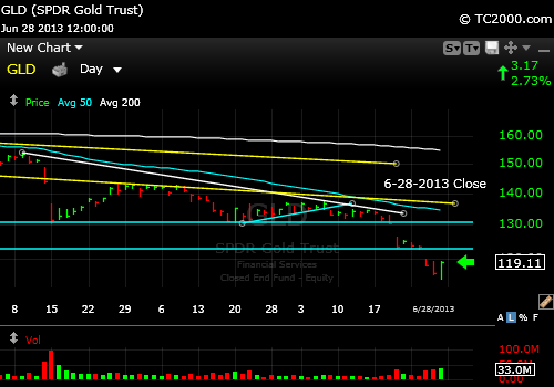
Be sure to check out the GLD Market Timing Chart this week GLD ETF Chart. Gold failed 2011 and 2012 support and lost its entire bounce only to begin a SECOND bounce from the prior low, which is now weakening even more since the end of the week. Review the chart on the GLDTracker™ page. And one more thing. If you appreciate the chart, would you please take a moment and “Like” this page below? Thanks very much.
I thank Worden Brothers for the charting system. If you want to know more about the charting system I use every day, go to my “Other Resources” page here: Other Resources
To receive future reports and reminders that charts are ready to be viewed, subscribe for free here:
UPDATE 6-29-2013: Gold bounced from the most recent low along with the gold miners. The bounce could go quite far and skin the Bears, perhaps all the way up to the 50 day moving average, which is the curved aqua line in the chart below now headed down to the first aqua support line below. Be sure to use a mental stop loss. And remember, if interest rates back up again, all bets are off most likely until inflation appears, which could be some time from now.
Gold bouncing from a 36% off sale for GLD and a 31% off sale from the gold futures high.
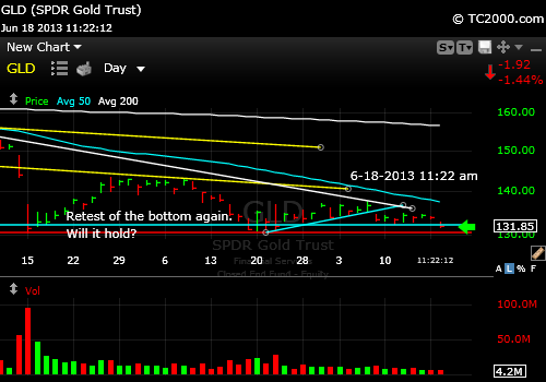
UPDATE for 6-18-2013 @ 12:05 p.m.: This is from slightly earlier today, but the chart is similar with a breach of the 6-11-2013 low, which will likely bring us to a retest or failure at the recent major low. Here’s the chart:
Gold is now weaker, moving below the higher low set on 6-11-2013. Negative.
UPDATE 6-10-2013 @ 11:33 am: So far GLD has held 132.80 support on a test (the red line on the chart below), a positive in the move up from the 5-20-2013 low.
It has a shot at 137.62, which is overhead resistance. I think the challenge will be whether interest rates on the 10 Year Treasury move toward 2.4% or fall from here.
We are now at 2.190% yield, and reversing the last breakout attempt on the yield chart, which was 2.211% on 5-31-2013.
6-08-13 Based on 6-07-2013 Close:
The GLD ETF has formed a based since mid-April. Since then it has tested that base once successfully in May. It then rallied in the formation of a market timing formation called an “ascending triangle” with the ascending edge of the triangle being the aqua line in the chart below.
On Friday, after the US stock market hit support and bounced (see main blog page), the GLD ETF broke the up trend line, and as it did so, I recommended exiting once again.
See the chart, and then I’ll have a final comment…
Yellow lines: Base and top of prior downward channel that was broken when gold fell dramatically. Curved blue line: 50 day moving average Aqua line sloped upward: up trend line White line sloped downward: 200 day moving average
Gold ETF is having a hard time rallying.
The ETF may need to retest the prior low once again and there is no guarantee of course that the prior base will hold. In fact, the huge base formed in the first half of 2012 was broken and the result was a bungee jump by gold, from which it has yet to recover.
In studying gold’s behavior over the years, the most compelling issue seems to be the real interest rate, which is the real rate of return after inflation. Inflation is higher than the government claims as they factor out gas and food as we all know, but it’s still not out of control, due to the slowing in the economy. How do I know? Because gold is not rallying!
Real interest rates need to be negative, not significantly positive at least for gold to rally strongly or at least hold its value!
The threat of higher Treasury prices due to less Fed intervention in the way of less QE (quantitative easing) without rampant inflation is scaring investors out of gold. Without the Fed creating negative real interest rates by force, the only other force that can do that is inflation.
Inflation is the likely next driver behind a further gold rally, but for that to happen, the Fed has to lose control of interest rates. To me, the danger zone is when interest rates rise above 2.41%. At least we need to pay close attention to how stocks and gold behave when that happens.
If the Fed allows rates to rise in the Treasury market to a point where real interest rates are comfortably positive, gold will be screwed until inflation appears.
Hedge funds have supposedly been re-accumulating gold lately, so maybe that part of demand is present. Although central banks have been diversifying into gold, they may be buying more equities and non-US dollar currencies rather than loading up on gold. Otherwise, I would have expected gold to maintain more of its prior gains.
Ultimately, the chart tells the truth! The equations that show up as the price of gold or the price of stocks are very complicated and are often discounted into the future, which is the purpose of market timing.
The idea is to follow the direction of the market rather than making assumptions that lead to losses and missed opportunities.
I’ve covered gold extensively in the past few issues of the blog. You can click those links to the right. See below for the link to my newsletter…
Standard Disclaimer: It’s your money and your decision as to how to invest it.
To receive future reports and reminders that charts are ready to be viewed, subscribe for free here:
I thank Worden Brothers for the charting system. If you want to know more about the charting system I use every day, go to my “Other Resources” page here: My Chart Source
If you “liked” this post, would you please “Like” it at the “Share” arrow below? Thanks very much!
And to follow my Buys and Sells and up to the minute insights, please follow and bookmark my Twitter feed here: Join Me on Twitter