A Market Timing Report based on the April 26, 2024 close…
(Main Issue begins below the Updates…)
UPDATE 4-28-2024: Key Opportunity Ranges™ for Monday, 4-29-2024
First, some tips about how to think about and use the Opportunity Ranges™.
The ranges calculated are sometimes penetrated, even for days in a row, especially when investors panic to buy/sell, so the ranges must be taken in context.
When markets aren’t impacted by such volatility inducing events, they tend to visit the side of the range in the direction they are going. On a pullback, they’ll tend to visit the low end of the predicted range, and during a rally, they’ll tend to tag the high end of the predicted range.
Here are a few key ranges for April 29th below… Remember, they change daily, and I will often report the extremes I see in the markets on social media (links below) on most market days.
The Predicted Lows and Highs are to the left and the “Current Price” in this case is the closing price on Friday, April 26, 2024. The position in the range for the closing price is shown next. The Day% is the price change for the day. The Down and Up percentages are the percentages for a move to the very bottom/top of the predicted range of course from the “Current Price,” which is the close in this case. The last number to the right is the ratio of the Up%/Down%.
I had to split the table in two to get it to show up properly, because Microsoft is unable to figure out how to allow a copy and paste of Excel to their own website software on WordPress! 😉
| ORange™ | ||||
| Pred. Low | Pred. High | Cur. Price | Position | |
| SPX | 5,012 | 5,167 | 5102.00 | 58.06% |
| QQQ | 420.28 | 438.53 | 431.00 | 58.74% |
| IWO | 246.12 | 257.47 | 253.09 | 61.41% |
| RUT | 1,955 | 2,035 | 2,002 | 58.75% |
| TNX | 4.561 | 4.785 | 4.669 | 48.21% |
| GLD | 212.84 | 220.76 | 216.62 | 47.73% |
| Day % | Down | Up | U/D | |
| SPX | 1.02% | 1.76% | 1.27% | 0.72 |
| QQQ | 1.54% | 2.49% | 1.75% | 0.70 |
| IWO | 1.29% | 2.75% | 1.73% | 0.63 |
| RUT | 1.05% | 2.35% | 1.65% | 0.70 |
| TNX | -0.79% | 2.31% | 2.48% | 1.07 |
| GLD | 0.32% | 1.74% | 1.91% | 1.10 |
SPX = S&P 500 Index RUT = Russell 2000 Index TNX = U.S. 10 Year Treasury Yield
Now let’s get back to the risks and opportunities ahead for the next several months…
Reviewing Key Risks and Market Timing Opportunities for 2024
Number 1: The 2024 election is going to be a mess. This will create a buying opportunity in stocks.
- The odds of a conviction of Trump leading to jail time, which could be the only way he’s abandoned as a candidate are still unclear. Even the ongoing NY trial could result in a hung jury or simply fines for multiple counts of business record fraud, which are misdemeanors. Many may write this off as peripheral to their most important interests, especially with misdemeanor convictions, which seem likely.
A felony conviction could tank Trump with Independents, and defeat him. That’s what they say in polls in large enough numbers to matter.
- Despite the eventual outcome, the markets could correct further given the fact that they are adverse to uncertainty. Even just the uncertainty of a conviction or not, could deepen the current or even a later drawdown closer to the election.
- Volatility increases into the election historically, and higher volatility means lower stock prices. That’s the reason for my holding cash and not going to 100% of my usual equity allocation for a Bull Market. My long time followers here since 2010 (and as far back as 2001 as “BeatTheSt”) know that I don’t share my own allocation to equity, except in relative terms, because your situation is likely different in some ways, so it’s best if you adapt your allocation per your specific needs and risk tolerance.
- It’s unclear whether ANY of the other trials are going to occur before the 2024 Election. If Trump wins, he’ll be able to hire an AG who can dismiss his federal cases, which should be changed in the constitution it would seem, regardless of one’s political views.
My prior CONCLUSION holds: “Markets hate uncertainty. They trade DOWN on uncertainty, and given the amount of it, it would seem unlikely that we’ll avoid a 10-20% drawdown prior to the election. I profited nicely from the “election jitter play” during the last two cycles, and I intend to make money on the chaos this time too!”
Number 2: The Economy is NOT slowing during the first half of 2024, as some anticipated.
Factset said on Jan. 26, 2024, “For CY 2024, analysts are projecting earnings growth of 11.6% and revenue growth of 5.4%.”
That has not changed much, as you see in the more recent update below…
From the April 26, 2024 – S&P 500 Index FactSet Earnings Season Update: (you can subscribe via the above link for free to John Butters’ weekly earnings updates, which are detailed and excellent…)
| 2024 | Earnings | Revenue |
| Q1 | 3.5% | 4.0% |
| Q2 | 9.7% | 4.4% |
| Q3 | 8.6% | 4.9% |
| Q4 | 17.3% | 5.6% |
| YEAR ’24 | 10.8% | 4.9% |
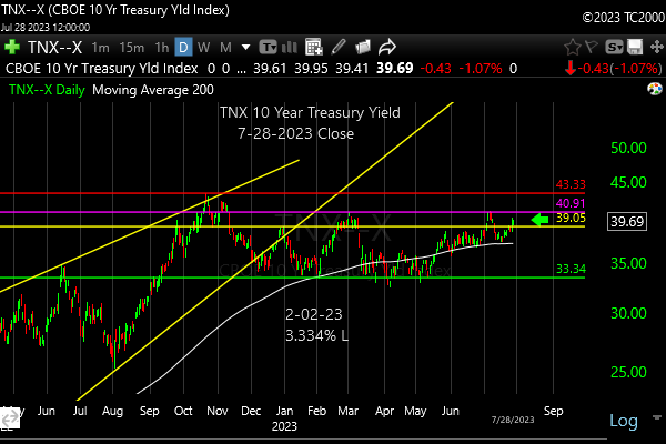
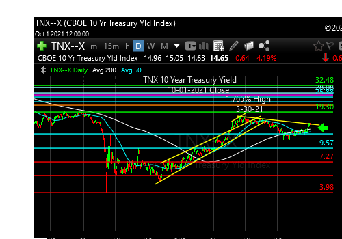
Number 3: “Interest rates need to move down from here…”
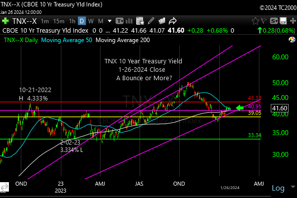
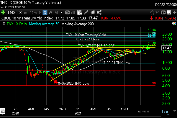
Interest rates are still rising toward the Oct. 23, 2023 high of 4.997% as you can see in the fourth chart below. This is a threat to stocks, particularly those needing new capital to replace loans coming due or to expand their businesses. This impacts small caps the most, but also large companies that took on too much debt.
A reminder before we go to the charts…
I combine three systems for market timing, which are:
1. My “Opportunity Range™” calculations on short term trading ranges help me pick better spots to add and reduce exposure to both ETFs and individual stocks. (I will publish a few of them here by Sunday at 5 pm ET at the latest, so check back…)
2. My “Market Trend Timing System™” helps me enter and exit major trends earlier than I otherwise would.
3. My “Market Indicator Panel™” helps me time the big market moves in stocks. This panel of indicators has enabled me to make significant market calls repeatedly.
To be up to date on my latest insights and buys/sells, be sure to…
and…
Real time messages are on StockTwits as always and appear a bit later on Twitter (following me on both ensures that you have a backup to get my posts btw…).
Keep up-to-date and read my comments on the current setup during the week at Twitter and StockTwits at the above links) where a combined 36,590 investors follow the markets with me…
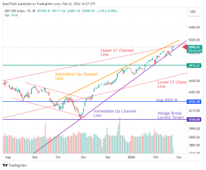
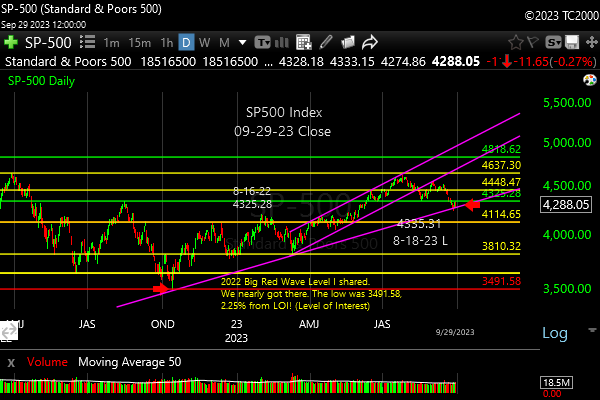
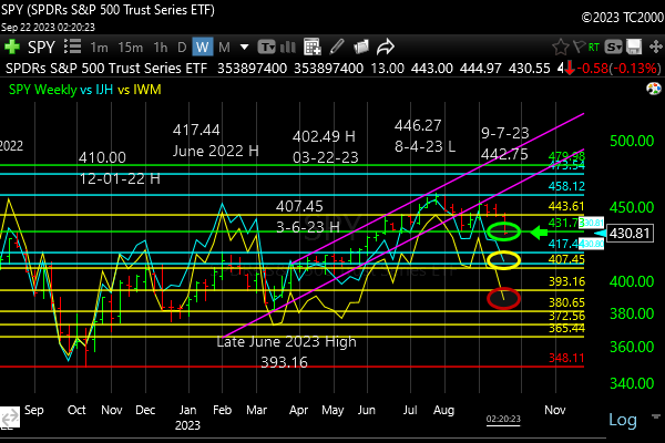
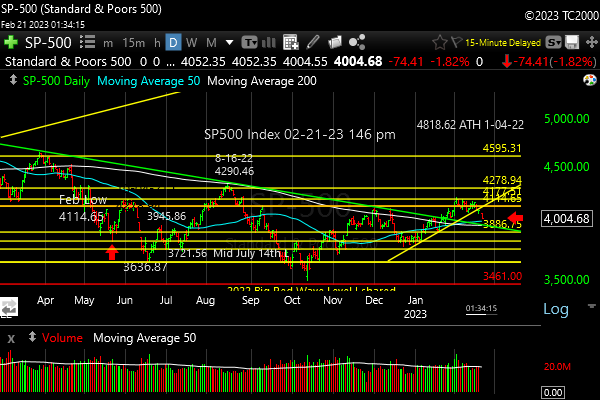
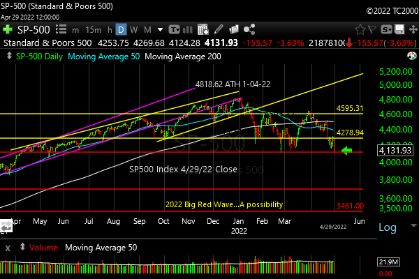
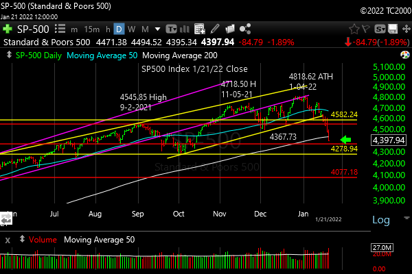
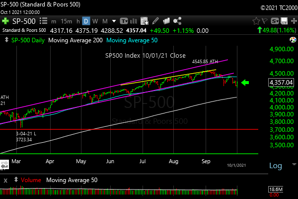
1. SP500 Index Market Timing (S&P 500 Index®; SPY, SPX):
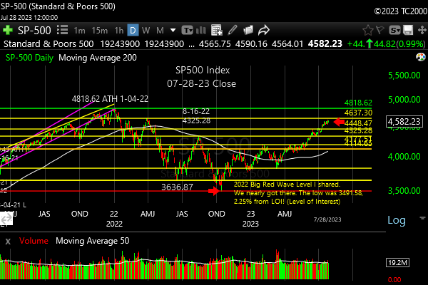
We have had new all time highs in the S&P 500 Index and the question is how low the current correction will go, or even if it could already be over. We are at –3.13% as of the 4-26-24 close vs. the ATH (all time high) and -5.91% at the low on 4-19-24. The former is a dip in my naming system, and the latter is at the shallow end of “corrections.” (the system for naming drawdowns is HERE – Search the doc for “New Rules”)
If we don’t head lower again with the Fed decision on Wednesday, May 1st, the next slide may be delayed until August or September, completing in October, unless there are issues with the 2024 election results. I’m sure that won’t happen, right? 😉
Click the market timing chart to see the details… (the lower RED arrow marks the October 2022 low)
You see the long term trendline (magenta) is below the current price, but the short term trendline (yellow) has been breached.

Dip done or just starting? Regardless, there’s more likely to come prior to the election.
Now let’s review investor sentiment…
Survey Says!
The AAII Survey of Individual Investor Sentiment (AAII) spread is -1.8% (Bulls – Bears). That means there is room for upside or downside from here, and it’s not a great help beyond showing there is a lack of an extreme. Not surprising investors are confused by the market chop!
| Bulls | Neutrals | Bears |
| 32.1% | 33.9% | 33.9% |
| Thurs. 12 am CT close to poll | ||
Now let’s look at the small caps, gold, and interest rates…
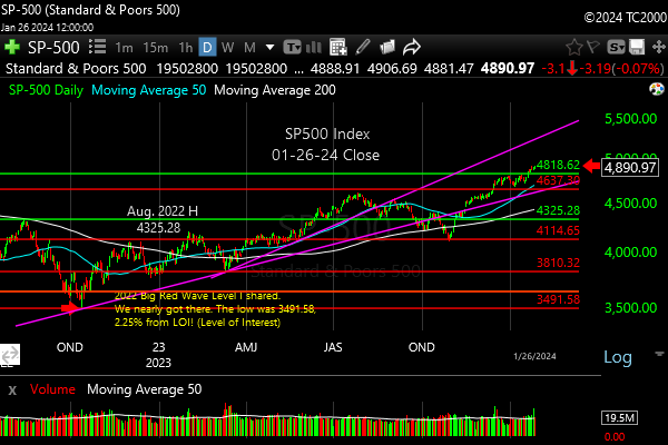
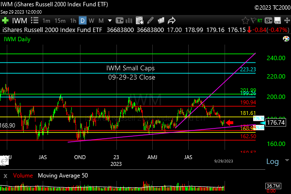
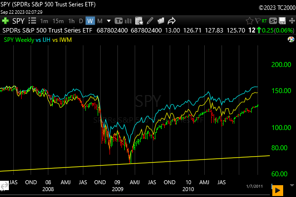
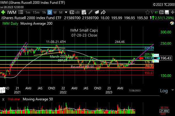
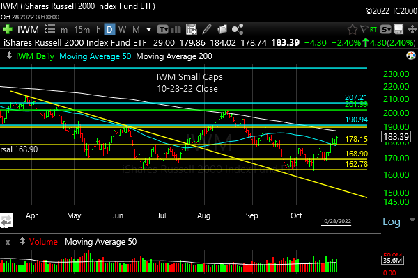
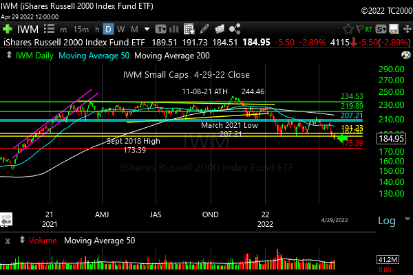
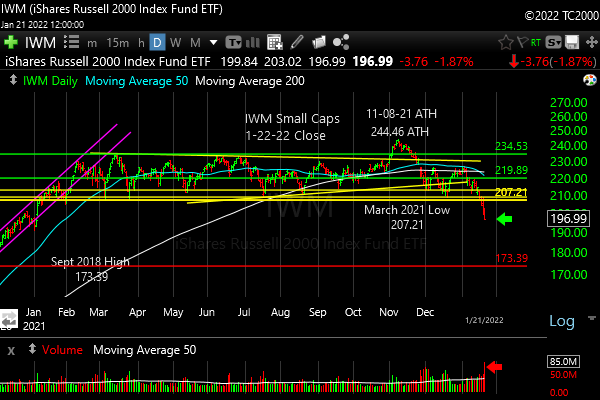
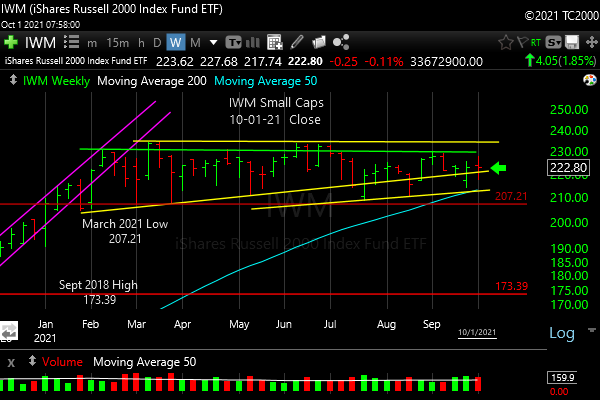
2. U.S. Small Caps Market Timing – Russell 2000 U.S. Small Cap Index (click chart to enlarge; IWM, RUT)
You can see all the “Levels of Interest” as I call them, lined up ABOVE the current price of IWM. Back in January, I said, “The Bulls need a new high above all the highs shown from 8-16-22 on to change this into a full fledged UpTrend™.” They did it, and then they lost it! And that’s a negative. That same level must be rapidly recaptured if the Bulls are going to continue in earnest.
Right now, the price is below ALL the levels highlighted on the upper half of the chart below… Click the chart to see the details better…
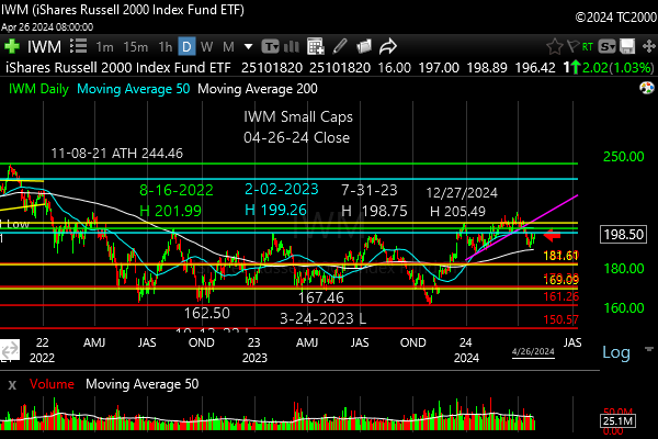
Current price of the small cap ETF IWM is below all the key “Levels of Interest” shown on the chart.
Gold is next…
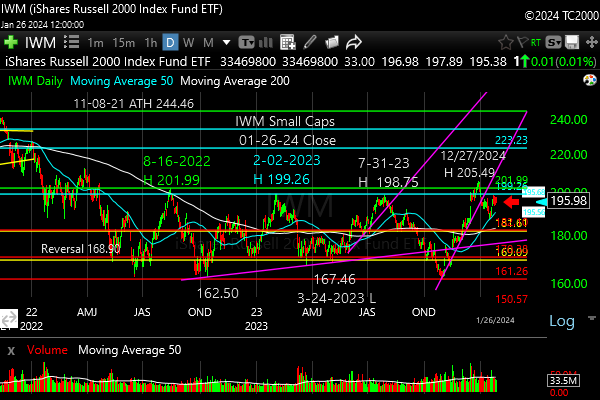
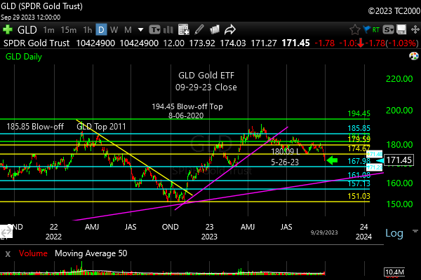
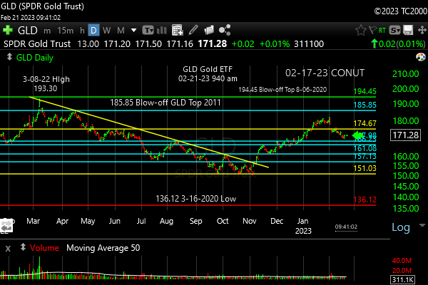
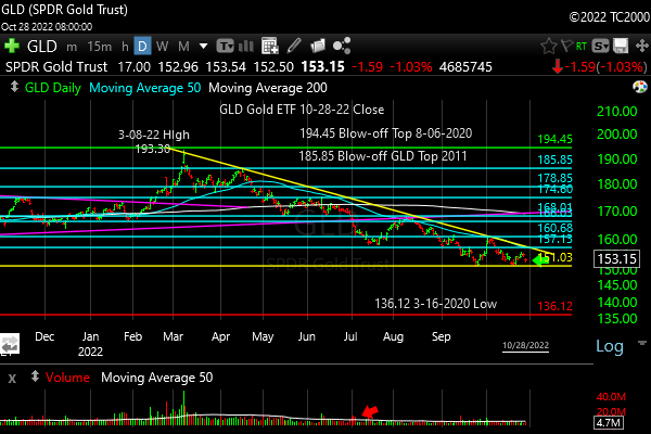
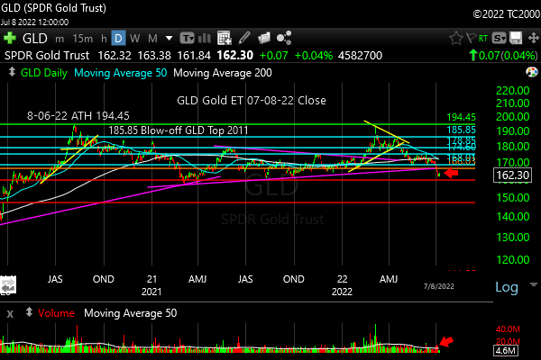
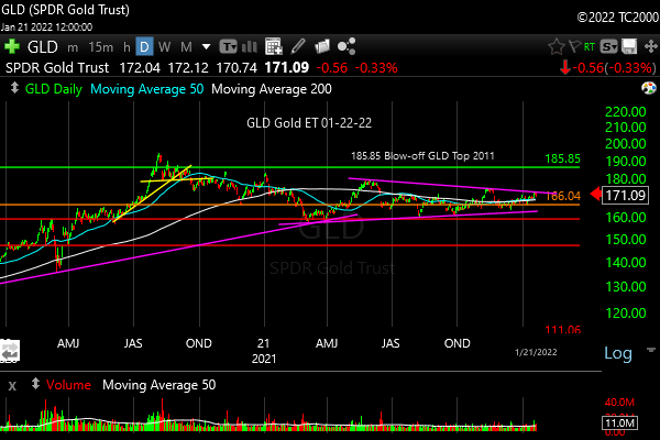
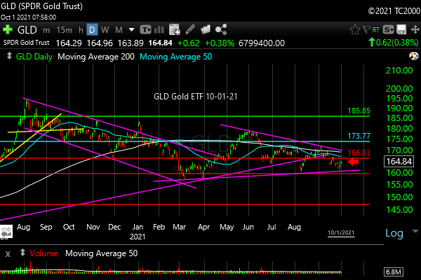
3. Gold Market Timing (click chart to enlarge; GLD):
Gold is in an uptrend that appears to be currently overextended…

On a tear and subject to correction, but the trend is still up despite rising interest rates.
Gold is moving up despite rising rates, which is ominous. It normally falls as rates fall, and as the U.S. dollar falls with falling rates. This implies investors are seeking gold for safety. Bitcoin may be moving up because of demand via ETFs around the world, but gold is still the only long term store of wealth – that’s what the market is saying IMO.
I’m currently at my maximum exposure for a Bull market in gold and silver (which don’t always move up together, because silver has industrial uses that depends on economic activity.
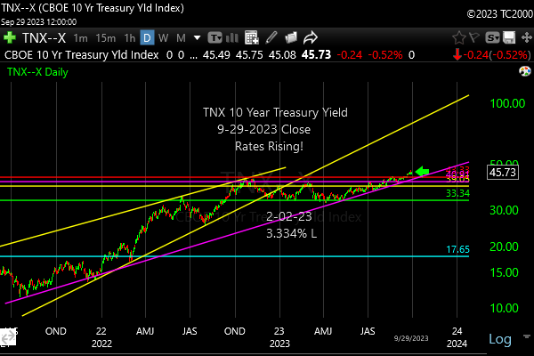
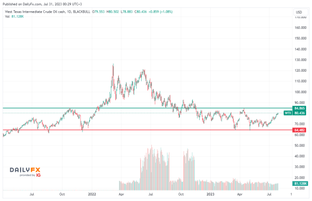
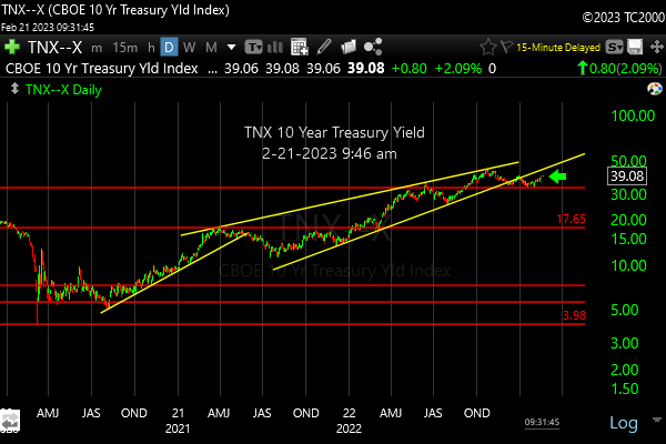
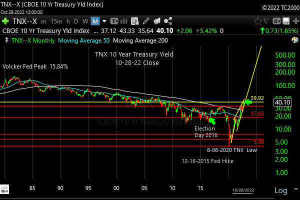
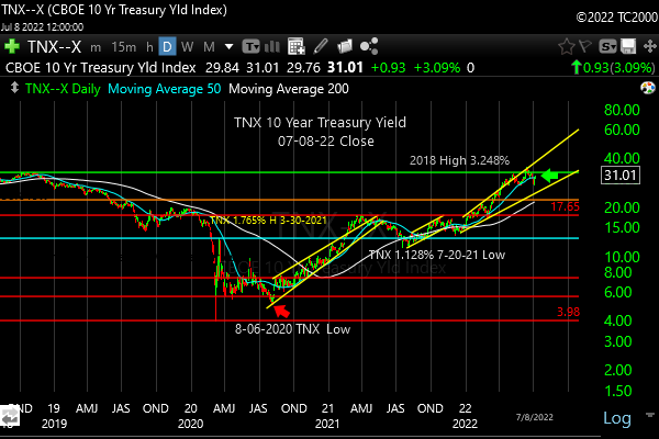
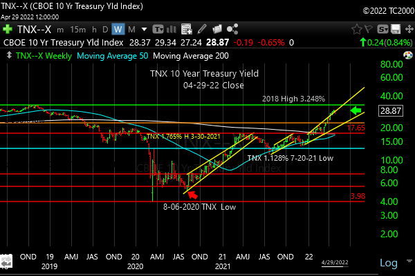
4. Interest Rate Market Timing (10 Year Treasury Yield; click chart to enlarge; TNX, IEF, TLT):
LAST TIME: “If the Federal Reserve pulls back on interest rate cuts, we could see the [10 year] yield continue higher from here. Stocks will need rates to start moving lower again very soon, or this rally will take a pause or more likely fail.”
Guess what happened? And rates are headed still higher unless the Fed via Powell actually sounds tough on inflation at the May 1st press conference vs. pandering to the rate cut beggars. Recently, they’ve been talking tougher about when rate cuts will come this year, which may be zero in number IMO.
Here’s the current chart…
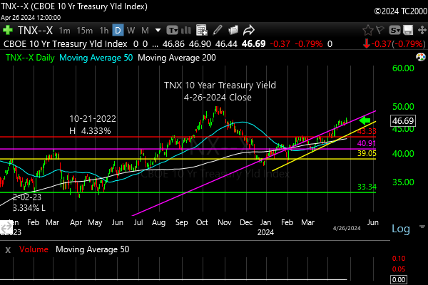
Interest rates continue to climb.
Now let’s review three key market timing signals together….
Do not use these signals as a trading plan. They are rough guidelines. I currently share my actual BUYS and SELLS in as timely a way as possible on social media (links above).
MY MARKET SIGNAL AND TREND SUMMARY for a Further U.S. Stock Market Rally with Real GDP Growth (“Real” means above inflation):
Stock Signal Bearish (this signal looks at small caps) for a further U.S. stock market rally with a short term Neutral and longer term Bullish SP500 Index trend. The small caps determine the stock signal in this section of the report. And the longer term trend must hold as explained above!
Gold Signal Bearish for a further U.S. stock market rally. The Gold Trend is short term Bullish and longer term Bullish as it’s above its longer term trend (see discussion above).
Gold will take off again to the upside IF/WHEN 1. Rates start falling again at the long end (10 years or longer). 2. The economy slows 3. Earnings fall for stocks, which reduces the overall yield on stocks. Gold likes weak competition and particularly falling real interest rates, which also tend to weaken the US dollar! The fact that gold is rising WITH the dollar and rates is unusual and ominous.
Kept for Reference: “Gold can RISE with stocks when real rates are FALLING, and the dollar is falling. Gold could rise WITH the dollar if the economy slows and real long rates fall. Money leaves stocks and moves into the US Dollar and gold.
These are thing gold normally doesn’t like: 1. Rising real rates (bonds/Treasuries become a threat to gold which pays nothing; banks and other companies make more money with rising rates) and 2. Economic recovery with higher corporate earnings. Earnings drive stock prices higher. Stocks pay dividends that compete with bonds, and companies use cash to buy back stock, which drives up stock prices, while gold pays nothing.
In liquidity crunches (which the Fed is supposed to prevent) gold can drop with everything else but the US dollar.”
What gold does mostly as I’ve written HERE is follow real interest rates around the world (if you own “gold in dollar terms” you care about U.S. rates most of all). The rest of the world does matter however, including massive buying by central banks. Real interest rates have been rising around the globe.
GUIDE: “Remember GLD is being used as an indicator for the ECONOMY here.” If gold continues to rise again, it means the market believes real rates are going to fall or stay negative for a period of time.
Rate Signal: At this point Bearish for a further U.S. stock market rally, as rates have risen again. The 10 Year Yield trend is short term Bullish, and longer term Bullish (meaning RISING).
(Remember: higher rates mean lower bond and Treasury prices and vice versa). We want slowly rising rates in a recovering economy. That’s what happens normally. The Fed raises rates slowly as the economy continues to grow until it doesn’t. What we don’t want is rapidly rising OR rapidly falling rates, both of which I call “Rate Shocks.” The Rate Shock we saw in 2022 was due to the Fed raising rates at the fastest pace since the 1980s.
Thank you for reading. Would you please leave your comments below where it says “Leave a reply”… or ask a question if you like…
Pay it forward by sending the link to MarketTiming.Blog (that link will immediately connect them to this webpage) to a relative or friend. Thanks for doing that. I appreciate it, if you took the time to do that!
Be sure to visit the website for more general investing knowledge at:
Standard Disclaimer: It’s your money and your decision as to how to invest it.
I thank Worden Brothers for the charting system I use to post these charts. If you want to know more about the charting system I use every day, contact me or them for any questions, and click HERE. Please use that link when you sign up as I am an affiliate (I don’t actually make much, but it may help to pay for some of my website expenses). It makes it much easier to follow along with me if you can see the charts and manipulate them on your own computer. It’s a great investment to have an excellent charting system.
Note: I’ve updated my criteria for the equity signal for a further U.S. stock market rally to the following: GREEN = Bullish, YELLOW = Neutral, RED = Bearish. In other words, the colors tell you whether the signal supports the stock rally or not, while the Bullish, Neutral, and Bearish designations are about the trend.
A BEARISH trend signal does not mean we should not buy.
A BULLISH trend signal does not mean you cannot sell some exposure. It depends on what is going on in the economy and how oversold/overbought the market is at a given point whether the Bearish signal is to be sold or bought, sold on the next bounce, etc. and whether a Bullish signal is to be bought or if profits should be taken.
A NEUTRAL trend signal does not mean the end of the Bull or Bear. It means to wait and look for possible subsequent entry points within the existing trend, Bull or Bear, but preserve capital if the entry fails.
Our strong intention is to buy low and sell high.
Copyright © 2024 By Wall Street Sun and Storm Report, LLC All rights reserved.