A Market Timing Report based on the February 17, 2023 close, with charts and commentary updated through 2-27-2023…
Market Timing Update for 3-15-23: The Bullish Scenario for U.S. Stocks and Bonds
The Bullish scenario is based on a “Big Green Wave” in long term Treasuries that could be starting. I flagged it on March 5, 2023 as timestamped HERE. A Big Green Wave is the opposite to a Big Red Wave pattern I’ve pointed out before, which was shared in the Barron’s online edition in 2018. That’s when stocks were crashing to their Christmas low during the “Christmas Crash.”
I also pointed out the current U.S. Stock Bear market Big Red Wave right on time, which was ignored by Barron’s. Their loss! (all timestamped from just after the late March lower high in the SP500 Index, and in plenty of time to protect my assets and yours if you understood and followed my advice)
So what could happen now? I call it…
“The Double Big Green Wave Scenario”
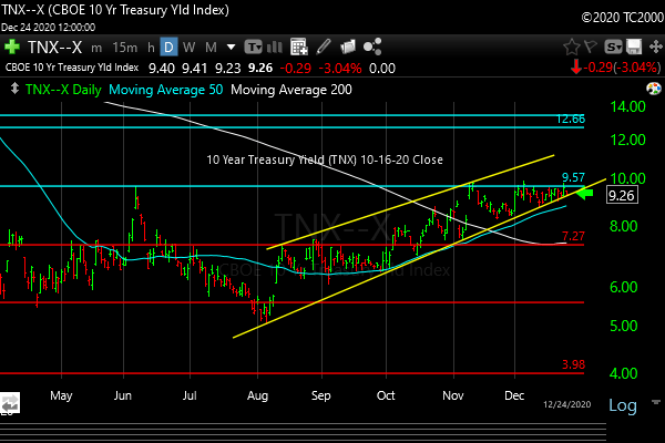
- The “Big Green Wave” in U.S. Treasuries continues UP. That will require a breakout above the Dec. and Feb. highs, which correspond to the lows in the 10 Year Treasury Yield (TNX) as noted in the chart below (4th chart down)
- IF the December SP500 Index Low holds in this pullback/Mid-sized Bank Run Crash that is going on now, that sets up the SAME possible “Big Green Wave” in stocks. Counting the SP500 Index waves off the Oct low: A. Wave 1 up to the Dec.1st high. B. Wave 2 down to the Dec. low. C. Wave 2, Number 2 up (called a “Double Two Wave”) to the Feb. high with a complete give back (Wave 2, Number 2 down) to the Dec. low where we are right now (close enough). D. This Wave hasn’t happened yet: Wave 3 Up, the “Big Green Wave” for the SP500 Index (and other U.S. stocks including IJH, IWM etc.).
- That means we would have TWO “Big Green Waves Up” going on at the same time and the 60/40 investors would be making a lot of their money back, because 60% is in stocks and 40% is in bonds and BOTH would be appreciating in value.
- Again, this requires BOTH “Big Green Waves” to be successful. As the jingle goes, “You can’t have one without the other.” Otherwise continued high rates would keep a lid on growth and a lid on returns on BOTH stocks and bonds.
Those who have said the Bear market is “already over” were a early I thought and as usual, the necessary negative stimulus got the current wave down started in earnest. The financial sector of SP500, XLF, is almost back to its October low today!
What to do? Nothing yet, although if you have zero stock exposure, you could add a bit here or a bit closer to the Dec. low and then use a stop if the SP500 closes below the Dec. low. You’d lose a few percent if that were to happen. Or you can wait with me to see the signals I will get in my Market Indicator Panel™. We may be a few percent behind the market, but that’s OK in a Big Green Wave. We’ll realize enough gains to make it worthwhile, and avoid biting too early and eating losses.
Having shared the above scenario, you know if you have been reading my posts that a different, much more Bearish scenario is also possible. Treasuries/Bonds could keep rising in price while stocks fall due at first to an earnings recession expected in the next two unreported quarters (Q1 through the end of June to be reported as Q2 starting in July 2023), possibly followed by an outright recession (falling GDP usually for a period of two quarters or more). If that happens there will be new lows in most every U.S. stock ETF.
I am not predicting new lows in stocks, because that would be foolish. There is no factual basis IMO to state that as a “certain scenario,” but it is a possible scenario, which is why we don’t latch on to any ONE scenario or “narrative” as Professor and Noble Laureate Robert J. Shiller calls them.
I will report my buy signals (as I do my sell signals), and you will see me buying when I do. So be sure to follow me on social media (links below) if you haven’t! We will use a stop on new positions, so be prepared to take smaller losses to avoid bigger ones, if the signals reverse. Or you can just hold your losses if that is your plan. The point is to have a plan and to execute on it nearly “no matter what.”
Outside events like Federal Reserve action sometimes require a faster reversal in our thinking, and that is why I follow the markets as they respond to events, rather than assuming a particular economic scenario and ignoring price action!
Continue reading below for prior updates and my prior major post to catch up. It includes my trend naming system you will need to know to follow my work…
Market Timing Update for 2-24-23 Close:
Market Timing Trend System™ Updates
Symbols are in bold. I’ve included about 1/3 of the 61 markets/sectors I follow. Key for the trend classification abbreviations is in the table below in the original post…
DG-D1 = Downgrade Day 1
UG-D1 = Upgrade Day 1
If there is no “Day” number, the market timing trend is confirmed. If not, it’s unconfirmed.
This does not mean you buy a market that is stretched to the upside or sell one that is stretched to the downside by blindly following the trend names. The trend names tell you which markets to consider buying, which to consider selling, and which to stay away from until proven otherwise. See the detailed notes on “Actions to Consider” in the “Key” for the system in the original post below the updates….
NOTE THESE ARE FOR 2-23-23 and may have changed since then. I share many trend changes on social media (links below)…
| DXJ | EMXC | GDX | GLD | HEDJ |
| UT | CDT | CDT | CONUT | UT |
| HYG | IJH | INDA | ITB | IWM |
| CDT | CDT | DT | CORUT | CDT |
| KBA | KWEB | QQQ | SLV | SPY |
| CDT | CDT | CDT | CDT | CDT |
| DG-D1*** | DG-D1 | DG-D1 | DG-D1 | |
| SPYG | SPYV | TLT | USCI | UUP |
| CDT | CDT | CDT | CDT | UT |
| UG-D1 | ||||
| VGK | ||||
| CORUT | ||||
| DG-D1 |
*** DG-D1 means “Downgrade, Day 1.” UG means Upgrade.
Market Timing Update for 2-23-23 at 3:05 pm:
Time to get ready for PCE Index Inflation Data out tomorrow at 8:30 am ET.
Except for the “Needed IMO” numbers, which are mine, the values are from HERE. They are the Year Over Year (Y/Y) percentage changes. The actual data will appear on the Econoday site by a few minutes after the release. Keep these numbers handy/bookmarked for the release, so you know why the markets are moving the way they are…
|
#Inflation % Y/Y |
Prior | Est | Range | Needed IMO |
| PCE Headline | 5.0 | 4.9 | 4.8-5.1 | 4.7 |
| PCE Core | 4.4 | 4.3 | 4.2-4.5 | 4.1 |
ACTUAL NUMBERS were PCE Headine 5.4% and PCE CORE 4.7%. Note that the prior month’s numbers were revised to 5.3% and 4.6%, respectively, both HOTTER than previously reported. That means both PCE readings ticked up by 0.1% on a Year Over Year (Y/Y) basis. This is clearly Bearish as the Fed will have more work to do unless these trends change.
As you can see, the analysts believe the Fed’s favorite inflation gauge, PCE Core Inflation is not going to move down much at all. That delta of 0.1% vs. prior for both headline and CORE readings shown would amount to noise, not an indication of a continued downtrend in inflation.
You can see on the far left what the market would need to be reasonably sure the trend is still down, but the analysts don’t see it being accomplished. In fact, some estimates are for a RISE in PCE inflation!
The market may not like the numbers if they match the analysts or are worse, meaning both bond and stock markets, and gold may fall when it is announced tomorrow. The dollar would rally if the PCE numbers come in hot.
It would be a real surprise and a good one for all assets noted above except the U.S. Dollar, if my much lower numbers above are met! See you for the release! Read on to get the updated picture of the markets…
Update for 2-23-23 at 10:55 am:
“Master Market” (a petulant toddler) is what I call the markets when they act like this from day to day. They are in fact not rationally Bullish over extended periods of time (Overbought Bubbles with maximum greed) and then at other times they are irrationally Bearish (Oversold wipeouts with maximum fear), and at others still, they are priced “just right.” Market timing is for that reason an imperative.
GDP was too hot (2nd reading of Q4 2022 GDP was released today), and today they liked it for almost exactly 30 minutes. The soft landing/no landing buyers showed up for a half hour. The S&P 500 Index has sold off since to about flat. GDP being “too hot,” means the #Fed continues hiking until they bring it down.
Back to the #Original Post…
Yesterday, on a market holiday (2-20-23) I wrote: “The market is at a tipping point. Which way it will tip is never known for sure until the signals are confirmed. At the moment, the tip appears to be down for bonds and down for equities, although that requires a bit more tipping to confirm it.” Today we see the immediate uptrend line on the SP500 Index chart (below) being breached.
Here are some highlights from my analysis of the 61 markets and sectors I follow as of Monday evening. Below is a quick summary of my system. If you follow my calls on social media (links below), you will catch on quickly…
Sun And Storm Market Timing Trend System™
| UpTrend™ (UT™) Despite small pullbacks, the trend is up.
Action to Consider: “Buy The Slips,” as I like to say. Some pullbacks will be so small the market or sector won’t be downgraded to a CORUT™, the next trend down in strength. |
| Correcting UpTrend™ (CORUT™) More serious pullback, but often “Buyable.”
Action to Consider: “Buy The Slips.” |
| Consolidating UpTrend™ (CONUT™) Deeper pullback that can morph further into a class of DownTrend™ (the three such patterns are noted below).
Action to Consider: Buy the slip only if there is corroborating evidence for timing a buy, such as a major turn upward in the overall market along with a sector you are considering. As said, the market/sector may end up in a DownTrend™ if the trend continues further downward, so if you buy a CONUT™, use a stop. After an extended rally, a downgrade to a CONUT™ can be a good time to take profits or even eliminate a position until it shows strength. |
| Bouncing DownTrend™ (BDT™) A Bounce (trending up) with minor pullbacks in a Bear Market or in a serious decline. Essentially it may be the beginning of an uptrend, but buying early carries increased risk, which is the point of the trend name.
I recommend mental stop levels. Why? Because when you put a stop into the market, the market makers may move the market down to your stop, trigger your sell and buy it from you and allow the market to go back up. Also, if you place a stop far below the current price, a computer glitch on the exchange called a “Flash Crash” could book you an enormous loss only to see the market recover that same day. Action to Consider: A Bouncing DownTrend™ is a tradable move up to add to on slips unless the move is very extended in volatility terms, such as an exponential move up, which may end a trend, and often lead to a pullback. At times, during more gradual pullbacks, a market will slip from one of the stronger up trends above to a BDT™, but more often I will downgrade the trend to a DownTrend™ Type 1 (see below). A BDT™ is the weakest up trend in the system and since a downgrade to a CONUT™ can be used as a stop for more aggressive traders, a further downgrade to a BDT™ could be used as a stop out point as well. Obviously the longer you wait, the greater the losses will be off the prior high. You have to decide what your time frame and risk tolerance for drawdowns is. One key? Get back in if you make a mistake and exit too early, but avoid whiplash from selling and then buying only to have the market break down a second time. Usually it’s best to give the market enough time to prove itself before rebuying. |
| Consolidating DownTrend™ (CDT™) Scraping along the bottom. Off a low, but there isn’t even a convincing bounce.
Action(s) to Consider: Stay away until it shows signs of beginning a bounce (generally meaning an upgrade to a “Bouncing DownTrend™).” Use a stop if you attempt an early buy of a small bounce, as a CDT™ is still a downtrend until proven otherwise. For example, you could add on a retest of and bounce from a major low that has not been broken, but use a stop if you do. A downgrade to a CDT™ could be used as a signal to stop out completely, but the losses are obviously higher given what would likely be a wide stop. As I mentioned above, after a long run, particularly when a given market is stretched beyond reason, selling a downgrade even to a Consolidating UpTrend™ may be a good idea. |
| DownTrend™ (DT™) Despite small bounces that don’t warrant an upgrade to a Bouncing DownTrend™ or even to a Consolidating DownTrend™, the trend is down.
On 9-26-23 I updated DownTrend™ status to two types of downtrends… DownTrend Type 1™ and DownTrend Type 2™. DownTrend Type 1™ (DT-T1™): A downtrend that is ABOVE its longer term trend. In other words, it has sliced through its immediate trend level, and is trending downward, but has yet to fall below its longer term trend level. I call these downtrends out, because waiting for a breach of the longer term trend level can mean losses that are far too big off the prior major highs. If the longer term trend is the only trend, then breaking it would morph the market to DownTrend™ Type 2 status in one step. That’s because the immediate trend is equal to the longer term trend in that case. DownTrend Type 2™ (DT-T2™): A downtrend that is BELOW its longer term trend. Action(s) to Consider: The difference in the two types is risk level. It’s possible that a DownTrend™ Type 1 market or sector will bounce before or as it reaches the longer term trend level. A DownTrend™ Type 2 market or sector is in a steady decline, and where it will stop is unknown. However, just because there is a long term trend level below the current price does not mean a market will respect it by bouncing from it. It may slice right through, which is why in both types of downtrend we… Action(s) to Consider: DownTrend™ Type 1 markets: If there is a bounce from the longer term uptrend level and the other signals confirm the move, it is a possible time to buy the given market or sector with a mental stop. DownTrend™ Type 2 markets: Stay away until the trend morphs to a CDT™ (see rules above) or an uptrend. You could short small bounces in either type of downtrend if you are comfortable doing so, but shorting requires a much higher degree of attention as you are trading against the natural direction of the market over long periods of time, which is up, because they throw out the losers periodically. For that reason I prefer “Passive Shorting™ described HERE. |
Here are some key findings with my comments (NOTE: All trend status determinations below were made on 2-20-23; I will update some key markets this afternoon and tonight on social media):
The “Safety Trade” has been in trouble, and Consumer Staples XLP, Healthcare XLV, and Utilities XLU are all in Consolidating DownTrend™ status. XLP and XLE are the only sectors being spared on 2-21-23, but they are light red. The rest of the sectors are deep red including both XLV and XLU. As of the Friday close on 2-17-23, the Safety Trade sectors were just consolidations (sideways moves), as the potential bottoms could give way to new lows in the “Safety Trade” if the entire market starts to sell off again with a further rates and US dollar rally. In fact, the dollar is doing just that.
The interesting thing is that key cyclical sectors like XLF and XLI are teetering near recent highs with XLB slipping further than those. Now all deep red on 2-21-23!
I also wrote yesterday (2-20-23): “The latter 3 sectors need to quickly make new recent highs to re-confirm their UpTrend™ status. If they don’t the entire market may start falling in synch…” Nine of eleven SPX sectors are falling together! All are shades of red today.
CPER “CORUT” (trend abbreviations are above) – Why is there an uptrend in copper if the global economy is slowing?
UpTrend™ Status (again, as of 2-17-23 close): DXJ EWG EWU FEZ HEDJ VGK XLF XLI
Some US sectors remain strong (but are teetering as noted above): XLF and XLI.
Europe is strong, despite their sluggish economy: You can see both US dollar hedged Europe (HEDJ) and unhedged Europe (FEZ and VGK) have UpTrend™ Status. The UK market EWU is also strong at the moment despite their economic issues. Remember the EU and the UK still both have high levels of inflation.
Japan is strong: DXJ’s UpTrend™ is stronger than the EWJ Correcting UpTrend™, but that’s because the US dollar is strengthening (DXJ is dollar hedged, so it goes up faster when Japanese stocks are strong and the US Dollar is strong.).
Emerging markets like Brazil EWZ and India INDA are among the weakest markets in the world, both with “Consolidating DownTrend™” status.
China has slipped a bit on the tensions of late (popping balloons!) with FXI in a CORUT and KWEB in a CONUT but just Day 1, unconfirmed. In general, it can take up to 3 days to confirm a “morph,” as I call them from one trend status to another. Of course if there is a big high volume move, it may be wise to cut exposure sooner than that.
Oil related stocks started slipping on Friday. OIH (CORUT Day 1) and XLE (CONUT Day 1). See comments are on social media.
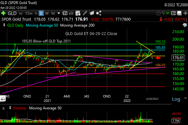
Gold and gold stocks: GLD and GDX both have Consolidating UpTrend™ (CONUT) status. Those are deeper corrections as noted above.
Silver stocks, SIL, are in Consolidating DownTrend™ status, Day 1 and SLV is in CONUT status.
Treasuries and Bonds are in Consolidating DownTrend™ status again, meaning Treasuries, IEF (10 Year) and TLT (20+ years), and LQD (corporates).
The Big Picture
Wherever possible I’ll keep my commentary to bullet points, because what matters most are the trends, not the narratives, but I’ll give you my sense of what the “True Narratives” are…
The single mandate Fed, as I called them many months ago, will continue to hike at least 2-3 times at 0.25% per meeting, but perhaps more. I covered that issue in the prior post (link to upper right).
In the last issue I asked,” What’s are the ‘catches’? The economic slowing and earnings recession the Federal Reserve is creating through their interest rate hikes along with the elevation of the US dollar that is further aggravating global growth and shrinking the earnings in dollar terms of our multinational companies.” STILL a problem for the US and other equity markets.
A good call in my prior post: “The market assumes Fed hikes will stop at a top (terminal) Fed Funds rate of 4.75%, but who is to say that will be enough?” It is now headed to 5.25% to 5.50% or so at a minimum per the CME data.
My key observation: During “…several bouts of inflation, when the Fed Funds Rate was raised to contain inflation, rates had to rise ABOVE the CPI inflation rate to bring inflation down as the chart shows HERE.” We cannot be entirely sure at what rate level the Fed will finally stop hiking.
Still True: Slower growth means lower stock prices. “It’s a tradable bounce, not very likely a sustainable bounce, despite the fact that three writers I follow have declared the Bear market over on Friday.”
The final low may already be in, yes, but if the recession we are now headed toward induced intentionally by the Fed is worse than expected, US stocks could make a new low. I would not count on that, and I will be following the trends rather than “calls” about when the market bottomed or will bottom.
From the prior post: “My point? I would not listen to anyone who says the market MUST make a new low. It doesn’t IMO…” We will know what to do by examining the markets themselves every day.
WARNING still holds: IF the market does break the June low again, the risk of a breach of the Oct. low clearly becomes real. And by that, I mean a BIG breach! If the October low is breached, we will be entering another major leg down into a Big Bear market as I’ve defined it with my “New Rules.” (they are HERE -scroll to “New Rules” in blue type).
… I will significantly lower my stock exposure further than I have should those breaches occur. ”
Now we’ll look at the current charts…
Be sure to…
Follow Me on Twitter® Follow Me on StockTwits®. (real time messages are on StockTwits as always and back on Twitter)
Keep up-to-date and read my comments on the current setup during the week at Twitter and StockTwits at the above links) where a combined 36,290 investors are following the markets with me…
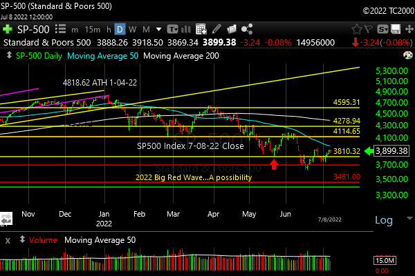
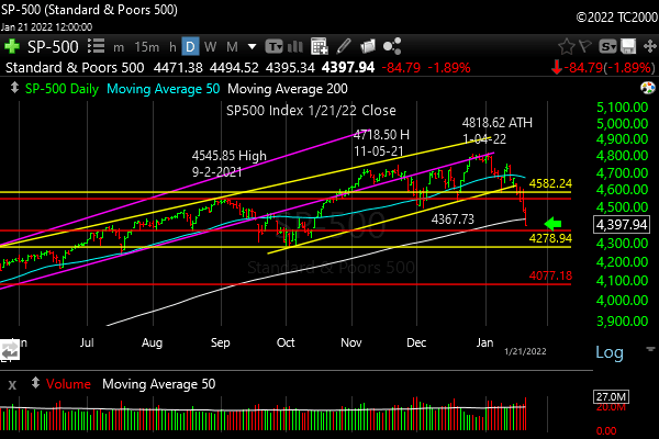
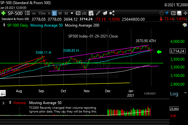
1. SP500 Index Market Timing (S&P 500 Index®; SPY, SPX):
This was correct (prior post): “I think it’s likely this bounce goes to the early June high, which will be above the 200 day mav, which contained the August bounce as you see above. That will suck in the last of the buyers.” The S&P 500 Index has failed at the June high. (This chart was from 1:46 pm on 2-21-2023, and the price is now below that slanted yellow line to the right on the chart below as you see…)
Click the chart to see the details… (the RED arrow marks the May low)
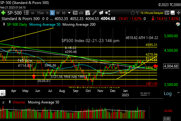
Sinking below the immediate uptrend line.
Now let’s review investor sentiment…
Survey Says!
The AAII Survey of Individual Investor Sentiment (AAII) spread is +5.3% (Bulls – Bears). That says investors are tilted slightly Bullish as the SPX retops at the June 2022 high. Not much help, as it’s not at an extreme.
| Bulls | Neutrals | Bears |
| 34.1% | 37.1% | 28.8% |
| Thurs. 12 am CT close to poll | ||
Now let’s look at the small caps, gold, and interest rates…
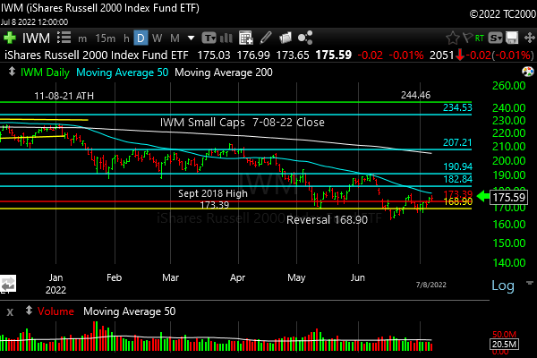
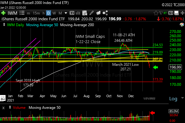
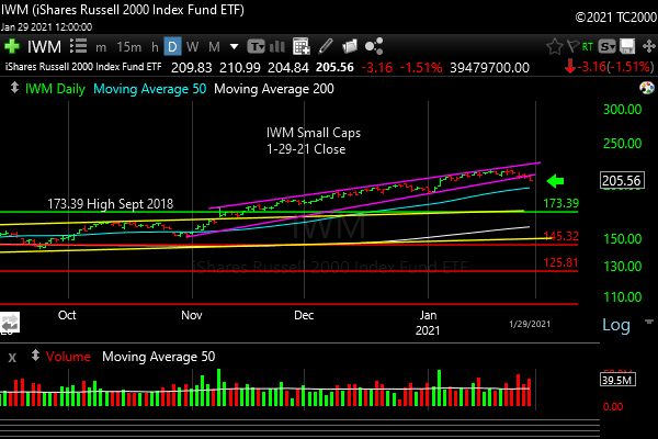
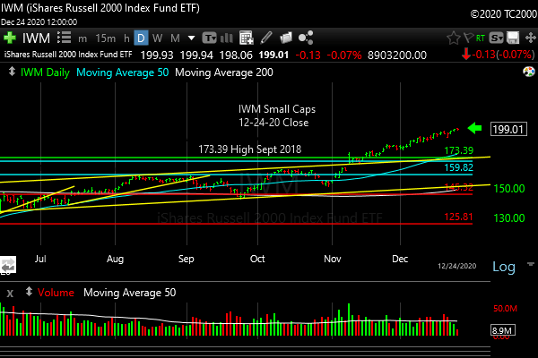
2. U.S. Small Caps Market Timing – Russell 2000 U.S. Small Cap Index (click chart to enlarge; IWM, RUT)
The June high was exceeded, but that breakout has now been given up. More downside is likely. Chart below was done at 9:34 am. Currently at 187.85 at 2:33 pm ET, 2-21-23.

Failed below the Aug. high, and now below the June and Dec. highs as of 1:34 pm on 2-21-23.
Gold is next…
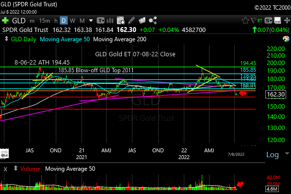
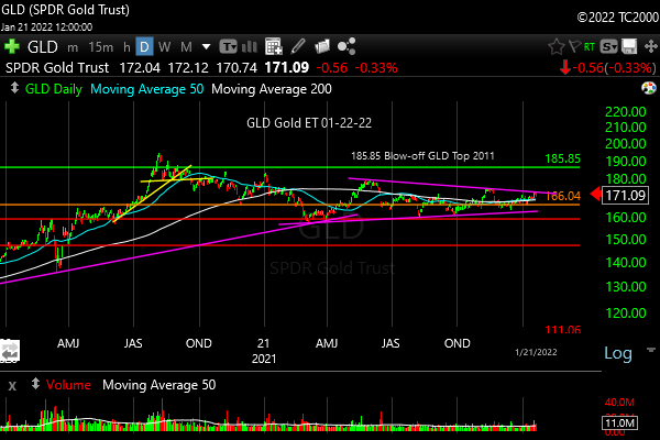
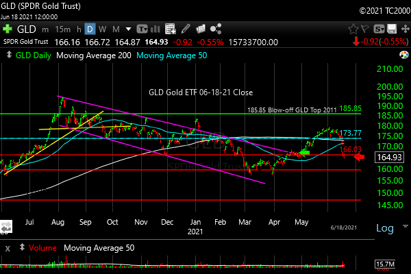
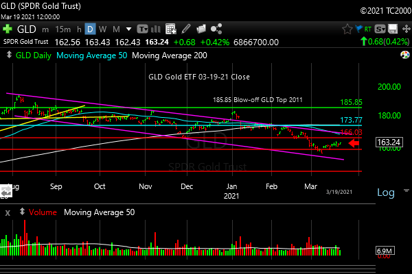
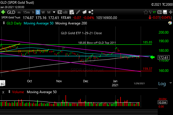
3. Gold Market Timing (click chart to enlarge; GLD):
Gold was discussed above. This is a more serious correction within an uptrend per my system. Rate pressure means pressure on gold as the US dollar goes up against it. Investors hold more dollars when rates go up. Chart below was done at 9:34 am. Currently GLD is 170.48, -0.46% at 2:32 pm.
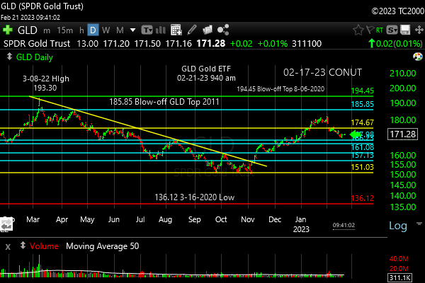
Pullback in an uptrend. Until its more!
Check out the “Market Signal Summary” below – after you review the following chart…
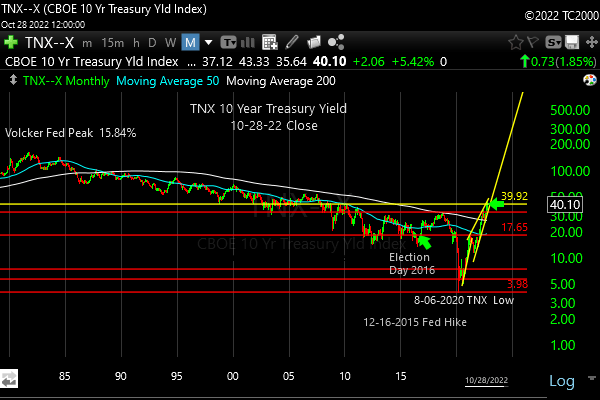
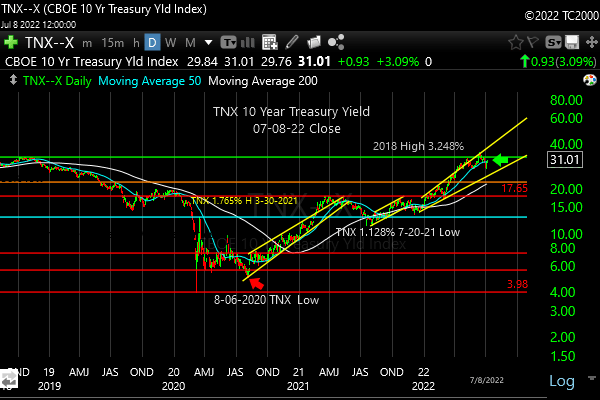
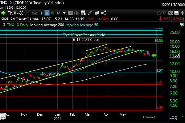
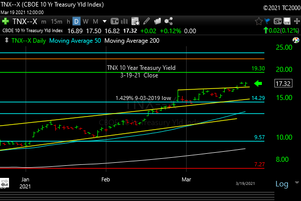
4. Interest Rate Market Timing (10 Year Treasury Yield; click chart to enlarge; TNX, IEF, TLT):
UPDATE 5-04-23: The TNX number I’ve been following is 3.334%. It must sustain a fall below there to get the “Big Green Wave” going in earnest. That is the “number of the year” for the long bond/long Treasury market (means 10 years to maturity or more in this context).
The status of IEF, TLT, and LQD is discussed above. TNX needed to hold below 3.905%, and it’s gone to 3.949% at 2:33 pm 2-21-23, up 12.1 basis points from last Friday. It could still hold to a lower high than the October high as stocks sell off and the earnings recession and possible GDP recession manifests. Then as rates fall again, Treasuries and high quality corporate bonds will be working again…
Here’s the current chart…
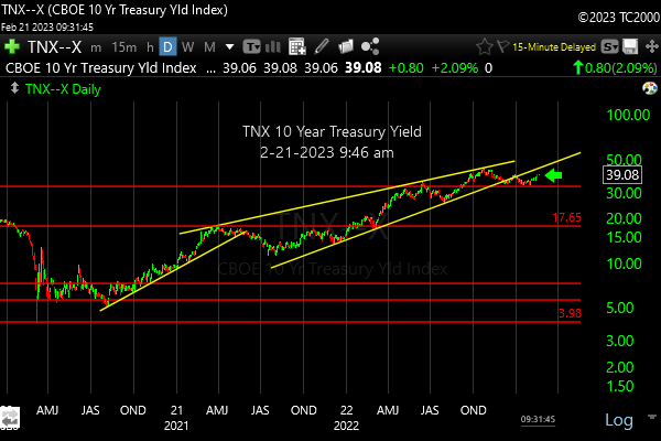
TNX above 3.905% is a problem for both Treasuries/Bonds and stocks..
Now let’s review three key market timing signals together….
Do not use these signals as a trading plan. They are rough guidelines. I currently share my actual BUYS and SELLS in as timely a way as possible on social media (links above).
MY MARKET SIGNAL AND TREND SUMMARY for a Further U.S. Stock Market Rally with Real GDP Growth (“Real” means above inflation):
Stock Signal Bearish for a further U.S. stock market rally with a short term Bearish and longer term Bearish SP500 Index trend. The small caps determine the stock signal in this section of the report. Small caps are breaking down, which is why the signal is Bearish short term.
Gold Signal Bearish for a further U.S. stock market rally. The Gold Trend is short term Bearish and longer term Bullish (see discussion above though). The Fed raising rates is a problem for gold until the economy starts slowing or until the market starts anticipating that happening.
Gold will take off again to the upside IF/WHEN 1. Rates start falling at the long end. 2. The economy slows 3. Earnings fall for stocks, which reduces the overall yield on stocks. Gold likes weak competition!
As said before, “If real rates rise as the Fed acts, gold will be hurt, but in the short term, the Fed is hiking into economic slowing Y/Y, so that means rising short rates can LOWER long rates, which could help gold by depressing long term real rates.”
Kept for Reference: “Gold can RISE with stocks when real rates are FALLING, and the dollar is falling. The dollar has been stronger of late, due to the Fed’s planned pivot. Gold could rise WITH the dollar if the economy slows and real long rates fall.
These are thing gold doesn’t like: 1. Rising real rates (bonds/Treasuries become a threat to gold which pays nothing; banks and other companies make more money with rising rates) and 2. Economic recovery with higher corporate earnings. Earnings drive stock prices higher. Stocks pay dividends that compete with bonds, and companies use cash to buy back stock, which drives up stock prices, while gold pays nothing.
In liquidity crunches (which the Fed is supposed to prevent) gold can drop with everything else but the US dollar.”
What gold does mostly as I’ve written HERE is follow real interest rates around the world (if you own “gold in dollar terms” you care about U.S. rates most of all). The rest of the world does matter however, including massive buying by central banks. Real interest rates have been rising around the globe. Economic slowing is creeping in now, which means ultimately real rates will fall again if the Fed suppresses growth.
GUIDE: “Remember GLD is being used as an indicator for the ECONOMY here.” If gold continues to rise again, it means the market believes real rates are going to fall or stay negative for a period of time.
Rate Signal: At this point Bearish for a further U.S. stock market rally, as rates have risen too quickly. The 10 Year Yield trend is short term Bullish, and intermediate term Bullish.
(Remember: higher rates mean lower bond and Treasury prices and vice versa). We want slowly rising rates in a recovering economy. That’s what happens normally. The Fed raises rates slowly as the economy continues to grow until it doesn’t. What we don’t want is rapidly rising OR rapidly falling rates, both of which I call “Rate Shocks.” We are currently experiencing a “Rate Shock” due to the Fed 1. Hiking Fed Funds rates and 2. Reducing the Balance Sheet.
Thank you for reading. Would you please leave your comments below where it says “Leave a reply”… or ask a question if you like…
Pay it forward by sending the link to MarketTiming.Blog (that link will immediately connect them to this webpage) to a relative or friend. Thanks for doing that.
Be sure to visit the website for more general investing knowledge at:
Standard Disclaimer: It’s your money and your decision as to how to invest it.
I thank Worden Brothers for the charting system I use to post these charts. If you want to know more about the charting system I use every day, contact me for any questions, or click HERE. Please use that link when you sign up as I am an affiliate (I don’t make much, but it may help to pay for some of my website expenses). It makes it much easier to follow along with me if you can see the charts and manipulate them on your own computer. It’s a great investment to have an excellent charting system.
Note: I’ve updated my criteria for the equity signal for a further U.S. stock market rally to the following: GREEN = Bullish, YELLOW = Neutral, RED = Bearish. In other words, the colors tell you whether the signal supports the stock rally or not, while the Bullish, Neutral, and Bearish designations are about the trend.
A BEARISH trend signal does not mean we should not buy. A BULLISH trend signal does not mean you cannot sell some exposure. It depends on what is going on in the economy and how oversold/overbought the market is at a given point whether the Bearish signal is to be sold or bought, sold on the next bounce, etc. and whether a Bullish signal is to be bought or if profits should be taken. A NEUTRAL trend signal does not mean the end of the Bull or Bear. It means to wait and look for possible subsequent entry points within the existing trend, Bull or Bear, but preserve capital if the entry fails. Our strong intention is to buy low and sell high. By the way, I will keep showing the prior orange “Trigger lines” in the IWM and GLD charts for now as reference points only; they have historical value for us from the post-2016 election period.
Copyright © 2023 By Wall Street Sun and Storm Report, LLC All rights reserved.