Market Timing Brief for 5-31-2013: One Down. Two Up.

A Market Timing Report based on the 5-31-2013 Close published Sunday June 2nd, 2013 with updates.

UPDATE for 6-13-2013 @ 2:40 pm: Is the sell-off over?  Not likely.  It looks like it could be a Bear trap, but if you discount the retest the other day as an aberration due to Japanese currency antics, I suppose you could say, “Never say never.”

Could we continue straight back up to the prior high?  Yes.  The statistics I cited in the prior post would say that is unlikely though, and they are pretty impressive.  If you play this rally, I’d use a stop.

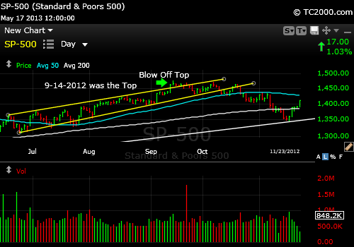
Today’s chart looks something like the April 2012 test of the 50 day moving average shown here:

sp500-market-tming-chart-2012-04-12-pub-2013-06-13

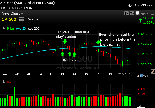
SP500 Index wobbled around the 50 day moving average last year. Could repeat a similar pattern.

UPDATE for 6-12-2013 @12:00 am: Take a look at the second chart below.  It will show you what is likely to happen over the next few days to weeks.  I checked EVERY retest of the 50 day moving average since 10-2007.

Here are all the prior second retests of the 50 day moving average since October 2007.  In all cases, the retests followed significant rallies on the daily chart: 10-2007 (100 point drop), 7-2-2009 (shallow dip of about 37 points below 50 day movoing average), 3-2011 (brief 53 point dip below), 5-2011 (failed by only 14 points, then staged another attempt to form higher high, which did not happen and sell-off intensified to 73 points), 7-2011 (bad break of 208 points initially and a bit lower on the Oct. retest of the low), 5-2012 (bad break of 110 points), 10-20-12 (90 point decline).

The 11-2010 retest of the 50 day moving average was an exception in that it did not fail, but it was fairly early in a bigger rally and a very shallow bounce from a very short fall to the 50 day moving average, so it looked more like a consolidation mostly above the 50 day moving average before the resumption the bigger multi-month rally.

So although history does not have to repeat itself, the odds favor a deeper correction.  Basically, when the market is not sure about recovering quickly after a fall, it’s a bad sign generally.  Noting that is the value of this post. 

I will demand more strength for a buy of the SP500 Index at this point.  That would mean a sustainable move above 1648.69.  Follow me on Twitter to keep tabs on this with me.  This means potentially forgoing profits between here and there, so if you disagree, execute a different plan by all means.

If support breaks, I think the March and April lows would be a reasonable first downside target from today’s close or 73-87 points lower or another 4.5-4.7% down.  That would bring the total pullback to a respectable 8.75-9.0% correction.

UPDATE for 6-12-2013 @ 10:16 am: This SP500 Index chart shows the potential for a reversal upward at the right shoulder support.  The target becomes the prior SP500 high of 1687ish. 

If that support does not hold, we go back and retest the 50 day moving average (mav) or the prior low, which was below it. 

Retesting at the 50 day mav is not something that we’ve been doing previously in this long rally, so it may not hold this time.  In both Feb. and April we hit the 50 day mav and bounced.  

Here’s the chart for the reverse head and shoulders formation (it COULD hold, although I’m leaning toward it not doing so at the moment):

sp500-index-market-timing-chart-2013-06-12-1013am

Could the reverse head and shoulders support hold at the right shoulder and lead to a rally?

UPDATE 4 for 6-11-2013 @ 2:23 pm: This chart from last Fall for the SP500 Index shows you the potential risk and why I took profits earlier (see Twitter):

sp500-index-market-timing-chart-Fall-2012-Pullback-2013-06-11

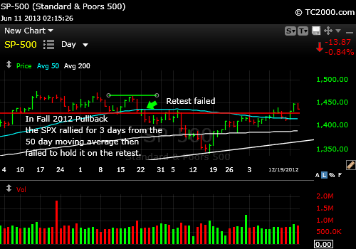
Fall 2012 SP500 Index Fail of Retest of 50 Day Moving Average

UPDATE 3 for 6-11-2013 @10:53 am:  This chart shows you what happened on 3-01-2013 when we retested a similar bounce from just above the 50 day moving average (aqua line).  We went a bit lower today, but it’s the same basic retest picture as the chart shows:

sp500-index-market-timing-chart-2013-06-11-1052am

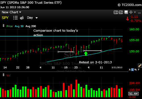
SP500 Index Retest back on 3-01-2013 was very similar to today’s retest.

UPDATE 2 for 6-11-2013 (see next post too) @10:35 am:

Here is why I bought DXJ (yes, it’s very volatile so use a stop). [NOTE: sold as reported on Twitter.]  There is a reverse head and shoulders on the hourly chart below also visible on the daily.  Whether it holds or not, I can’t tell you, but the set-up is valid for a bounce from here.  As I said, use a stop to protect capital, because the trade is higher risk than usual due to the level of volatility in the Japanese market:

dxj-market-timing-chart-2013-06-11-1034am

Market Timing the Hedged Japanese ETF, DXJ.

UPDATE 9:20 am 6-11-2013:  The SP500 Index is testing the low from Friday this morning (base of current consolidation you could say; now lower at SPY 163.20 as I type with low 163.14) and must hold that level or thereabouts or it will likely just retest the prior low near 1600.  Whether it will hold twice we don’t know, so watch your stops! 

sp500-index-market-timing-chart-2013-06-11-premarket-920am

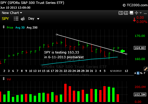
SP500 Index testing base of Friday’s range in premarket. Must hold about there.

UPDATE 6-07-2013 @ 10:02 am: We survived the retest of my closing number that is needed today as mentioned in the text below.  Here’s the chart:

sp500-index-market-timing-chart-2013-06-07-1002am

SP500 Index making progress in its bounce from predicted support.

UPDATE 6-07-2013 @8:49 am ET: The jobs number fell right around consensus and so my SP500 Index target is now a minimum bounce to 1659, although a stop at 1635 is possible.  Above 1659, we re-top at the last high. 

It does not have to go there in a single move, and for today I’d like to see a close above 163.42 on the SPY and above 1629.31 for the SP500, which are the highs for 6-05-2013.

UPDATE 6-06-2013 @12:51 pm ET:  In considering the fall in rates today with the 10 Year Treasury reversing, I’d say that there are two things it could mean:

1. That the Fed will stay in charge.  That the employment number will be somewhere between the ADP number of 135000 and 185,000 jobs created and won’t shock the markets.  In fact, the markets will relax knowing that employment growth is still slow.

2. That the stock market will not in fact hold 1600 and the flight to Treasuries from stocks is the driver.

A close below 1600 for the SP500 Index would point to choice #2.

UPDATE 6-06-2013 @ 11:28 am: I started adding back to my equity exposure via SPY and MDY (US large caps and US mid caps).  This chart is why.  The MDY chart if you look at it on your own shows a drop to below the 50 day moving average with a recovery.  Today, the SP500 Index dropped to 0.1 points of that number. 

Good enough for a bounce most likely.  Yes, set a stop below in case there is no bounce.  Also please read my Tweets from the past few days to lower right.  Here is the market timing chart:

sp500-index-market-timing-chart-2013-06-06-1124am

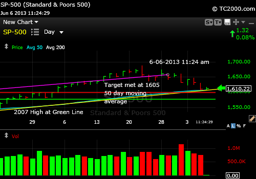
SP500 Index Market Timing

UPDATE 6-05-2013: The ADP employment report did not help coming in at 135K, but the reaction was not strong in either direction.  The market is a bit down today thus far.  See my Twitter comments down a bit to the right. 

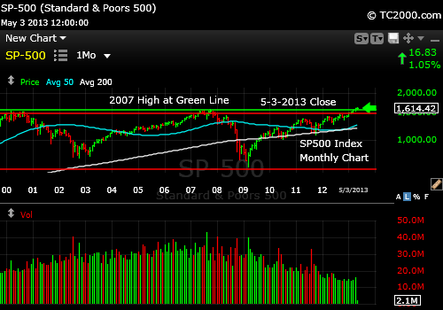
My SP500 Index target is 1600 with lots of support there.  It will probably dip below that level a bit to shake out some investors, so the Wells Fargo target of 1590 at their high end is a reasonable next target (1560 was the Wells Fargo low end target as uttered on CNBC).  Then the 2007 high comes into play (see green line on chart below). 

If  we we break below the 2007 high, this whole blip up will be looked at as a failed breakout.  The selling on such a break would be significant.

sp500-index-market-timing-chart-2013-06-04-close

1600ish is the next target.

The Great Rotation is not supposed to go this way.  The money is not supposed to go from out of stocks AND bonds at the same time and end up in cash!  It’s supposed to go from bonds to stocks.  The basis for this pullback is the feeling that the Fed is not going to be of as much help via QE and low rates for an unlimited time and that QE could be reduced in the near future.  Less liquidity means lower prices for stocks and higher yields with lower bond prices.  High yield bonds are being hammered finally.  The capital gains from the beginning of the year are ALL gone in high yield bonds.  There is more downside if yields move up to 2.4% on the 10 Year Treasury or even higher.

 It will be interesting to see how low the SP500 Index (SPX, SPY)  falls on Monday.  Here are the chart links:

Market Timing Charts for Sunday’s Issue (opens separate window with all charts)

If the high in the 10 Year Treasury (TNX) is contained at 2.4%, I think this sell-off will be contained at or just above the 50 day moving average, at least for a bounce.  Above 2.4% yield on TNX and we’ll see a retracement of the entire rally from the April lows.

So keep an eye on the 10 Year Treasury Chart too, which is at the link above.

The VIX volatility index may stop at about 18-19 in this move, which could happen in one or two days.  A perfect set-up for a bounce would be a 10 Year at 2.4%, the VIX at 18-19 and the SP500 Index at the 50 day moving average or at least close to it.  Note that back in February it did not quite reach it as the chart below shows.

sp500-index-market-timing-chart-2013-pullbacks-to-50-day-moving-average

SP500 Index pullbacks have come close to the 50 day moving average.

It may be worth buying such a pullback this time provided the 10 Year rate is contained at 2.4%.  Remember investors believe the economy is getting stronger.  Unemployment has been falling.  If unemployment drops too much on Friday, I suppose the reaction of the stock market could be negative, but if it eases slightly, but not dramatically, that may be interpreted as positive.  A temporary low in the market is likely this week.  The ISM reports on Monday and Wednesday will be important tea leaves as will be the ADP report Wednesday.

The market wants the Fed to be active, while the economy improves and not simply turn off the faucet abruptly.  Dr. B. has said that, yet the bond market seems to be preparing for higher rates.  In the end, rates MUST rise if the economy is improving and earnings will rise as well if that economy is doing well provided that interest rates don’t move too high and stay there.  Many companies are fine for now as they’ve refinanced debt at lower rates.  So what is happening is supposed to happen, despite this pullback.  Rates are supposed to go up and they are.

That is why this market can continue to rally after a pullback.  Again, because rates are supposed to be rising.  Volatility is up as we near the summer.  If it keeps rising, we could be in for an up and down market such as we’ve seen in recent summers.

We could see a low this week and then another rally with a final push lower, before a more sustainable rally.  There are lots of Bulls who are ready to pounce on this pullback, which is why I believe we are just a few days from the end of this first A-B-C wave.  A down, B up, and C down.  It’s like a waltz in letters.

Now what about my remark on Twitter that this could be a “3 wave” in Fibonacci terms?  The 3rd wave is classically 1.618 times the first wave down, so the next move after a bounce from this one could bring us to about 1494, which would likely be around the 200 day moving average at that time.  That could then be followed by a classic 4 wave up and a 5th wave that retests the prior low (end of wave three) or makes a new lower low.

Reaching an SP500 Index of 1494 would require game changing events such as:

1.  A startling left field high risk financial system event.

2.  A further slowing of the world economy causing E’s to shoot up and P’s to fall.

3.  Interest rates north of 2.4%.  I am not certain 2.4% will be high enough to unravel things, but it’s starting to have an impact and if things snowball through massive bond sales by investors who are now losing lots of money in their bonds, they may just decide to sit in cash rather than going from falling bonds to falling stocks.

Will they buy gold (GLD)?  Not so likely.  I’m watching the developing and very shaky up trend.  Gold is at best and aggressive trading buy, due to the poor performance on Friday.  The feeling apparently is that rates will be going up much faster than the rate of inflation, so real interest rates will be positive.  Gold is a poor thing to hold when that happens.  We need inflation or the security of negative real interest rates due to Central Bank intervention to boost gold.  I bought a trading position in gold last week, and it’s in the red.  I may be forced to dump it in exercising my stop loss.  The small up trend line was broken, but it’s possible that a higher low will be formed in this pullback.  It’s been a tough trade and that is not likely to change soon.  The chart is at the main link above.

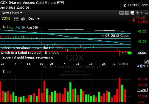
The best thing GLD has going for it is GDX, the gold miners.  That chart is leading gold up hopefully and the swoon Friday could be temporary.  The red lines are support and the aqua lines are overhead resistance, the curved one being the 50 day moving average.

gdx-gold-miners-market-timing-chart-2013-05-31-close

Gold miners showing some life in a reversal from a breakdown. Base formed?

I’ll comment on sentiment separately and tweet the link.

Key Takeaways for the Week:

1.  The selling is not over yet.  It will likely stop for a bit this coming week

2.  There are 3 things that can turn this sell-off into a more serious one: a financial flare-up (Euro debt etc.), a slowing world economy, and skyrocketing interest rates.

3.  The 10 Year is headed to 2.4% in this move.

4.  Gold is a shaky trade still. The gold miners offer a glimmer of hope for GLD finally.  Use a mental stop!

NOTE: We’re moving to a once a month publication schedule for the main newletter, but expect chart updates weekly at various times.  Thank you.  If you would like to provide feedback, please do so here:

Provide Your Feedback

Standard Disclaimer: It’s your money and your decision as to how to invest it.

The above is the text from this week’s free report.  To receive future reports ahead of publication subscribe for free here:

Free Subscription to My Newsletter

I thank Worden Brothers for the charting system. If you want to know more about the charting system I use every day, go to my “Other Resources” page here:
My Chart Source

If you “liked” this post, would you please “Like” it at the “Share” arrow below?  Thanks very much!

And to follow my Buys and Sells and up to the minute insights, please follow and bookmark my Twitter feed here: Join Me on Twitter

Copyright © 2013  By Wall Street Sun and Storm Report, LLC All rights reserved.

Posted in federal reserve, gold, gold etf, gold stocks, investment, large cap stocks, Market timing, S&P 500 Index, trading, Treasuries, volatility index | Tagged , , , , , , , , , | Leave a comment

Market Timing Brief for 5-24-2013: Markets Giving Up Their Stretch As Warned

A Market Timing Report based on the 5-24-2013 Close published Saturday June 1st, 2013

UPDATE 6-01-2013:  The Bear has reared its head.  The sell-off in the form of the C wave mentioned below is now underway. The so-called C wave is the second DOWN wave in the SP500 Index (SPX, SPY) and most other stock markets.  It could turn into something worse and become a 3 wave, something I’ll cover in this week’s issue. 

The “Go Away” time was a bit late this May, but there will be more going away (read that “selling”) this next market week too.  To get the jump on it, subscribe to the free newsletter emailed to your door by this Sunday evening (see link below).

If you feel the reaction of the market to the Fed is overdone and we are in for more gains in the immediate future, then there is no need to sell anything despite all the sell signals in the MTT table below in this week’s issue.  Or you might want to trim here and there or raise cash with each lower low.  Regardless of your personal choice, the fact is that the market broke down technically this past week with classic key reversal days in multiple indices.  Some indices were punished particularly severely including one I highlighted just this past weekend as super stretched, the REIT Index.  There was a key reversal day for the REITs on Wednesday after the Fed minute release.  A key reversal is a higher high with a lower low than previous day with a close near the low.

I had warned about the REITs as the worst index in terms of the stretch above the 50 day moving average, issued a SELL, and the REIT Index (RMZ, VNQ, RWR) dropped 2.0% more.  You could have sold the break of the trend line well before that.  The total drop from the top was 5.6% from the recent closing high to the low on Friday.  The bounce occurred almost exactly at the 50 day moving average.  So now it’s sitting on support and could bounce in the coming week.  I’d say a break below the 50 day moving average will be another SELL signal.

The Chart is Here:reit-index-market-timing-2013-05-24-close

REIT Index gives up its stretch!

NOTE: All charts are courtesy of Worden Brothers charting system.  To read more about the software that I use every night to check the charts, go to: The Chart System I Use

Big Tech is still much more stretched than the REITs are, as shown here (NDX, QQQ):

ndx-qqq-market-timing-chart-2013-05-24-close

Big Tech is still stretched.

The white lines running up and down show the degree of stretch from the 50 day moving average.  Note how much longer the one on the far right is than the others.  There is plenty of room for a further correction to happen just to bring the price back down to the yellow line.  The 200 day moving average has provided the best support though, so more damage is possible.  It should not retrace to there if the economy is indeed recovering, but at times things are overdone as the momentum shifts from the recent greed of investors to fear.

Certainly the 50 day moving average could support a bounce if not a strong recovery.  If rates rise further from here to 2.4%, I’d bet on the 200 day moving average target.

The SP500 Index is also stretched still, as the chart shows via the following link:

Market Timing Charts for Sunday’s Issue (opens separate window with all charts)

Men and women preserve profits.  Boys and girls give them all back.  I’ll get to that again just below.  Remembering that truth may save your financial butt some day.

Given the pullbacks that have started, it would be wise to consider your alternatives. 

Too late for the first one, but you could have reduced your risk by quickly selling the break of the up trend at a very stretched level (you could have exited intraday on the 1st break of the up trend on day 1 of the decline).  There is the risk of selling early whenever we sell the very first break however.

  1. You could simply hold and take the losses from the prior tops believing that the economy is recovering.
  2. You could still sell next week, but we have no idea if the market will gap down or not.  You might be selling too late.  So you could sell some arbitrary amount such as ¼ or 1/3 and see if the market gives way some more and sell more lower.
  3. You could simply orient your strategy around preservation of profits and limiting losses to an arbitrary percentage.  I would not give up more than X% of your profits.  Your call on what X will be.  Some use a 25% trailing stop.  Others use 20%.  Some cut their losses at 50% of profits if the profit was gained quickly.  If your profit is small and support is close, you might decide to give it all back and even sell at a small loss below support.   But if your profits are large, giving up more than 25% on a trailing stop would be dangerous to your capital.  (if you don’t know what a “trailing stop” is, you need to know it, so please read my entry on how to buy stocks here: How To Buy Stocks (and when to sell them!)

Never, ever, ever give your profits all back when you have big gains. 

Benjamin Graham said “Although there are good and bad companies, there is no such thing as a good stock; there are only good stock prices, which come and go.”  Put a yellow sticker with that quote under the screen you use for trading.  Graham did not focus on market prices as much as he focused on value, but to me the quote has a greater meaning across all investing strategies.  Don’t marry yourself to your thesis.

There is another caveat though.  YOU MUST BE WILLING TO RE-ENTER THE MARKET.  If not, buy and hold and forget all this.  No system of selling will work if there is no price at which you will rebuy the market you’ve sold.  You will lose out on too much opportunity waiting for the perfect entry point.  Ask the investors who sold everything at the bottom in March of 2009 how they feel today.  We know how many feel.  They have left the market and have not come back.

How about Tuesday in the US markets?  The market could bounce on Tuesday to a lower high and then come down again.  The only thing that changes the current technical picture is a new high.

I’d like to discuss the Nikkei 225 Index a bit.  Their new monetary policy is not a short term job.  It’s a longer term commitment to insanity.  The Japanese were infected by the Bernanke Virus, isolated by the CDC and guaranteed to promote monetary illness immediately following infection.  They’ve got the bug.  Here’s the chart to show the big move under way in their stock market:

nikkei-index-market-timing-monthly-chart-2013-05-24-close

Nikkei Index Market Timing

Monthly resistance was hit and we’re falling from there.  Japan has been given the green light by the rest of the developed world to defile its currency.  Dr. B said so himself.  No problem.  Print yen, and we’ll look away.  They’ve had a tough time with zero gains in principal value in the index since March 1986!  The peak was 1990, but we are at 1986 prices.  That is TWENTY SEVEN YEARS of no gains!  They’ve been in investment hell for far too long and funding our non-repayable debt the entire time while their population has been aging.  So now the US has to look the other way.  That means that after this pullback, there is more to come most likely.  The pullback admittedly continued on Monday by another 3.22% in losses in the index.  So I was early in re-buying more Japanese exposure, but it only represented an increase in my equity exposure of 2%.  I will preserve profits at a certain point and Tweet it to you.  Decide where you’ll preserve your profits.  I’ve made the Pac Rim a trading sell, but have not yet sold.  I will do so to preserve profits (follow my tweets if you like).

You can take a look at the level of damage on Yahoo Finance here: http://finance.yahoo.com/echarts?s=^n225+interactive#symbol=^n225;range=my;compare=;indicator=volume;charttype=area;crosshair=on;ohlcvalues=0;logscale=off;source=undefined

Most charts don’t go back 27 years.  Congratulations to Yahoo on providing this great resource!

Commodities are headed back to their prior low.  “Stuff” just can’t get a break!  Even gold is slipping around, while trying to bounce (see Chart Link above).

The VIX volatility index hit the lower highs in Feb., March and April and turned down.  As it could go either way, it has little value to us.

Sentiment on the part of investors is eerie this week.  I reported on it on Thursday, because I was surprised at the parallel I found to 2007.  Read it here in the last update to this post: Sentiment Survey

The King of all Indicators is shown in this week’s Bonus Chart of the Week at the Chart Link above.

The 10 Year Treasury Note (TNX, TBT, TLT) is King now because it will tell us if the market seriously believes the Fed is going to reverse course here.  If rates DECLINE this week, we’ll know the pullback is not serious.  If rates crash up through the upper resistance line on the chart above, we’ll know the Fed premium is being taken out of the market and we had better take it seriously in preserving our profits and limiting losses on new positions.

The Fed premium is what stretched this market in the first place.  Take it away and away goes the stretch.

Key Takeaways for the Week:

1.  The markets are already less stretched than at the recent highs, but there will likely be at least one more step down before a bounce.  Most pullbacks, even the brief ones are A-B-C wave moves, A down, B up or sideways and C down

2.  The Treasury market is the key indicator to follow.  Rising rates would tell us we’ll need to sell more to protect profits.

3.  Gold can rally when stocks are selling off.  Maybe it began a bounce this past week, but if it fails to hold the last low, watch out below.  There will be more pain for gold investors.  Rising rates are bad for gold until inflation kicks in and it hasn’t.

4.  Sentiment is where it was near the 2007 high.

5.  A reversal back below the 2007 SP500 Index high would NOT be taken lightly by investors should it occur.

6.  Consider selling in steps, not all at once, if you do so to preserve profits and capital.   We could see a bounce from the next move down for example after the C wave (see #1 above).

Have a great week investing and/or trading!

Standard Disclaimer: It’s your money and your decision as to how to invest it.

The above is the text from this week’s free report.  To receive future reports ahead of publication of the text shown above AND much more market timing information, please subscribe for free here:

Free Subscription to My Weekly Newsletter

I thank Worden Brothers for the charting system. If you want to know more about the charting system I use every day, go to my “Other Resources” page here:
My Chart Source

If you “liked” this post, would you please “Like” it at the “Share” arrow below?  Thanks very much!

And to follow my Buys and Sells and up to the minute insights, please follow and bookmark my Twitter feed here: Join Me on Twitter

Copyright © 2013  By Wall Street Sun and Storm Report, LLC All rights reserved.

Posted in federal reserve, gold, gold etf, investment, investor sentiment, large cap stocks, Market timing, Nikkei 225 Index, REITS, S&P 500 Index, trading, Treasuries, volatility index | Tagged , , , , , , , , | Leave a comment

Market Timing Brief for 5-17-2013: How Blow-off Tops and Bottoms Can Make You a Fortune

A Market Timing Report based on the 5-17-2013 Close published Sunday May 19th, 2013

UPDATE for 5-23-2013 @ 1:42 pm: Survey Says!  Why I am Starting to Take Some Profits.  I am slowly taking some profits because of the individual charts and sentiment in combination.  I am still 77.1% invested vs. my maximum equity exposure as a reference point.  IN most cases, I’m trimming rather than eliminating profitable positions.  I would like to have some cash just in case the market does not simply plow higher.  The reason is sentiment this week plus the negative chart formations (see Twitter for more to the right). 

I usually save my sentiment comments for the weekend, but this time, it cannot wait.  Yes, there could be positive seasonality (upside bias) in the trading leading up to the holiday as is commonly the case, so that is the upside risk on a trading basis, but here is the sentiment info you need. 

Investor Sentiment 5-23-2013: Sentiment is not good news this week the AAII survey and individual investors shows a 27.4% spread between Bulls and Bears.  Investors are getting a bit too bullish. 

It’s interesting to compare this to the October 2007 high, namely the one that was marginally above the previous July 2007  high (you can view the data at AAII.com).  Sentiment then ALSO showed a spread of 27% with 51.81% bowls and 25.30% Bears. This time we are at 48.97% bowls and 21.58% bears which is still a significant spread and a significant number of Bulls at a new all-time high.  So sentiment says to watch out and preserve profits.  Sentiment here matches that at the 2007 high reasonably closely.

The Caveat?  Positive sentiment can persist for a while, but the data is at least saying to be cautious and err on the side of preserving profits, PROVIDING you are willing to rebuy lower OR higher.  If not, what is the point?  Read my passive shorting page if you haven’t yet. It’s on the main website – see the “About” tab above.  How deep this correction goes depends on the Federal Reserve and what they make public about their discussions.  There are a lot of leaks happening lately.  I’ll have more this weekend in the regular issue, which is out by Monday night.

UPDATE for 5-20-2013 @ 11:42 pm: This chart shows that silver (the silver ETF, SLV) and gold mining stocks (GDX) have tracked together very closely since the silver ETF all time high and have both done similarly poorly vs. gold (GLD).  They could be better buys than gold if this bounce is real! 

slv-market-timing-chart-vs-gld-vs-gdx-since-slv-high--2013-05-20-close

Silver vs GLD (gold ETF) vs GDX (gold mining stock ETF)

Check out my Twitter feed to the right side of this page and on Twitter if you want to see them all (see Twitter “Follow” button).  The full issue gives you my entire table of 35 index calls for the week (see link at bottom).  Lastly, I thank Worden Brothers for the charting software I use every single day (see my Other Resources page on the main site).

And now for this week’s issue…in which you’ll learn how to identify blow-off tops and blow-off bottoms (capitulations).

The market keeps moving higher, up, up and away as the song goes.  It’s the Bernanke balloon.  Of course, balloons go only so high and then they pop.  Last week I demonstrated how you can tell when a market is stretched to the upside.  Compared to last week the degree of stretch has increased and yet, even my “example market” stretched even further to the upside last week.  This is why it is not very smart to sell a market just because it’s “high.”  We generally do not appreciate how high a market can run.  And yes, even I have gotten out early as I did a while back with utilities.   If you get out early, you need to decide to get back in, even when you are behind.  That is the way to address an early exit.  Admit it and re-enter and pat yourself on the back for having the discipline to reverse course.  Pride and stubbornness are the greatest killers of capital and opportunity as I have said many times before.

I’ve been adding to my banking exposure lately because of this chart:

bkx-banking-stocks-market-timing-2013-05-17-close

Banking stock market timing breakout.

The Green Line is at the 2010 high of 58.83 over which the breakout occurred over the past market week.  The breakout was on Tuesday, 5-14-2013.  There is a reverse head and shoulders formation on the chart which predicts a new target of 111.17 or thereabouts.

Here it is:

bkx-banking-stocks-market-timing-reverse-head-and-shoulders-2013-05-17-close

Banking Stocks coming up out of a reverse head and shoulders formation, which is positive.

As far as the SP500 is concerned, notice the last fit of buying at the end of the week on the chart? Review both the text and the SP500 Index chart at the link here:

Market Timing Charts for Sunday’s Issue (opens separate window with all charts)

Why is there more risk this week in the market than last week?  Because the degree of stretch in the market took it above the prior up trend line.  There was a bit of a rush to buy compared to the trend.  It’s much more subtle for big stock indices, but it’s there.   Here is an example of a little “blow-off” top from September 2012:

sp500-index-market-timing-chart-blow-off-top-2012-09-14

Small blow-off back in Sept. 2012 was enough to lead into a correction.

What a “Blow-Off Top” means is that the quality of buying has gone down.  Investors are beginning to panic into the market afraid they’ll miss something.   Now we are not that far above the trend, but it’s the first level of warning.  I’ve learned not to fire before seeing the whites of their eyes so to speak.  Otherwise you will tend to leave a lot of silly profits on the table.  Silly because the late buyers are made to look silly.

What about the gold top?  Was it a classic “blow-off”?  Yes indeed it was:

gld-gold-etf-market-timing-chart-blow-off-top-2011-08-23

Gold ETF (GLD) Market Timing Blow-Off Top in 2011.

You’ll note the entire top was lost quickly after it was made.  The market became “exponential” following the trajectory of an exponential curve.  Notice that you still would have kept the lion’s share of your profits had you left after the second top occurred.  What about the current gold chart?  Has there been a “blow-off” bottom?  Yes there has been:

gld-gold-etf-market-timing-chart-blow-off-bottom-2013-05-17-close

The Current Set-up Looks like a Blow-off Bottom (Capitulation). Could it get worse?

Commodities tend to do this much more often than stodgy stock indices, the exponential part that is of both blow-out tops and bottoms.  Capitulation is another term you could use for a “blow-out bottom.”

We can say that there has been “too much selling” for now.  See the fall BELOW the channel?  There is a “risk” of a bounce from support that held on the Friday close.   There is one reason I don’t recommend going for the gold yet.  I want to see gold stocks reverse upward from their latest breakdown last week.  Gold could be bought with a stop, but it is risky and a bad chart can always get worse.  Buy more as we rise and get out with a profit if you achieve one and it tanks again.  Longer term we still don’t know where gold will be in say one year’s time.  We assume that the world’s Central Banks will screw everything up and that gold will have at least one more grand run at a new high or at least the prior high, but there are too many unknowns to be sure.

The close up chart of the gold trade this week is at the above link on the GLDTracker™ page. 

Interest rates are still set to rise some more I believe unless there is a “left field” issue that pops up.  See the Bonus Chart of the Week at the above link as well.

There are several ways that a significant correction could begin:

1. There will be an “incident” in the news that provokes it.  Can’t defend ourselves against this other than to have some cash on hand.

 2. The buyers will exhaust themselves.  The cash ready to be traded will simply not be enough.

3. Earnings will deteriorate more and revisions will drive down stock prices as investors pay more attention to earnings.  That seems unlikely at this point in the cycle.  Things are slow but getting a bit better.

4. The Fed will raise interest rates.  Not happening any time soon.

Survey Says!  What?  Sentiment is not in the way of the rally in stocks with the spread only at only +9.2%, Bulls (38.5%) leading Bears (29.3).  You can review all the data at the AAII website (Google AAII).   Lastly, the VIX (volatility index) is low but can go lower to the April or March low.

 Key Takeaways for the Week:

 1.  The market is now “above channel” and more vulnerable since last week, but the trend is UP. 

2.  Sentiment is supportive of more gains in stocks.

3.  Gold has had what could suffice for a “blow-off” bottom and may be done falling for now.  Gold stocks (HUI, GDX) need to reverse their last breakdown for gold to be a buy I believe.  Gold has failed multiple false bottoms on the way down.

4.  Investors give themselves away in forming these blow-offs.  They just cannot help themselves.  It’s easier to buy when everyone else is.

5.  Buy the cheaper looking markets like Europe and the Emerging markets and US banks.  The US Bank stocks just had a multi-year breakout with a target of 82% gains.  No guarantees, but it is a strong chart. I’ll admit that the banks are a little stretched just after this last breakout, so average in as we rise and retest lower.  Stick to the strongest of the foreign markets like Germany in the case of Europe.  I prefer the basket for emerging markets because the risk is higher, but I have been buying India separately for value.

Have a great week investing and/or trading!

Standard Disclaimer: It’s your money and your decision as to how to invest it.

The above is the text from this week’s free report.  To receive future reports ahead of publication of the text shown above AND much more market timing information, please subscribe for free here:

Free Subscription to My Weekly Newsletter

If you “liked” this post, would you please “Like” it at the “Share” arrow below?  Thanks very much!

And to follow my Buys and Sells and up to the minute insights, please follow and bookmark my Twitter feed here: Join Me on Twitter

Copyright © 2013  By Wall Street Sun and Storm Report, LLC All rights reserved.

Posted in banking stocks, Bonds, gold, gold etf, gold stocks, investment, investor sentiment, large cap stocks, Market timing, S&P 500 Index, trading, Treasuries, volatility index | Tagged , , , , , , , , , | Leave a comment

Market Timing Brief for 5-10-2013: Markets Getting Streeeeeeetched!

A Market Timing Report based on the 5-10-2013 Close published Sunday May 12th, 2013

UPDATE for 5-20-2013 @ 12:51 pm: This chart shows why silver is a better buy than gold, but both are buys on a trading basis WITH a stop in place.  See my tweets for more to right side of this page (see link).  More tonight… Here is the chart:

slv-market-timing-chart-2012-05-20-1248pm

Why Silver is the Better Buy Over Gold

UPDATE for 5-15-2013 8:14 pm: Gold Slide

Here’s the market timing chart for GLD:

gld-gold-etf-market-timing-chart-2013-05-15-close

Gold may revisit the prior low at the downward arrow on the chart.

It does not mean that GLD has to stop at that prior low.  The valuation of gold is impossible to calculate precisely as is commonly the case with metals and commodities.  The cost of gold production varies but the average production cost of gold is $1200/oz. according to recent estimates.  Following the chart is often the biggest clue.

And now for this week’s issue in which you will learn how to spot a stretched market with higher risk…

When a market rises too far above its 50 day moving average, it can mean that a correction is imminent.   Take a look at the most stretched market I found this week, the US Real Estate Investment Trust Index (RMZ, VNQ, RWR):

reit-index-market-timing-2013-05-10-close

US REIT Index is stretched.

REITs were probably the most stretched of the major indices I follow.  Note the vertical white lines that measure the degree of stretch from the 50 day moving average represented by the aqua line.   Note also that the degree of stretch from the upwardly curving white line, representing the 200 day moving average expands all the way across the chart.  Eventually markets revert to the gentler up slopes that these averages represent even if the Bull market continues.  Pullbacks are a normal event in a Bull market and when they don’t occur, as they have not been, the risk level rises for the later and later entry points.  There is a stretch premium that is built into many indices right now.

There is another observation about these trends that is important.  Did you notice that the distance between the price and the 50 day moving average (aqua) can expand to a point and then stop expanding and just remain somewhat elevated?  And then the degree of stretch can stay at about the same level for a while as the REITs have since early April – well at least with only very minor corrections.  There was a slight pullback on 4-15 that then allowed the index to keep marching up to the present time with only one minor “blip” down on 4-25 (hidden by one of the white lines but that was the minor low in the up trend).

Big Tech (QQQ, NDX index) is also stretched as the chart shows:

ndx-qqq-market-timing-chart-2013-05-10-close

Big Tech is in an up trend, but is stretched.

To compare, bring up the SP500 Index (SPX, SPY) chart here:

Market Timing Charts for Sunday’s Issue (opens separate window with all charts)

You see that the SP500 Chart is not quite as stretched. 

This verifies that in terms of RECENT history that is true.  The green arrow points at the Big Tech (NDX, QQQ) index, while the yellow line tracks the daily closes of the SP500 Index. 

ndx-qqq-vs-sp500-index-market-timing-chart-2013-05-10-close-recent

Comparison of Big Tech vs. SP500 Index (yellow line)

So recently, big tech is moving up faster than the SP500, but what if we look back farther to November 2012 on a weekly market timing chart?

ndx-qqq-vs-sp500-index-market-timing-chart-2013-05-10-close-since-Nov-2012

Big tech (NDX, QQQ) vs.SP500 Index

You see that tech is actually trailing the SP500 since that low and has been catching up.

Beyond the “stretch factor,” what do the other indicators say this week about the likelihood of a pullback?

The volatility index is back at tremendous support, so there is room to rise.  Of course, we could still head down to the March low.  The potential is there.  I’d say the VIX by itself gives the edge to the Bears.

Commodities (CRB, DJP) are tipping down a bit, although possibly making a reverse head and shoulders formation, which is bullish.  Gold fell last week, but it did close above the May 1st low.  It was a new recent closing low though, so more downside is still possible.  What is positive in the charts?  With the gold miners attempting to form a higher low, gold may just hang on.  So I’d still say gold is a crap shoot short term.  Long term I still suspect another strong rally possibly to higher highs or just a re-topping.  We will know within a couple of days at most if the current consolidation will hold.  It’s wise in my opinion to use stops on any new buys at these levels.  The chart of GLD is at the link above.

Remember that the last time gold fell fast, the entire market fell with it, and that could happen again.

Sentiment has room to rise still, per the AAII Survey data (www.aaii.com), although it has recovered from the lows that occurred near the HIGHS of the market; I’m referring to the 2007 highs.  The easy part of the rally is over.  The Bull Bear spread (difference in percentage) is up to 13.4% up from -4.9% last week and Bulls are back up to 40.79% with Bears at 27.44%.   Those numbers are in the middle, so they are less predictive at this point.  Markets can remain Bullish for prolonged periods, so the survey data should not make the Bears much more comfortable.

Interest rates rose dramatically on Friday as the chart shows at the link above (see the “Bonus Chart” link of the 10 Year Treasury Note [TNX, TLT]).

This gives room for more movement out of bonds and into stocks as investors finally get the message that interest rates won’t stay down forever – not if the economy is recovering.  With employment rising due to job creation rather than decreased participation rates, the momentum may be up at this point.  Even the European data is getting less bad, which is why I’ve overweighed my portfolio in the direction of foreign stocks.

An early warning sign is that margin interest is running at an all time high per Bloomberg.   This means investors are taking on more risk than they likely should, believing that markets cannot come down.  The issue is that as they unwind their positions in a decline, the decline gets worse and worse as margin calls come in and they must sell more stock to cover their losses.  The market falls more and they have to cover more by selling more and it snowballs.  This gambling makes corrections worse than they would otherwise be.  The bright side is that there are better bargains at the lows of the corrections!

Key Takeaways for the Week:

 1. Many indices are stretched, which raises the risk of purchases at these levels.

 2. Despite the stretch, the trends are up and can continue.  The indices may rise more and then pull back still leaving some investors behind.

3. The bond to stock switch may get stronger now with rates rising again.  Bond investors are headed toward losses for the quarter unless the stock market corrects.  That will provide more ammo for the Bulls.  They need it to expand PE’s further or else we’ll correct when the “new” money runs out. 

4. Margin interest is at all time highs, so any correction that occurs will be amplified and create greater bargains.

5. Foreign stocks are more attractive on a valuation basis than US stocks, because US stocks are considered safer.  Emerging markets were starting to correct a bit on Thursday and Friday, so they are a hold for now.  Preserve profits where you must.

6. Gold is attempting to form a bottom but must hold the recent low or we’ll at least retest the prior low during the big swoon.

Have a great week investing and/or trading!

Standard Disclaimer: It’s your money and your decision as to how to invest it.

The above is the text from this week’s free report.  To receive future reports ahead of publication of the text shown above AND much more market timing information, please subscribe for free here:

Free Subscription to My Weekly Newsletter

I thank Worden Brothers for the charting system. If you want to know more about the charting system I use every day, go to my “Other Resources” page here:
My Chart Source

If you “liked” this post, would you please “Like” it at the “Share” arrow below?  Thanks very much!

And to follow my Buys and Sells and up to the minute insights, please follow and bookmark my Twitter feed here: Join Me on Twitter

Copyright © 2013  By Wall Street Sun and Storm Report, LLC All rights reserved.

Posted in Bonds, gold, gold etf, investment, investor sentiment, large cap stocks, Market timing, REITS, S&P 500 Index, trading, Treasuries, volatility index | Tagged , , , , , , , , , | Leave a comment

Market Timing Brief for 5-03-2013: New Highs but Could the Rally Fall Apart?

A Market Timing Report based on the 5-03-2013 Close published Sunday May 5th, 2013

UPDATE 5-9-2013 @ 2:29 pm ET: The SP500 Index is now above the wedge previously discussed no matter how you draw it.  The Bears need a break down back through the top of the wedge to start salivating.  Otherwise we go higher in my opinion.  We are also in the second week of trading above the 2007 high (non-inflation adjusted).See the chart:

sp500-index-market-timing-chart-weekly-2013-05-09-225pm

SP500 Index now above the wedge.

I thank Worden Brothers for the charting system. If you want to know more about the charting system I use every day, go to my “Other Resources” page here:
My Chart Source

And now for this week’s text:

Yes it could and I’ll share the “why.”  Markets sometimes make new nominal highs (meaning non-inflation adjusted highs) and then reverse the breakouts.  The 2000 high for the SP500 Index (SPX, SPY) was 1552.87 and the 2007 high was 1576.09 intraday.  Of course we saw a massive collapse from that 2007 high.   This is the chart of the past 13 years:

sp500-index-market-timing-monthly-chart-2013-05-03-close

SP500 Index Monthly Chart showing the climb back to the 2007 high.

You can see a difference between the 2003-2006 period and the recent 2009-2012 period.  There was much more volatility over the past few years than during the prior recovery, because of all the repercussions around the world of the financial crisis, particularly in Europe.  Notice how the depths of the 2010 and 2011 corrections were much greater compared to the corrections since that time?  Volatility has gone down as confidence in the future has risen.

Now it is “easier” for investors to invest in stocks knowing that the markets did recover, except for the few firms like Lehman Brothers that went bankrupt during the crisis.  A notable company that was saved by the US government in an effort to stabilize the system by stealing from savers was AIG, which essentially was a root cause of the crisis.  AIG has been attempting to SUE the government for money.  Amazingly ungrateful people run that company apparently.  If people had taken ALL of their savings when QE started and put it into stocks, they would have done much better than staying in cash.  That is what investors learned from all this.  Not necessarily the wisest risk management strategy, but it has worked so far in what some call the “Bernanke Bubble.”

Next see the daily Sp500 Index chart at the following link:

Market Timing Charts for Sunday’s Issue (opens separate window for access to all charts)

And I’d like you to pull the weekly chart up from here:

Weekly SP500 Chart is Second Chart

On that chart, we are now at the top of the wedge shown that I’ve been talking about lately and although it is positive that we’ve made a new high and continue to rise above the 2007 high, we must break UP out of that wedge to negate it.  If we break down through that bottom white line on the chart, there will be $$$$ to pay.

What about sentiment?  Investor sentiment did not shift that much from last week, with the AAII Survey showing the Bull Bear spread moving from -10.5% to -4.9%.  Bears only dropped about 3% and Bulls only rose about 3%.  That allows for more Bulls to show up before the next significant pullback.  Remember, investors were inappropriately BEARISH as we tested the 2007 high.  Once they gain more confidence, we may see the next blip down or correction.  So far, every blip has been bought by the thirsty Bulls.

What about valuations?  They are about at fair value, but are still undervalued compared to prior highs in the markets including tech and non-tech and small and large cap stocks, so what it will take to make more upside progress in stocks is to have more buyers come in.  If no new buyers show up, we’ll stall out from 35,000 feet.  As I’ve mentioned recently, the current trend is that investors who were previously avoiding stocks completely have shifted to a blended approach, putting new money in both bonds and stocks.  That may be the fuel that carries the market higher.

What about the economy?  As Twitter followers noticed, I did some substantial buying before the pop up on Friday, because I saw that the combination of a positive ADP employment report and the lower unemployment weekly claims number would mean a better overall employment number on Friday and it was.  It was the first time that the overall employment number did not drop mainly because of a falling participation rate, meaning people dropping out of the work force.  The number was better, because hiring was better, which is what we all want.  That brought the rate of unemployment down a bit to 7.5%, which is now 1% from the goal of the Fed’s policy to achieve 6.5% unemployment and inflation below 2.5%.

Dr. B. is leaving, have you heard?  Bernanke has telegraphed that someone else can do what is needed to get the economy off his crack cocaine monetary policy.  No one knows what will happen when they start withdrawing the drug, because it’s never been done before.  The unavoidable consequence will be higher interest rates, which at some point will pressure stocks.  The question is whether the Fed Reserve will move first and rates will rise or whether rates will rise and the Fed will be forced to follow.  They have to follow interest rates up eventually and raise the Fed funds rate or they essentially are using the government to feed free cash to banks, which has been what they have been doing all along.  It is just more blatant when the Fed’s money costs the banks 0.5% and they can lend it for 5% vs. 3.5% now.  That the savers of this country have not revolted is absolutely amazing.  That is how skillful Dr. B and cohorts have been in mesmerizing our people.

Things are likely to get more expensive over the next decade as the sources of cheap labor are drying up more and more over time.  The Chinese and Indians are not going to work for next to nothing forever.  These nations have been controlling their population growth, which will add to the labor shortage.  Take a look at aging Japan, with fewer and fewer people working to service the aged population.  If costs go up, rates will have to go up.  Luckily for us, the Fed cannot ignore their second mandate of keeping inflation low.  They can play monetary games that may end up in a future inflationary disaster, but if inflation rises, they’ll have to put the fire out by raising rates, because that is in their job description.

The one bit of good news on costs is that energy costs are likely to go DOWN over the decade as the US becomes a net exporter of energy due to the massive discoveries being made.  What will the balance be?  For that, we need to follow Treasuries and gold.

The 10 Year Treasury (TNX, TLT) is signaling the go ahead for the “Great Rotation” from bonds into stocks.  Corporate bonds plummeted on Friday as the Ten Year yield skyrocketed from the low it had reached on Thursday.  There is plenty of room for a TWO MONTH rally in stocks based on the bond selling according to where the 10 Year Treasury is trading.  This means pain for bonds and love for stocks.   And that brings us to the end of June or early July, so the “going away” may be delayed this year.  Take a look at the stats I shared last week about when to “go away.”  It’s not always in May and it does not always work.  (The stats are on the blog in last week’s post if you missed them.)

The chart at the link above shows how the 10 Year Treasury is bouncing now, endangering bond fund returns.

Gold bounced the “usual” amount as I explain at the GLDTracker™ link above.

You may as well flip a coin at this point to determine its next direction based on the gold chart itself.  If you know me, you would know that I would then look to other markets for clues as to what gold will do.  If interest rates continue to rise back up from here as I suspect they will, gold will be retesting its recent low at least.  Gold will be under pressure as long as positive real interest rates are a reasonable possibility and they will be in a recovering economy.  The Bulls can say, “But the central banks continue to print money” and that is true, but until gold acts like the excess money is going to cause real inflation that rises FASTER than interest rates, gold will not be off to the races.

The long term signals are out today in the MTT table below (available only to free subscribers).  The only negative long term signals are gold, gold stocks, commodities, short term bonds, and Canadian stocks (not surprising given bias toward resources).

Key Takeaways for the Week:

 1.  The SP500 Index is up against a wedge that it must break up and out of or it will be “go away” time.

2.  Stocks are not overvalued vs. prior highs.

3.  Investor sentiment has room to be more Bullish which allows for more gains in stocks.

4.  Gold is a crap shoot at these levels (or worse as #5 suggests).

5.  Interest rates are likely rising near term which could hurt bonds and gold.

Have a great week investing and/or trading!

Standard Disclaimer: It’s your money and your decision as to how to invest it.

The above is the text from this week’s free report.  To receive future reports ahead of publication of the text shown above AND much more market timing information, please subscribe for free here:

Free Subscription to My Weekly Newsletter

If you “liked” this post, would you please “Like” it at the “Share” arrow below?  Thanks very much!

And to follow my Buys and Sells and up to the minute insights, please follow and bookmark my Twitter feed here: Join Me on Twitter

Copyright © 2013  By Wall Street Sun and Storm Report, LLC All rights reserved.

Posted in Bonds, federal reserve, gold, gold etf, investment, investor sentiment, large cap stocks, Market timing, S&P 500 Index, trading, Treasuries | Tagged , , , , , , , , , | Leave a comment

Market Timing Brief for 4-26-2013: When Was the Right Time to “Go Away” Over the Past Decade?

A Market Timing Report based on the 4-26-2013 Close published Sunday April 28th, 2013

UPDATE 5-06-2013: QQQ, the Big Tech Index (NDX) has broken out again and is a bit stretched relative to the 50 day moving average, but is on its 3rd breakout day which is positive.  Likely more to come, but once an index is stretched, the risk of a temporary setback rises.  Investors will likely add on dips.  Here is the chart:

qqq-market-timing-chart-2013-05-06-303pm

QQQ breaking out, a bit streched now.

I thank Worden Brothers for the charting system. If you want to know more about the charting system I use every day, go to my “Other Resources” page here:
My Chart Source

UPDATE 5-04-2013: I’ll do a further update in this week’s issue out Sunday night (sub link at base), but we are now right on the line.  Although there was a successful breakout above the last series of highs, we came right up to the top of the wedge (white lines on chart below) that I pointed out last week.  We need more gains next week to avoid the consequences of a downside breakout below the base of the wedge.

sp500-index-market-timing-chart-weekly-2013-05-03-close

We are at the top of the wedge and need to break out.

UPDATE 5-01-2013:  OK it’s May, so go away.  Well, we will see if it works again this week or whether one of the other patterns noted below prevails.  But the chart just below is what I’m more concerned about.  There is a Bearish rising wedge on the SP500 Index weekly market timing chart and it does not look good.  Wedges show decreasing buying interest as a market moves up and that is why they are bearish.  We could easily fall about 7.35% (may have changed slightly since ISM number came out) to 1475ish on the chart below.  That would be a typical 7-10% correction. 

Are we due?  Or is the “Great Rotation” of investors from bonds into stocks now starting?  What is actually happening some have reported is that investors are buying BOTH bonds and stocks whereas previously they had bought only or mostly bonds.  For now, we face the upward wedge below, which classically but not invariably leads to a correction back to the base of the wedge.  I’d say it won’t go as far as the base of the wedge, but I could be wrong.  What changes the picture?  Breaking up and out of the wedge negates the signal.  That’s the “way out.”

sp500-index-market-timing-chart-2013-05-01-959am

SP500 Index looks worse when we examine the weekly chart above with a Bearish Upward Wedge.

Now for this week’s issue…

We will get to that data in a bit.  It’s extremely interesting, but first, let’s talk gold.  Gold (GLD) bounced from the depths it had fallen to after slicing below 2011 and 2012 support.  It’s hard to catch a falling knife they say, and the fact that gold has now bounced does not mean that the fall is over.  Commonly there is a rally back during a fall to about the 50% point in the fall.  That has already happened.  Now is the place either the Bulls or the Bears will prevail.  The market will show us the way.

Gold may be a speculative buy, but it is not a technical buy, because it failed an important level, so short of scaling that again in the near future, gold must form a bottom first before becoming a technical buy again.  If it’s true as the gold Bears say that the economy is recovering and there is no risk of another recession despite the recent slowing of the economy, one would assume that central bank interventions will subside, interest rates will rise ahead of inflation and gold will fall much further than it already has.

If the gold Bulls are right that central banks will overdo things with loose money, then the inflation rate will run ahead of interest rates, resulting in the negative real returns on money that have driven gold up for years.  Is there yet another explosion of gold buying left?  No one can answer that question definitively, because central banks have never done what they are doing now, never in the history of this world.  We are part of Dr. B’s experiment with his monetary science kit.  My guess is that they will overdo things and won’t keep up with inflation.  Where gold goes in between now and then is another issue.

As you may guess, I favor the gold Bulls, but will sell more GLD if gold goes still lower.  There is no such thing as a “good investment.”  Paraphrasing William O’Neill’s statement on stocks, “They are all bad.”  Bad unless they are acting “good.”  Despite the fact that gold may correct significantly more, I expect it will at least meet the prior high in the next few years.  How high that is depends on how high inflation flies above the prevailing interest rates.  The chart showing where we are in the bounce is shown via the following link:

Market Timing Charts 

The SP500 Index (SPX, SPY) is still above the 2007 breakout and the longer it stays up there, the greater the chances of yet another breakout.  But then again, it is soon to be May and those of you on Twitter have seen multiple comments by me about the “sell and go away in May” trading pattern that has prevailed over the past three years in classic form.  But what are the statistics especially the most recent history?  Note from the list below, that over the past 10 years, there were a couple of times when the pullbacks were shallow and selling would not have done much good.

Go Away Time                                  Come Back Time

2003      Mid June                                Early August (could have just stayed in)

2004      Early March                          Mid August

2005      Early March                          Late April

2006      Early May                              June or July

2007      July or October                     Mid August or March 2008 for a trade only

2008      Mid May                                March 2009 (The Big Bear: Earlier buys tough to time)

2009      Early May                              Early July (could have just stayed in)

2010      Late April                               Early July

2011      Late April                               Early October

2012      Early April                             Early June

2013              ?                                                 ?

So where are we are now?  We’ll know by mid-May whether the “go away” scenario will occur this time around, but for now, have a look at the SP500 Index chart at the link above.

So where is the “secret signal” at this point?  Over the last few weeks I’ve pointed out that the 10 Year Treasury Note (TNX, TLT) has been rallying when it should be falling (OR rising in yield as in yield up/bonds down).  As an economy recovers, interest rates should be rising, because the successful businesses put pressure on the sources of funding as they compete for loans.  That is not happening yet.

The Bonus Chart of the Week at the above link will show you where the Treasury signal is this week.

Notice on the chart that the 10 Year Treasury yield is below the 4-17-2013 low but not below the 4-23-2013 low of 1.643%.  If we drop below there, the SP500 Index will likely be breaking down and may herald in the “go away in May” period.

The VIX is down but has room to fall for at least another market week, so it’s not very helpful at this point.  It could rise from here as easily.

What about investor sentiment?  In the AAII Suvery of Individual Investors, the Bulls rose very minimally from 26.85% to 28.29%, but Bears dropped much more from 48.22% to 38.82%, bringing the spread between Bulls and Bears to -10.5% from -21.4%.  That means that there is plenty of room for the Bears to rise now.  There is a precedent for this at least in approximate terms.  I told you two weeks ago that there was no precedent with a -35% spread, but there was one that was at least a cousin if not a sibling and that occurred near the 2007 high.  Bearishness then maxed out 11-29-2007 at 56.12% and the spread at -28%, which is not nearly as impressive as -35.2% from 2 weeks ago, but it is suggestive of a parallel.  It at least shows that we can at times see fairly high levels of Bearishness at market tops (and therefore a high negative spread between Bulls and Bears).  AND IT OCCURRED IN 2007, which is the high above which we are now testing.

Here is the chart back in 11-2007 (Recall the massive Bear market that followed?):

sp500-index-market-timing-chart-2007-11-sentiment-spread-minus-28

Sentiment can be very negative at some tops.

(see my “Other Resources” page at SunAndStorm.com for the chart source; I’ve been using them for years)

What happened back in 2007 as it is now is that the spread narrowed a bit toward zero as it has this week and then shot up again as the selling commenced in earnest.  That time in 2007 the sentiment spread got all the way back to +12% before the market sold off in mid December.  The big difference in the chart then is that the market had sold off hard earlier in October and was rallying back to resistance and had formed a lower high when sentiment hit that -28% spread.  This time, we have had no preceding sell-off of note.  My conclusion is that we can at least take from this that markets can be quite high and still show negative sentiment.  Extremely negative sentiment does not only occur at bottoms and may be paradoxically NEGATIVE for stocks not positive as we’d think.  Sentiment is usually a CONTRARY indicator.  Individual investors are usually wrong about the direction of the market when it’s about to pivot, overly bullish at tops and overly bearish at bottoms.

Finally, as you’ll note in the table below (available to free subscribers only; see link below to sign up), some markets are particularly strong, such biotech stocks (BTK) and are outperforming the SP500 lately.  Drug stocks have been very strong too, but just weakened a bit.

Key Takeaways for the Week:

1. There is an approximate parallel between sentiment back near the 2007 high and today.  The breakout above the 2007 high has yet to be reversed.

2. Gold may not have finished its fall despite the bounce.

3. The correct time to “go away” and take your money out of the market over the past 10 years has varied from early (March) to late (July) and 2 of 10 times it did not pay to exit, as the market did not correct enough to matter.

4. The Treasury rally is negative at this time in the cycle and means a longer wait for a strong economic recovery.

Have a great week investing and/or trading!

Standard Disclaimer: It’s your money and your decision as to how to invest it.

The above is the text from this week’s free report.  To receive future reports ahead of publication of the text shown above AND much more market timing information, please subscribe for free here:

Free Subscription to My Weekly Newsletter

If you “liked” this post, would you please “Like” it at the “Share” arrow below?  Thanks very much!

And to follow my Buys and Sells and up to the minute insights, please follow and bookmark my Twitter feed here: Join Me on Twitter

Copyright © 2013  By Wall Street Sun and Storm Report, LLC All rights reserved.

Posted in Biotech, Bonds, gold, gold etf, investment, investor sentiment, large cap stocks, Market timing, S&P 500 Index, trading, Treasuries, volatility index | Tagged , , , , , , , , , | Leave a comment

Market Timing Brief for 4-19-2013: Survey Says! Sentiment Tells a Bullish Story This Week

A Market Timing Report based on the 4-19-2013 Close published Sunday April 21st, 2013

Gold cracked back further as I felt it would after Friday’s dive below critical 2011 and 2012 support (GLD).  Sometimes things go exactly as the charts dictate.  Since no one has a clue what gold is worth above its marginal sales price (see the gold link below), gold can slide down to or below that price before it stabilizes.  The situation is interestingly very similar in the case of Apple.  Why?  Because no one knows what Apple (AAPL) is worth either considering the lack of a convincing pipeline of new products in a world in which half of the world or more already has a smart phone.  Samsung is pressuring sales, and we learned that now even the previously lifeless Blackberry is pressuring their sales.  So what is a company worth that is under attack without a “Coke formula mote” to defend itself?  The patent battles offered Apple only partial protection.

What happened to gold can be seen on the GLDTracker™ page at the following link: Market Timing Charts

So what happened on the Apple chart?  Same thing as gold.  It broke support AGAIN this week and dropped another chunk of its valuation as the chart shows (note: Apple earnings are out on Tuesday):

aapl-market-timing-chart-2013-04-19-close

AAPL has the look of gold!

And why did stocks start to correct after the big celebration of the breakout above the 2007 high.  Blame it on gold liquidation they say.  Due to the unwinding of big gold positions, other assets came under selling pressure, or so we are told.  Ultimately all financial assets come into alignment in value and the stock market is finding its spot too given:

– Weakening consumer activity

– Increased income taxes on the rich and increased payroll taxes on everyone

– Decreased government spending in the form of the sequestration

– Major tax on U.S. businesses through Obamacare regulations kicking in now

– Slowing Europe and emerging markets and secondarily slowing U.S. economy

On the plus side there is:

–  An improving financial picture (really just less bad) for the U.S. given the increase in taxes and decreased government spending

–  The common belief that the U.S. economy will be stronger the 2nd half of the year (without a clear basis being given except that the sequestration might be fixed eventually).

–  The vague sense that Europe can muddle through despite the occasional financial flare-up like Cyprus

–  Obamacare might be modified to fix some of the onerous consequences for firms with over 50 employees.

–  Cheaper commodity prices including oil, hence lower input costs and gas prices.

The SP500 Index (SPX, SPY) started to correct this week and hit the 1540 area of support as explained by the SP500Tracker™ chart at the above link.

A break through that area next week could bring more pain, but the Bulls can point to the “save at support.”

I will be closely watching the 10 Year Treasury Note (TNX, TLT) this next week to see if it can break to lower yields next week.   If it does, stocks will break 1540.  The 10 Year Treasury Index Bonus Chart of the Week is also shown at the above link.

The VIX hesitated in its climb back to the late February high.  There is again room for it to fall and 19.28   should cap its rise.

Investor sentiment lost some of its extreme Bearishness this week with the AAII Individual Investor sentiment moving to a spread of -21.4% from -35.2%.  Bears eased down to 48.22% from 54.48% and Bulls rose from 19.31% to 26.85%.  That allows the Bears room to grow in number or if the correction is now over, the Bulls to continue rising.  Interestingly the last time there were about the same number of Bulls of around 55%, the market had just found support near the 50 day moving average and then rallied slowly over a couple of months and gave it all back before rising to a new high and giving that all up and then some into the summer.  Here is the WEEKLY chart with Nov. 5th, 2009 at the green arrow when Bullish sentiment was at 55.56%:

sp500-index-market-timing-chart-2009-11-05-bullish-sentiment-at-56-percent

With Bullish sentiment at a similarly high level, this is what happened in 2009.

I thank Worden Brothers for the charting system. If you want to know more about the charting system I use every day, go to my “Other Resources” page here:
My Chart Source

The above chart would suggest that there is no rush to get into this market, but it also says that if you bought at that support, you would not have had to worry about the market going lower any time soon.  The market has not revisited the 1069 area since that time, and you could have collected the dividends during that period of waiting for upside.

Key Takeaways:

1. Gold is in mid-fall and there is no sign of stability yet, except for the consolidation.  It could move either direction from this point on the chart

2. The SP500 Index found support at 1540 and sentiment at these levels has predicted HIGHER not lower prices in the past.

3. Stocks that suddenly become hard to value like Apple are bad investments.

4. The Treasury market will spill the beans early next week.  If interest rates move to new recent lows, the SP500 will break support.  So this will be our check on the prediction from sentiment.

5. Stay away from commodity producers as their product is going on discount (CRB dropping) and may go still lower.

6. I added some municipal bond exposure this week.  There is some overhead resistance I expect it will get through next week.  It will be easier to do so if stocks sell off.

Have a great week investing and/or trading!

Standard Disclaimer: It’s your money and your decision as to how to invest it.

The above is the text from this week’s free report.  To receive future reports ahead of publication of the text shown above AND much more market timing information, please subscribe for free here:

Free Subscription to My Weekly Newsletter

If you “liked” this post, would you please “Like” it at the “Share” arrow below?  Thanks very much!

And to follow my Buys and Sells and up to the minute insights, please follow and bookmark my Twitter feed here: Join Me on Twitter

Copyright © 2013  By Wall Street Sun and Storm Report, LLC All rights reserved.

Posted in Bonds, gold, gold etf, investment, investor sentiment, large cap stocks, Market timing, municipal bonds, S&P 500 Index, trading, Treasuries, volatility index | Tagged , , , , , , , , , | Leave a comment

Market Timing Brief for 4-12-2013: SP500 Index Breaks Out as Gold Breaks Down Further

A Market Timing Report based on the 4-12-2013 Close published Sunday April 14th, 2013

UPDATE 4-19-2013 @ 2:41 pm: SP500 Index is testing support at the 50 day moving average and several past lows that fall there as well, around 1540.  It’s bullish that it’s survived, but more strength above 1554 is required by the close to prevent a resumption of the sell-off.  The chart is below (image from 2:39 pm, not the close):

sp500-index-market-timing-chart-2013-04-19-239pm

SP500 Index taking a stand at 1540ish.

UPDATE for 4-15-2013 @ 6:34 pm: I said gold (GLD) was a sell on Friday as tweeted.  I had no trading position prior to the drop Friday and reduced my long term position by 30% today.  This is a risk management decision as I have significant gains at these levels.  I will sell more at lower levels if we see them. 

Decide for yourself what your pain tolerance is for a further correction.  I know some sold on Friday per my advice and avoided today’s pain.  There could be other days like today, perhaps not tomorrow, but no one can make guarantees unfortunately!  Where gold is valued now depends on mostly non-technical issues. The cost of production was stated by a CNBC article as being $1200, but it could fall below there under the selling pressure.  It does give you an idea that gold could find support between here and there.  Could.  In the meantime, the SP500 Index lost the prior breakout above the 2007 high.  This gives the edge to the Bears for now.  More on that below…

The following WEEKLY chart shows there is more room to fall for gold (GLD) to fall on a technical basis:

gld-gold-etf-market-timing-chart-2013-04-15-close

Gold falling rapidly over two days after breaking important support.

I thank Worden Brothers for the charting system. If you want to know more about the charting system I use every day, go to my “Other Resources” page here:
My Chart Source

And now for this week’s text…

Gold has reached a “Bear market” in common market timing terms of a 20% correction or more.  You can see on this week’s gold ETF chart (GLD), which is a weekly chart, that when the volume spiked as high as it was this week back at the end of 2011, there was an ensuing rally.  With that volume spike there was a break on a closing basis at least.  What happened?  The market rallied back a bit and then fell to a marginal new low and bounced in a big way.  The gold miners (GDX) were a hint of worse things to come in gold as well as the poor commodities index behavior I pointed out in last week’s issue.  The commodities index was a SELL in last week’s issue.  Still is. 

The GLDTracker™ chart can be accessed via this link:

Market Timing Charts

Although gold could do the same thing this time as it did in 2011 and recover, we’re left with a weak technical picture and no reason to buy it yet.  It must first either recover back above those 2011-2012 major lows in a definitive way (several closes above) or form a new bottom here or lower.  Fibonacci wave numbers don’t really work well here unless you consider the prior three up waves to include an “extra 2 wave” up.  There were three waves up in other words.  In a classic two waves up pattern, the subsequent wave is the big one, which is the 3rd wave down.  If that happens, gold holders will suffer.  I believe the smart thing to do is to average out according to your beliefs and tolerance for intermediate term losses.  Gold corrected in 2008 and then recovered.  Is it going to be different this time?  The Bulls on the economy say yes.

Although we have good reason to believe the Fed’s experiment will end badly with resulting high negative real interest rates and a flight from bonds and Treasuries to gold, we cannot be certain of the time frame.  Some of you may believe you should hold gold as much as you should hold US dollars or any other currency.  Gold is now more of a currency than a commodity may be your view.  Then continue holding it.  Decide for yourself and you’ll be far happier, but I advise writing down your decision (email it back to yourself and file it in your “investment decision” email folder).  You’ll improve quite a bit with practices like that.  If you sell only to see gold skyrocket when the next fiscal crisis in Europe starts, make a note of it and learn from it.  It’s better to preserve profits than to take losses beyond your ability to withstand them.  Some investors use a hard stop at a certain point.  The number used varies from 8 to 25%.  Some use bigger stops on more volatile positions up to 50%.  Do what you feel comfortable with, but don’t ever, ever give up most of your profits on a solid trade!  What if gold were to go back to $1000 per ounce?  Would you be holding it?  I wouldn’t be.  At least not much of it.

In the meantime, the SP50o Index (SPY, SPX) is doing a whole heck of a lot better than gold.  It managed a major breakout in nominal terms (non-inflation adjusted) during the final 3 trading days and now is 3 days into the breakout which is very good for the Bulls.  One could see how the whole thing could turn over here too and this could become a false breakout, but I am 70% invested vs. my maximum equity position, because of the strength that the market is showing.   The SP500Tracker™ Chart can be seen via the above link.

But all this is happening with some weirdness in the backdrop that gives one pause.  The most important is the 10 Year Treasury Note (TNX, TLT, TBT).  It is RALLYING when it should be falling if we are actually now simply going to have the economy continually recover and see rates rise rather than fall.  Could the Fed be responsible for this fall perhaps?  It’s unlikely because they really have no vested interest in keeping rates this low.  This is “smart” money hiding and it does not bode well for the “Great Rotation” from bonds into stocks thesis.

Check out the rally in the 10 Year Treasury Note at the above link, which is called the “Bonus Chart of the Week.”

The VIX volatility index of investor fear is back testing the Sept. low.  It will have to break that and the March low for this rally to continue.  There is still room to drop on the chart, all the way back down to the 2007 lows (in which case the stock market will be going UP).  The VIX will be very telling this week.  [VIX rose strongly as fear rose on Monday 4-15-2015 in the face of the ugliness wreaked on Bostonians by cowardly terrorists.]  And earnings so far have been mediocre for the few companies reporting, Alcoa’s results were actually OK, but the stock has fallen a bit.  Wells (WFC) and JP Morgan Chase (JPM) are both down less than a percent after their earnings.  Wells had light revenues and Chase missed slightly too. Chase is spending $200 million this year on cybersecurity.  The internet has its pluses and minuses.  Next week is much bigger for earnings.

Sentiment went absolutely nutty BEARish this week!   The AAII Survey (see data at AAII.com) Bulls fell from 35.49% to 19.31% and the Bears went from 28.17% to 54.48%!!!   The spread went from +7.3% to -35.2%.  These are numbers typical of bottoms in the market!  This was startling and prompted me to write an important blurb in last week’s report on Thursday (click link to upper right in article list to read it please).

Key Takeaways:

  1. Gold is not a buy.  It just had a bad break and you must determine where your sell stop will be at this point. [calling a bottom would most likely be a mistake; wait for it to form unless you have your own way to value gold]
  2. The SP500 Index made an important breakout.  A reversal would be taken very badly, but we’re 3 days into it, so the Bulls have the ball now [The close below prior breakout, until scaled again, gives the edge to the Bears now].
  3. The Treasury Market is signaling something bad is about to happen. [as we saw today; the move started last week in Treasuries]
  4. AAII Investor Sentiment is amazingly Bearish at this top, which favors a further rally [short term at least, the individual investors are right so far in calling a top; it would be a rare event]
  5. Large US companies including Big Tech (QQQ) are back to buys this week in the “Market Trend Table” below [reversed by close today with reversal of the breakout in both Big Tech (QQQ) and the SP500 Index (SPX, SPY)].

Have a great week investing and/or trading!

Standard Disclaimer: It’s your money and your decision as to how to invest it.

The above is the text from this week’s free report.  To receive future reports ahead of publication of the text shown above AND much more market timing information, please subscribe for free here:

Free Subscription to My Weekly Newsletter

If you “liked” this post, would you please “Like” it at the “Share” arrow below?  Thanks very much!

And to follow my Buys and Sells and up to the minute insights, please follow and bookmark my Twitter feed here: Join Me on Twitter

Copyright © 2013  By Wall Street Sun and Storm Report, LLC All rights reserved.

Posted in banking stocks, Bonds, gold, gold etf, gold stocks, investment, investor sentiment, large cap stocks, Market timing, mining stocks, S&P 500 Index, small cap stocks, tech stocks, trading, Treasuries, volatility index | Tagged , , , , , , , , , | Leave a comment

Market Timing Brief for 4-05-2013: Going Down?

A Market Timing Report based on the 4-05-2013 Close published Sunday April 7th, 2013

UPDATE for 4-11-2013 @ 2:15 pm: The AAII Survey numbers last night were off the charts Bearish, meaning there are a lot of Bears suddenly at this top.  You’ll read in the text below that I felt that the market could sell off if the spread turned negative from the prior data points.  It has, but in an extreme way. 

It is very unlike investors to turn bearish at tops!  They do it at bottoms and in fact with a spread of Bulls minus Bears at -35.2% (19.31% Bulls, 54.48% Bears), that matches the sentiment lows in the big sell off in the summer of 2010.  We took a huge fall to get there.  Since individual investors are often contrary indicators at extremes, the logical conclusion would be that the numbers this week are very bullish, not bearish.  Short term, the bearish sentiment may have to work itself out by easing to more positive numbers as the rally convinces more and more investors that the breakout above the 2007 high is real.

The caveat is this and it’s an important one: We don’t have data to verify what this very negative spread at a major top means from past data.  I even went back to 1987 to check that crash and investors were EXTREMELY bullish at the top.  Again, I’ve given you the logical conclusion that this is BULLISH for the market, but I have no other major top to point to when investors were this bearish.  Fascinating don’t you think?

UPDATE for 4-08-2013 @ 10:10 pm: The S&P500 Index closed at 1563.07, but needs to get above the 3-25-2013 high of 1564.91 to say that the Bulls have fully regained the ball.  It’s pretty much like the NCAA championship at half time tonight (1 point for Michigan as I type). 

The green line from last week’s chart is where the SPX will retop if it makes it above the red line of resistance on the chart (see the SP500Tracker™ link via the link below).  The Bears are now on edge, but so are the Bulls with the upcoming earnings.  The response to Alcoa was negative for Alcoa (AA), down 1.43% after hours, but OK for the SP500 Index (SPY up 0.16% so clearly not definitive).

And now for this week’s text…

When the attendant on the elevator used to ask us “Going down?” most of us would answer politely yes or no.  When the market starts going down the most frequent reaction of investors is not to say yes or no, but to just not notice or to pretend not to care, but then rush to the TV to see if the Dow (DJI, DIA) is up or down for the day.  I am not telling you what to do.  I am simply telling you to be conscious about what you do.  I also tell you what I’m doing and you may or may not agree with it, but at least you are a more conscious investor and in the end, I believe it will make you a better investor.

The tricky part about trading even partially out of the market is of course the issue of whether the market is selling off from a significant top or whether it is simply correcting a bit.  If it is the latter, getting out early will result in lost opportunity.  If it’s the former, it will result in retained profits and/or capital.  We then wait for the market to make some sort of lower low before getting back in and collect the difference on the way back up.  It’s less risky than is outright shorting, because with a true short, you lose money while the market rises as opposed to simply missing out on the opportunity, so it’s a double whammy.  There is also the issue of having to pay the dividends on the short position.  So I coined the term “passive shorting,” which you can read about by Googling it and clicking on the top listing.  Then decide what your personal plan will be even if it is to do nothing in what I believe will at least be a correction.

Why is this pullback not going to be something much bigger?  Because of all the accommodation being done by our Fed.  What Bernanke has done “worked,” not in the sense of avoiding future consequences, but in terms of keeping the economy afloat at a time it was going under and then when it remained vulnerable.  He has bubbled housing back up a bit and has clearly bubbled stocks up.

The next true Bear market, as opposed to a correction, will come as soon as interest rates are steadily rising and/or the Fed hints more strongly about raising rates.  They will talk about it before they act on it.  So listen to the hints they throw out.  If you read between the lines, there are more and more Fed members who are saying that the boom on cheap money will be lowered earlier than the Fed originally thought.  In the last new conference, Dr. B. said it would probably take another 3 years for the unemployment rate to get to 6% which is below their target of 6.5% at which point (or with inflation above 2.5%) they would ease off the monetary easing peddle.  This week there was noise from some members of the Fed that it could be sooner.  Are they simply dissenters or are they seeding the future?

The panic in other markets, as in Europe on the Cyprus fiasco, helps the Fed, because they can let those panicking do more of the Treasury (TNX, TYX, TLT, TBT) buying.  They can then do less or pile onto panic buying.  A strong dollar can also entice foreign investors to U.S. stock markets.

So where are we in this pullback?  The SP500 Index (SPY, SPX) hit first support on Friday and bounced, so the Bulls could point to that as positive.  Nevertheless there has been a reversal from the last breakout, which is a point for the Bears looking for a correction at a minimum.  I’ve noticed some of the Bulls taunting the Bears.  Being prideful will kill their investment results.  The market is in a position to fall to at least the vicinity of the 50 day moving average as this week’s chart shows at the link:

Market Timing Charts for Sunday’s Issue (opens separate window)

Tech (NDX, QQQ) is leading the US stock market down.  There is pressure particularly due to the lack of spending by the Federal government on tech due to the sequestration.  The NDX (NASDAQ 100 Index) is just barely above the 50 day moving average.  The close Friday was below the 3-21-2013 low and below the 2-13-2013 high.  Both are negative.  I believe the minimum pullback will be to 2703.75, the 1-8-2013 low if the 50 day moving average is broken on a close.  Check out the chart here as the Bonus Chart of the Week at the link above.

Gold (GLD) completed a market timing reversal this week.  It is now back above the last two lows on the daily chart, which were on 2-20-2013 and on 3-8-2013.  Falling back below that first low could be dangerous for gold. The 2012 lows are the last important support and below there is technical trouble.   The chart is at the above link.

The gold miners (GDX, HUI) are not as healthy looking.  They failed a reversal last Friday as the chart below shows:

gdx-gold-miners-market-timing-chart-2013-04-05-close

Gold miners still having trouble having failed a breakout on Friday.

I thank Worden Brothers for the charting system. If you want to know more about the charting system I use every day, go to my “Other Resources” page here:
My Chart Source

The thing that looks bad for gold is that its friends in the commodity world are not doing well.  The CRB index just broke down significantly.  If there is less worldwide demand for commodities, there is deflationary pressure despite the Fed, which is why they started the whole QE program in the first place.  Low interest rates did not help Japan get out of its two decade rut and it was not working for us either.

What about investor sentiment that has been a pretty good guide lately?  The AAII survey of investor sentiment showed that Bulls were down a bit from 38.40% to 35.49% and the Bears were down about a half % to 28.17%.  The spread, which is the difference between Bulls and Bears, barely budged from 9.7% to 7.3%, so sentiment is not really in the way of a further rally.

But what happened at the last high in 2007?  The spread then was at +29% and the Bulls were at 54.64% and the Bears were at 25.77%.  We did get to those levels this year on 1-24-2013, but the market actually rallied after that and then gave it back only to rally again to the recent higher high.  So obviously that sentiment combination is not predictive of a top for more than a short term trade.  What about the other major top?  On 3-24-2000 when the SP500 topped, the spread was 46% and the Bulls were at 65.7% and the Bears were at 20%.  We are not even close to that sort of stock mania.  What I am looking for now to confirm any sort of downside momentum is a shift of the spread to negative spread numbersI believe that sentiment could start to snowball in a negative way if we get that break below a zero spread.  If the spread recovers from here, the Bulls will simply regain the ball after a brief pause.

What above the VIX volatility index?  It has been sort of stuck in a range right around the critical number I’ve been pointing to which is 13.20.  On Friday it closed at 13.92.  It failed to break out above 15.40, which needs to happen for the SP500 to break support.

The US Dollar Index chart shows the dollar drooping (UUP, USDX).  It looks as though it will fall back a bit after a strong rally.  That will help gold make up some ground.  Note the Bull 5 status of the short term bond

I believe we are in for more of a correction in US stocks, which will follow the emerging markets (VWO, EEM) down as discussed previously.  Weakness in small caps (RUT, IWM) and banking (BKX, XLF) help to confirm that.  Other foreign markets are breaking down too, including the Aussie market.  A break in sentiment will convince me that we could gain some downside momentum.  A sloppy earnings season that begins on Monday with Alcoa (expected to be strong due to airline demand for planes and auto demand) would aid such a break.  If Alcoa sells off based on weak forward earnings predictions that could be the start of the next break of market timing support for the SP500 Index.  The Big tech chart hints that tech earnings could be among the worst.

Standard Disclaimer: It’s your money and your decision as to how to invest it.

The above is the text from this week’s free report.  To receive future reports ahead of publication of the text shown above AND much more market timing information, please subscribe for free here:

Free Subscription to My Weekly Newsletter

If you “liked” this post, would you please “Like” it at the “Share” arrow below?  Thanks very much!

And to follow my Buys and Sells and up to the minute insights, please follow and bookmark my Twitter feed here: Join Me on Twitter

Copyright © 2013  By Wall Street Sun and Storm Report, LLC All rights reserved.

Posted in banking stocks, Bonds, emerging markets, gold, gold etf, investment, investor sentiment, large cap stocks, Market timing, mining stocks, S&P 500 Index, small cap stocks, tech stocks, trading, volatility index | Tagged , , , , , , , , , , , , | Leave a comment

Market Timing Brief for 3-28-2013: The Resurrection of the US Stock Market. Or is it?

A Market Timing Report based on the 3-28-2013 Close published Sunday March 31st, 2013

UPDATE for 4-04-2013 @ 12:11 am: The SP500 Index has hit close enough to the 2007 high to say we’ve made it.  The move down today could be the start of a correction. Realize that positive data on Friday could cause the market to retop or go down if too strong, so being smug is not an option.  Why react negatively?  Because the Fed might meet its 6.5% unemployment target sooner than strategists though. 

The next market timing target is at the red line shown by the arrow on the chart just below.  Today the Fed started talking about turning off the money faucet by summer, which spooked the market.  Is it just jawboning or are they serious this time?

sp500-index-market-timing-chart-2013-04-03-close

We’ve finally hit our major 2013 target and dropped down from it.

UPDATE for 4-01-2013 @ 10:08 pm: There was a reversal of the SP500 below the prior breakout from Friday.  This is not yet a definite correction starting, as it could be a one day test below the breakout point, but it gives the Bears the ball unless the weakness is promptly reversed tomorrow.

And now for this week’s text…

Talk about resurrections and new life!   The SP500 Index (SPY, SPX) is supposedly at new highs.  Is it?  Is this a new life or just a repeat of the 2007 high, which was a repeat of the 2000 high?  In terms of the closing high it is a brand new high, but not in terms of the all time intraday high of 1576.09.  My weekly readers know that one day over that high won’t be enough either.  Several days are required to substantiate a breakout.  I added to my large cap holdings by buying SPY, not based on a “new high,” but based upon the breakout above the red line that is clear on Friday’s chart shown via the following link:

Market Timing Charts for Sunday’s Issue (opens separate window)

That added back ¼ of that sold, so my equity exposure is now at 74.3% of maximum exposure (4-1 update: dumped it today due to reversal below breakout.  The reason to buy was the breakout, which dissolved away).  The purpose of giving you the information in that way is that you can compare what you are doing and make your own decisions.  I don’t buy the rigid rules that say if you are X age, you should have Y invested in stocks vs. bonds vs. cash.  And at an extreme low, you will see my exposure go above 100%.

We are not yet beyond a correction and of course, there are sometimes fake-outs at tops, so any new positions added from here will be sold immediately should the breakout fail.  Being wrong is not the problem in making investments.  Being wrong and doing nothing is the problem.

Small cap stocks (IWM, IWO, IWN) did not make a new high this week, while midcaps did.  Perhaps the rally if it does continue will be more top heavy.  Biotech (BTK) and drug stocks (DRG) made brand new highs this week and were on my New Year’s list.  What if they allowed drug commercials for heroin?  I’d bet more people would take that too.  My opinion is that drug commercials should be banned as they were previously.  Mute them when you are watching TV or they may brainwash you.  In the meantime, the commercials are working wonders.

Corporate bonds (LQD) were stronger this week as stocks rose.  That is not the expected “Great Rotation.”  Another sign of weakness is that the financials (BKX) have moved DOWN as the SP500 seeks its new intraday high.  Housing stocks (HGX) also say “No!” to the stock market rally.  Hmmmmm let me think…which were the two industries most involved in the decline from the 2007 highs?…Oh!  Housing and banks.  The fact that they are not moving up now is ominous.  They could pick up steam and solve the problem that way, but if they keep moving down, the general market will follow eventually.  Emerging markets perked up a bit, but must make it above their late February low to look interesting (VWO).  I sold 40% of my position and may have been early.  If you never sell, you’ll always be late of course!

Pop Quiz!  So take a guess!  Did Big Tech (NDX,QQQ) outperform gold since the bottom of tech in 2002 or was it the other way around?  Find out the answer at the Bonus Chart of the Week (see above link).

Speaking of gold, the worldwide financial system scares are getting smaller and smaller.  Cyprus turned out to be a financial gnat, easily crushed by a few billion dollars from governments and a few billion from individuals who trusted the Cyprian banking system.  When a banking system becomes much larger than the productive capacity/value of the country, guess who takes the hit following banking incompetence?  The rich depositors of course who may be giving up 40% of their assets over the insured limit of 100,000 Euros (about 130K USD).

Gold is going to need a bigger financial threat to get its blood running again or a significant rise in the inflation rate above interest rates would work as well.  It seems the world has been capable to responding to serial financial threats, so a steep rise in the current negative real interest rate will likely be the key.  If not before the Bulls celebrate brand new nominal SP500 highs, it will come when the Fed fails miserably to contain the inflation that it will face.  The Fed has always either over-tightened or over-loosened in regard to its monetary policy and you can certainly guess which one it is for our pal “Helicopter Ben,” a name that arose from his quote that he’d drop money from helicopters before letting the country fall into a depression at the expense of those who bothered to save anything.  Gold is faltering under resistance as shown in this week’s chart, but has not broken down yet through 2012 support as shown on the gold chart (see link to the charts above).

Some say the way to maintain wealth in the face of inflation is to follow Warren Buffett and invest in companies that can raise their prices despite inflation.  Those would be firms that have relative monopolies, not those like Apple that are now being challenged severely by Google’s Android phones and by reports from last week, by Blackberry.  Ouch!  When everyone thought they were dead, the Blackberry emerged from the dead and actually took market share from the Apple and Google platforms recently.  So Apple’s stock is going down, because it is losing business and has a new product pipeline problem despite its protests that it’s “Bat Watch” will be a huge success.  How many more gadgets do people need to do the same thing?  Mac, Ipod, Iphone, and Ipad, now I need an iWatch?  Iyiyi!  AAPL’s next support is down around 435 as shown (broken on 4-01, so we’re heading to the lower low on the chart below):

aapl-market-timing-chart-2013-03-28-close

AAPL stock is struggling again, looking for support!

I thank Worden Brothers for the charting system. If you want to know more about the charting system I use every day, go to my “Other Resources” page here:
My Chart Source

The VIX (volatility index) is back down at 12.70, below “my number” of 13.30.  I said last week that “It must dive below 13.30 again to allow any significant SP500 rally.  I don’t believe it’s very helpful this week, because it’s been bouncing around the 13.30 number.  We are at the Jan. and Feb. lows again, so there is room both to the upside as well as the downside.  It does not truly help this week, but its behavior around the 2007 intraday high will be a useful hint.

What of sentiment?  The AAII Survey of investor sentiment saw the Bull – Bear Spread expand only slightly from 5.6% to 9.7%.  Bulls barely budged and mostly the Bears dropped by around 5% and went into the neutral camp.  This allows for a further rally.  Sentiment certainly is not in the way.  I am not sure why, but most financial writers do not understand market sentiment and mislead investors accordingly.

Remember that in the backdrop, Europe is weak and the US government is spending less money in the economy, reducing our GDPEarnings are going to be pressured somewhat as a result.  This raises PE’s and could impede the market’s progress.  Meanwhile the Bulls can say that the consumer is spending fairly freely considering the higher payroll taxes and reduced government spending.  That as oil prices head up once again.  Will the spending continue after the late refunds of tax money are saved and/or spent?  So if the market ever wanted a wall of worry to climb, it has it.  It is when earnings are revised downward that the stock market pays the price.

Be sure to sign up for the weekly newsletter using the link below.  One reader just this week said:

I have been following you for a few years now.  As of late, the huge Santa Rally 2011 and the large run up in the markets from November 2012 through early March of this year 2013 have made me some very nice returns.  I made my buy and sells of stock funds using the market information from your newsletter and daily Tweets.  If this is the development of a correction in the Markets I am we’ll prepared to take advantage of it and my preparedness is directly related to your market analysis.

Standard Disclaimer: It’s your money and your decision as to how to invest it.

The above is the text from this week’s free report.  To receive future reports ahead of publication of the text shown above AND much more market timing information, please subscribe for free here:

Free Subscription to My Weekly Newsletter

If you “liked” this post, would you please “Like” it at the “Share” arrow below?  Thanks very much!

And to follow my Buys and Sells and up to the minute insights, please follow and bookmark my Twitter feed here: Join Me on Twitter

Copyright © 2013  By Wall Street Sun and Storm Report, LLC All rights reserved.

Posted in Bonds, drug stocks, emerging markets, gold, gold etf, investment, investor sentiment, large cap stocks, Market timing, S&P 500 Index, small cap stocks, tech stocks, trading, volatility index, Warren Buffett | Tagged , , , , , , , , , , | Leave a comment