Market Timing Brief for 3-22-2013: Are Emerging Markets the Key Signal? If So, What Are They Saying?

A Market Timing Report based on the 3-22-2013 Close published Sunday March 24th, 2013

UPDATE for 3-25-2013 @ 8:09 pm: The SP500 Index closed today in the middle of the current consolidation band, meaning we’re still going sideways in the US markets.

And now for this week’s text…

The emerging markets (VWO, EEM) rose with our markets after the low was hit in March 2009, but have failed to keep up recently.  On January 3, 2013, the emerging markets started a sell-off that has continued with small rises in the down trend, while our market has continued to move up from the November low.  This won’t persist.  Either the emerging markets need to make the turn upward or the SP500 will sell off.  Access the chart which is listed as the Bonus Chart of the Week:

Market Timing Charts for Sunday’s Issue (opens separate window)

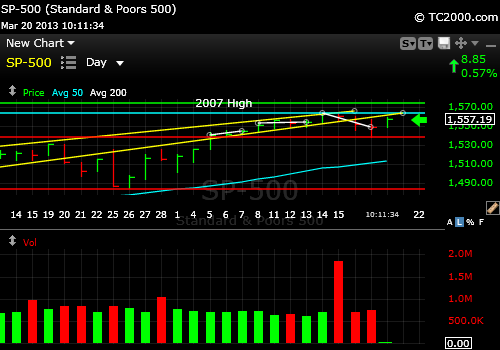
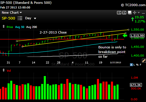
You could claim the SP500 Index (SPX, SPY) has been consolidating (moving sideways in market timing terms) over the past 10 market days, but really the chart looks like a consolidation, followed by a false breakout to new highs, and then another consolidation back down at the lower level.   So there is some weakness that has appeared in the failure to maintain the new recent high, which amounted to a failed minor breakout as the chart shows at the above link.

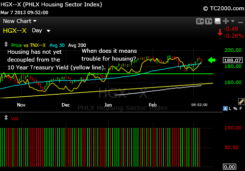
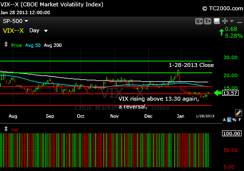
The VIX (volatility index) is back above “my number” of 13.30.  You’ll note that my numbers are the numbers around which the market will play very often.  That is, at least, when I know I have the market’s number.  It plays around it or hesitates at it.  It must dive below 13.30 again to allow any significant SP500 rally.   Housing stocks are an indicator for the financial system and just failed a breakout.  They might pull it off this next week, but the reversal this week was negative.

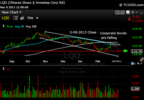
The strength in the 10 Year Treasury and corporate bonds off their lows is a negative for stocks.  It means that the “Great Rotation” referred to last week from bonds to stocks may be delayed yet again!

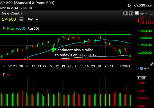
My sentiment analysis from last week still stands.  The AAII Survey of investor sentiment saw the Bull – Bear Spread contract from 13.4% to 5.6% this week.  Bulls dropped to 38.94% from 45.2% and Bears increased only slightly from 32.03% to 33.33%.  At the moment, this supports only a mild correction at best.

The technical formation by itself could resolve upward with a breakout as back in August 2012 when that was the case (compare this chart to that at the above link):

sp500-index-market-timing-chart-2013-03-22-vs-2012-08

The technical set-up was similar back in August 2012 vs. now. Compare this chart to the SP500 chart at the link higher up.

I thank Worden Brothers for the charting system. If you want to know more about the charting system I use every day, go to my “Other Resources” page here:
My Chart Source

Longer term, the market corrected fairly substantially after the breakout however.

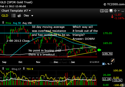
The US dollar index (UUP, USDX) has been rounding off a top and may continue correcting for a bit.  This is of course helpful to commodities and precious metals including gold (GLD).  The gold ETF has still not risen above the blip up induced by Bernanke’s words back on 2-26-13 as the chart reveals at the link above.

That, by the way, is part of the value of this newsletter.  There is no point in buying at a top unless you are ignoring the chart and relying solely on valuation to make your buying decision.  Why not wait to see prices above resistance, especially on a close, before adding to positions?  So that is one benefit of understanding the charts.  You don’t buy at really bad chart points.  This is one such point for the SP500 Index.  Why buy here when we just failed a breakout?  One could buy if the prior recent high is exceeded.  I don’t expect that right away, but that would be the point to buy.  The other place you could buy is off a low within the current consolidation.  That is a bit riskier, because the consolidation may break, giving rise to lower lows, but if you set a stop just below the consolidation, it would not be ridiculous to buy at its base.

It could be that gold finally gets the break it needs.  The gold mining stocks (GDX) look like this (download the PDF and open it in Acrobat if you see a bunch of wavy lines; the chart will be clear):

gdx-gold-miners-market-timing-chart-2013-03-22-close

There is a glimmer of hope for the gold stocks for the short term, but the intermediate trend is still down.

GDX Chart Hints:

  1. Intermediate trend is down.
  2. The short term trend is up, because there is now both:
    1. A higher high since the high of 3-12-2013 and
    2. There has been a reversal back above the 2-20-2013 low.
  3. However, the price has pulled back below the 3-12-2013 high, which is negative.

Based on points 2 and 3, GDX will be a buy on a short term basis at least when it climbs back above the 3-23-2013 high of 38.58. 

So what are the “takeaways” this week?  The SP500 Index failed a minor breakout just over a week ago and there is no point in buying more until we see a new recent high (by new recent high, I mean a high higher than recent prices; the all time high was back in 2007).  Emerging markets are signaling a US stock market sell off unless VWO quickly rallies.  A VIX volatility index value below 13.30 is probably a MUST for a further SP500 Index rally.  Gold and gold stocks are looking like they have a chance, but if they fail this opportunity, I expect major damage to gold and gold stocks.

If you have gained from this blog or the newsletter today or in the past, would you mind sharing it with me here at this link?   Testimonials  If you submit a response, you are of course giving permission to have the testimonial used.  If you want to have it “signed” a certain way, please indicate that (full name, first name, initials etc.).  If you don’t mind listing your city and state, that would be great.  Thank you for your support.

Have a great week investing and/or trading!

Standard Disclaimer: It’s your money and your decision as to how to invest it.

The above is the text from this week’s free report.  To receive future reports ahead of publication of the text shown above AND much more market timing information, please subscribe for free here:

Free Subscription to My Weekly Newsletter

If you “liked” this post, would you please “Like” it at the “Share” arrow below?  Thanks very much!

And to follow my Buys and Sells and up to the minute insights, please follow and bookmark my Twitter feed here: Join Me on Twitter

Copyright © 2013  By Wall Street Sun and Storm Report, LLC All rights reserved.

Posted in emerging markets, gold, gold etf, investment, investor sentiment, large cap stocks, Market timing, S&P 500 Index, trading, volatility index | Tagged , , , , , , , , , , | Leave a comment

Market Timing Brief for 3-15-2013: Survey Says Watch Out for the Coming Correction

A Market Timing Report based on the 3-15-2013 Close published Sunday March 17th, 2013

UPDATE for 3-20-2013 @ 10:14 am: The market is bouncing based on aid from Russia to Cyprus of 10 billion dollars.  The chart below shows:

1. The price of the SP500 Index is still below the yellow line which was the prior up trend line that was broken last week.  A close above the high for yesterday (1557.25) would be the first sign of strength. 

2. The SP500 has overhead resistance at the last recent high (aqua horizontal line near the top) and ..

3. Then comes the 2007 high which could also act as a resistance point for traders (top green line).    One more thing…if you appreciate this update would you please like the page at the bottom?  Thanks.

sp500-index-market-timing-chart-2013-03-20-1012am

SP500 Index facing overhead resistance as it bounces on the news of aid from Russia to Cyprus.

UPDATE for 3-19-2013 @ 10:00 am: Volatility did indeed snap back and the market corrected a bit yesterday with the Cyprus announcement that they would seize up to 10% of bank deposits to strengthen their banking system.  Not too subtle! 

Steal from depositors to shore up the banks?  That has been going on in the US since QE started, but in a less frontal way, by paying out almost zero on most bank deposits in a regressive way.  Those with higher levels of deposits have been making a bit more in the US.  If this were to spread, it would cause another Europanic, so we’ll have to keep an eye on the charts and not make assumptions based on interpretations of the facts by the press.

And now for this week’s report…

The SP500 Index continued to edge up this past week, moving up and entering its 3rd consolidation (sideways move) during the 9 day rally.  The market is approaching the 2007 high, and it can easily get there and even exceed that level.  The question is whether this will happen before or after a pause.  Consumer buying was found to be a bit stronger than expected this week and the employment numbers continued to look better. This represents the opportunity for relatively safe growth compared to the rest of the world, where growth is very elastic.

At least as long interest rates remain below 2.0% or so, our stock markets should be OK.  I think 2.4% would be tolerated by the SP500 Index, but not by the housing index (HGX, ITB).  There are two SP500 charts this week, one of which shows the uptrend in a channel and the other the higher power view of the 3 steps up, one after another over the past 9 market days.  The SP500Tracker™ Charts are here:

Market Timing Charts for Sunday’s Issue (opens separate window)

Luckily for the Bulls, sentiment still has yet to reach extremes.  This week the AAII Survey of Investor Sentiment Bulls were at 45.42% and Bears were at 32.03% and the spread turned back to positive with the Bulls in charge at +13.4% vs. -7.5% last week.  That spread is not that high and the Bulls can keep running from 40% to 50% up to the end of April when the Bears usually come out to play.

Chart back around 12-12-2013 when Sentiment was similar to today’s.

investor-sentiment-market-timing-2012-12-12-vs-2013-03-12

Investor sentiment was similar on 12-12-2012 as it is now.

I thank Worden Brothers for the charting system. If you want to know more about the charting system I use every day, go to my “Other Resources” page here:
My Chart Source

What will keep the market moving up is a continued sense of “Oh, I don’t know if this thing has much left.”  That is called the wall of worry; however, despite a Euro slowdown, things are “less bad.”  Relative US stock market value vs. the 2007 high is better now than it was then and far better of course than in 2000, when PE’s were far too high.  I have to admit that the last time sentiment was close to the current combination was Dec. 12th following which the market went down for 2 days, up 2, then down 7, followed by a rapid rally back up as shown in the ABOVE CHART (we’ll get to the one below next).  The net effect was a minor correction in an up trend and that is what I expect now.  The correction will scare a bunch of late investors out and then the rally will resume.

That however is the more optimistic scenario.  The other is this:

investor-sentiment-market-timing-2012-03-08-vs-2013-03-12

Another investor sentiment match that was less rosy, except for the very short term.

In the above March 2012 scenario, first note that the time of year is identical.  We are headed back to the “go away in May period.”  That would give us about 9 more good market days with continued positive sentiment in the teens followed by marginal new highs up to about April 1st followed by a decline.  Note the lower high in the above chart which occurred on May 1st, the perfect “go away in May time.”  I expect the market to have some trouble that will start in 10 market days or fewer based on current sentiment.  If a correction starts right away (within the next market week), we could then TOP the 2007 highs before ending the rally and seeing a more substantial 7-10% correction.  So an immediate correction will allow more for the Bulls than one that is delayed another 9-10 market days.

The VIX is holding new lows, BUT is stretched now to the downside (low level of fear).  The last 2 snapbacks came at an identical place, and that would favor the immediate correction starting Monday or Tuesday.  The Bulls still have room to run sentiment back down to the 2007 lows though, so don’t think the Bears have an edge here yet.  The edge may only be a mild correction as I discussed when reviewing the sentiment numbers.

Dr. Bernanke, at helm of the Federal Reserve, seems to still have control of the ball on the interest rate court.  There was a dive from a potential breakout in yields back below 2.0% for the 10 Year Treasury Note (TNX, TLT, TBT) as shown in the Bonus Chart of the Week at the above link.

The interest rate news is good for housing, but rates are a bit higher now and housing stocks have underperformed the S&P 500 Index as I felt they would at the beginning of the year.  Note the lag below the yellow SP 500 Index line since housing stocks (HGX, ITB) peaked on the far left:

hgx-housing-index-market-timing-chart-2013-03-15-vs-sp500

Plotting housing stocks vs. the SP500 Index since the last top in the housing stock index.

See the way the housing stock prices are lagging below the SP500 Index?

Having interest rates below 2% is excellent for gold, which has finally formed a clear higher low in early March, followed by the most recent consolidation just above there as shown in this week’s chart at the link above.

Gold is a buy here with a stop below the early March low for new positions.  See the market timing table for more.

Have a great week investing and/or trading!

Standard Disclaimer: It’s your money and your decision as to how to invest it.

The above is the text from this week’s free report.  To receive future reports ahead of publication of the text shown above AND much more market timing information, please subscribe for free here:

Free Subscription to My Weekly Newsletter

If you “liked” this post, would you please “Like” it at the “Share” arrow below?  Thanks very much!

And to follow my Buys and Sells and up to the minute insights, please follow and bookmark my Twitter feed here: Join Me on Twitter

Copyright © 2013  By Wall Street Sun and Storm Report, LLC All rights reserved.

Posted in Bonds, federal reserve, gold, gold etf, investment, investor sentiment, large cap stocks, Market timing, S&P 500 Index, trading, volatility index | Tagged , , , , , , , , , , | Leave a comment

Market Timing Brief for 3-08-2013: Stocks Make New Highs

A Market Timing Report based on the 3-08-2013 Close published Sunday March 10th, 2013

UPDATE 3-11-2013 @ 7:12 pm ET: Intel provided a great trading example today.  Some say to forget all intraday moves.  Sometimes that works, but not always.  Trading out of Japanese stocks on the first market day after the tsunami worked.  I sold Intel based on the weakness earlier in the day.  We will see how that works out.  The chart below shows how Intel dropped well below the prior uptrend (white line) on Friday and today fell through the 5 day moving average (yellow line).   The price then recovered by the close today to just 0.01 above the 5 day moving average.  In the chart below:

ARROW 1 : The close for Monday, 3-11-2013.  The green bar is mostly below the yellow line, which is the 5 day moving average.

ARROW 2 : The white uptrend line that was broken on Friday.

intc-market-timing-chart-2013-03-11-close

Intel recovers today after a swoon, but needs to show more strength.

I thank Worden Brothers for the charting system. If you want to know more about the charting system I use every day, go to my “Other Resources” page here:
My Chart Source

The problem for Intel is that the last two days still looks simply like a consolidation (sideways move). Yes, it did recover to a point just above the 5 day moving average, and it could continue a rally, but must show immediate strength.  Otherwise the prevailing direction will assert itself.  A move below Friday’s low would likely cause significantly more damage.

And now for the text from this week’s newsletter…

The SP500 Index (SPX, SPY) broke out again after a very minor correction.  This means the Bulls are in charge still.  The Dow (DJI, DIA) made new all time highs as you heard.  According to some indicators, the SP500 is stretched.  But looking at stretch via Bollinger Bands, there is room for a further rally, which puts the 2007 high into play.  It’s just 1.6% higher than Friday’s close.  In terms of PE ratios at the highs, the data shows we are at a lower PE ratio now than we were back in 2007.  The length of this leg on the chart is almost identical to the leg that extended from June to September 2012 the Bears could complain.  But why not go “all the way” to the 2007 high?  The growing consensus is that the Fed will finally have to pull their foot off the monetary accelerator a bit, which will drive down bond prices and drive investors fearful of equities back to stocks.

The tipping point will be the resumption of inflation as the economy improves.  If the Federal Reserve is very slow to pull back on the monetary stimulus, you’ll see the Nabisco boxes shrink to 10 cracker or cookie boxes for 3 bucks.  “Honey they shrunk the cookie and cracker boxes” again, according to my brief survey this weekend.  Still, commodity prices are low even though as noted below, there was a reversal upward this week.

So what’s the current sentiment scenario?

Sentiment is the key to what is going on I believe.  Barring a left field disaster, which cannot be accounted for in the charts, this market is not ready to begin selling off yet.  This week sentiment was at a Bull minus Bear spread of -7.5% barely changed from -8.2% last week.  Now that we have a new high the situation changes from last week.  Now sentiment can get a bit less bad and a bit less bad over a period of weeks.  This could bring us to a brand new all time high for the SP500 Index.  When the market peaked back in 2007, the Bull-Bear spread (difference) was +29% right at the peak, not -7.5%.  There are too many Bears and too few Bulls at the moment for a market peak to occur at this point right after a breakout.  The SP500 Chart which you can access at the following link shows where we are:

Market Timing Charts for Sunday’s Issue (opens separate window)

Yields are doing exactly what we expect if the stock market is to sustain a new high above the 2007 high.  It supports what stock market gurus like to call the “Great Migration” into stocks, where they hope that the late 90’s as a period of rising enthusiasm for equities will happen all over again resulting in inflated PE ratios.  The truth is that even with a modest increase in stock prices, the US market would not be that overvalued.  This again favors the Bulls.  The 10 Year Treasury Note (TNX, TLT, TBT [inverse ETF]) just barely broke out to a new recent high in yield (means the note is selling off, so the yield rises) on Friday as the chart shows at the link above (Bonus Chart of the Week).

The last high was on 2-14-2013 at 2.054% and Friday’s close was 2.056%, so we need follow through next week to confirm the breakout.

We need sustained breakout on the above daily chart to keep the stock market in rally mode.  And it would be best if the10 year Treasury yield peaked at about 2.4% at most.  Municipal bonds are falling.  Corporate bonds are falling (LQD) steadily as well as this chart shows:

lqd-corporate-bond-market-timing-2013-03-08-close

Steady downtrend in bond prices, since mid October.

As interest rates rise, the threat to gold (GLD) rises (read prior entries on the blog if you need to catch up about real interest rates and gold prices).  The gold chart can be viewed via the link above.

Gold will likely hold up without another huge correction simply because Central Banks around the world are not going to allow it.  First, they’ll continue buying gold.  Second, they will continue printing money to continue digging us out of the housing mortgage crisis.  We are up, but not out of the woods yet.  If there is anyone we should respect in calling the housing market it is the man who called the last two major bubbles, the great Robert Shiller from Yale.  His feeling is that housing has stabilized, but the crisis is not yet over.

The next drop in the housing market will likely come when interest rates cannot be held down any longer (below 2.4% particularly), finally driving up the cost of housing and making rentals less attractive for purchase.  Much of the buying has been driven by real estate investors who are cash buyers.  Many have done well, but it will be harder with rising rates.

So hold onto your long term gold positions.  I would say that if gold were to break down again under current support, it would be time to lighten up on long term positions while being willing to re-enter when strength resumed.  That is all hypothetical at this point.  Commodities are in Bull 1 mode having completed a reversal to the upside last week.  I don’t believe in buying and holding anything unless it is a business you know inside and out that can be properly valued.  Others may differ and that is fine.  If you want to treat your gold as a safety reserve, do so.

The last thing to watch closely this week is the VIX volatility index.  It is back down testing the 2013 lows and could break out again to lower lows energizing the SP500 rally further.  Doing so would confirm a further Bull run in the markets and likely more than a simple re-topping at the 2007 high.

Have a great week investing and/or trading!

Standard Disclaimer: It’s your money and your decision as to how to invest it.

The above is the text from this week’s free report.  To receive future reports ahead of publication of the text shown above AND much more market timing information, please subscribe for free here:

Free Subscription to My Weekly Newsletter

If you “liked” this post, would you please “Like” it at the “Share” arrow below?  Thanks very much!

And to follow my Buys and Sells and up to the minute insights, please follow and bookmark my Twitter feed here: Join Me on Twitter

Copyright © 2013  By Wall Street Sun and Storm Report, LLC All rights reserved.

Posted in Bonds, federal reserve, gold, gold etf, investment, investor sentiment, large cap stocks, Market timing, S&P 500 Index, trading, volatility index | Tagged , , , , , , , , , , | 2 Comments

Market Timing Brief for 3-01-2013: Saved by Dr. Ben but Soon a Correction

A Market Timing Report based on the 3-01-2013 Close published Sunday March 3rd, 2013

UPDATE 3-07-2013 @ 12:10 pm ET: The REITs did in fact break out and are now consolidating (moving sideways) just above the breakout point of 959.48 (see the prior chart below).  If you pull up the chart on your favorite site, you’ll see how the market moved just below the breakout point and recovered.  That means the Bulls are still in charge, but we’ll have to see if the breakout holds.  If not, I’d use a stop on a newly acquired position.  And watch interest rates as noted in the discussion of housing below.   And now for today’s chart….

I specifically wanted to look at the correlation between the housing stock index (HGX, ITB is close to it but includes HD etc.) and the 10 Year Treasury Yield.  You can see the correlation here with TNX (10 yr. Treasury) in yellow:

hgx-housing-index-market-timing-chart-vs-tnx-2013-03-07-1220pm

Housing stocks have been correlated with interest rates so far, but when will they decouple?

When the 10 Year Treasury Yield runs in the OPPOSITE direction to the housing stock index (HGX), you’ll know the housing market is going to have some trouble.  Low rates keep the housing market attractive, because the overall cost of owning a home is highly dependent on the mortgage loan costs o the buyer.  I think the decoupling of the correlation of housing stocks and the 10 Year Treasury Yield could happen with a new breakout in yield for the 10 Year Treasury Note (TNX).  When that happens, be sure to have a stop on your housing stock gains.  If it does not happen, the housing stock Bull run may continue for a bit. 

What we are seeing is localized inflationary pressure built courtesy of the Fed for the housing market through the purchase of so much housing debt and from outright purchases of Treasuries.  They are also goosing the stock market and admitting to it as I’ve been reporting all along.  And eventually gold will have another run before this whole thing ends.  I’ll be reporting on that again this weekend, so now would be a good time to sign up using the link at the bottom of this post.  You’ll hear from me by Sunday evening and be one step ahead of the market.  That’s my intention.

UPDATE 3-05-2013 @ 12:03 am ET:  Some markets are still below resistance (unlike the biotech market as shown in the chart in this week’s issue below), such as the REITs.  There is some fear of rising interest rates despite the rally of Treasuries that preceded the Bernanke testimony to Congress this past week.  The following chart shows why we need to wait to buy a breakout in some markets:

reit-index-market-timing-2013-03-04-close

US REIT index is below resistance.

And now for this week’s text…

Let’s start with some good news.  Biotech (BTK) has broken out once again.  Those who noted that drug companies are having to buy biotech companies to keep their pipelines full are right.  Biotech based drugs are more likely to have a closer relationship to the actual biochemical disturbance of the patient’s system or be able to more specifically target a patient’s cancer or virus, because the immune system does have great specificity when functioning normally.  I’m a molecular immunologist by training and the co-discoverer of NF-AT (I found its source and my co-discoverer had some critical technical expertise that led us to the NF-AT molecule that forms all vertebrate heart valves and part of the nervous system and that regulates the immune system, particularly the interleukin-2 gene which drives the growth of T-cells in our bodies.  T-cells are responsible for killing tumor cells, viruses and other foreign targets.  The specificity of the immune system is the power behind the biotech industry.  Here’s the biotech chart revealing the latest breakout:

btk-biotech-index-market-timing-chart-2013-03-01-close

Some markets like biotech have strong fundamental reasons for breaking out.

Gold (GLD) continues to disappoint investors and gold stocks (GDX) have broken support ahead of gold this time.  They need to recover quickly to avoid massive further damage and Monday would be a good choice.  Gold reacted positively this week for a short while, as the chart shows (please click the link below so you can view all of this week’s charts and refresh the pages to be sure you have the latest chart.)

Market Timing Charts for Sunday’s Issue (opens separate window)

The US Dollar Index (USDX, UUP) will likely retest the July 2012 high next, so gold has a headwind in the way.  Dollar strength and a lower level of Euro Fear has been hitting gold with a one-two punch.  The thing that is holding gold up a bit is continuing negative real interest rates.  If that changes, I’ll dramatically lower my long term GLD position.  I have no open trading position in gold and a miniscule position in GDX.

In the meantime, the SP500 Index (SPX, SPY) is struggling below the breakdown point mentioned last week.  Remember the “kissing of the channel.”  Well, there was a second kiss on Friday.  So that is twice the market has failed to show true strength.   View the chart at the link above.

The Treasury market decided to celebrate Chairman Bernanke’s testimony a day ahead of time as the chart shows at the above link.  This leaves the Federal Reserve in charge for now.  You will know when things have truly changed when we top 2.4% yield in the 10 Year Treasury (TNX, TLT).  Until then, Dr. B has the interest rate ball.  Investors have been taking profits out of stocks and moving back to safety to some degree.  That is particularly evident in the VIX explosion this past week.   Despite the pullback toward the end of the week, the VIX is still above the early February high.  This also means that there is room for the VIX to fall of course.

Sentiment is the real trouble spot.  This week the AAII survey of individual investors showed the Bulls falling from 41.79% to 28.39% and the Bears rising from 32.50% to 36.59%, which leaves room for further bearishness to develop.  The spread moved from 9.3% to -8.3%.  More importantly, the pattern is almost a duplicate of that of the April top in the market last year, which led to the moderate correction that ended in early June 2012.  But first things first.  The correction was delayed a bit during the prior similar episode, which is likely this time too.  Sentiment may now move back toward neutral with a bump UP in the SP500 Index to the prior high or to a somewhat higher high followed by a moderate correction.  That is within the realm of possibility.

In Fibonacci wave terms the pattern (see SP500 Chart) is one wave down, two waves up (the two small bumps up on the daily chart), and the next down wave, which is the “3 wave,” would start Monday.  What all this says is that the SP500 is behaving as if its days are numbered or over for a while before it once again resumes its up trend based on further economic recovery around the world.

Remember that we follow the charts around here, while keeping an eye on the fundamental story, so if we get a new high in the SP500 Index, the recent weakness will be essentially canceled and a further more substantial rally will follow.  That is not what I favor due to the backdrop of Europe in recession and the US economy slowing from the sequestration of funds by our federal government, which will lower GDP by 0.5-1% according to various estimates.  I believe this market will be in a better buying position in days to weeks, and we should hold some cash to take advantage of that opportunity.

Note that among the foreign markets we follow, the emerging markets and Europe are rated sell for now, despite their potential to bounce a bit with a US rally.  My actual sell points are reported on Twitter and will be reported in these issues as well.  I use stops that exceed the signal points a bit, to avoid being jerked out of markets at key chart points.  The Pacific Rim is again a BUY as noted in this week’s table (see link below to view the Market Timing Table).

Have a great week investing and/or trading!

Standard Disclaimer: It’s your money and your decision as to how to invest it.

The above is the text from this week’s free report.  To receive future reports ahead of publication of the text shown above AND much more market timing information, please subscribe for free here:

Free Subscription to My Weekly Newsletter

I thank Worden Brothers for the charting system. If you want to know more about the charting system I use every day, go to my “Other Resources” page here:
My Chart Source

If you “liked” this post, would you please “Like” it at the “Share” arrow below?  Thanks very much!

And to follow my Buys and Sells and up to the minute insights, please follow and bookmark my Twitter feed here: Join Me on Twitter

Copyright © 2013  By Wall Street Sun and Storm Report, LLC All rights reserved.

Posted in Biotech, drug stocks, federal reserve, gold, gold etf, gold stocks, investment, investor sentiment, large cap stocks, Market timing, S&P 500 Index, trading, US Dollar Index, US Stocks, volatility index | Tagged , , , , , , , , , , | Leave a comment

Market Timing Brief for 2-22-2013: The SP500 “Kisses the Channel Goodbye”: What that Means

A Market Timing Report based on the 2-22-2013 Close published Sunday February 24th, 2012

UPDATE 2-28-2013 @ 12:11 am updated @ 9:24 am: The further bounce in the SP500 Index has fallen short of the breakdown point at the base of the channel as shown in the chart below, so there is certainly no point in buying until that strength is shown.  I would say that despite the emotional indecision in the market, the Bears still have the ball.  The lower channel line must be exceeded to give control to the Bulls and would like result in a retopping at the recent daily high if it were to happen. 

Sometimes it takes a few days for the market to digest comments from Chairman Bernanke and that is what has been playing out.  It is the fight between those who believe the Fed will be done with its easing this year and others who think it’s still going to continue for an indefinite period of time.  More Fed interference supports higher equity prices.  Bernanke has admitted to this.  The updated chart is below:

sp500-index-market-timing-chart-2013-02-27-close

The SP500 Index has to get back above the lower line forming the channel to show real strength.

There are some markets like Biotech that are already rechallenging their recent highs, which does give the Bulls some hope.  Still, I would not buy biotech until new highs are achieved or until a significant correction is sustained.  This is NOT the place to buy.

btk-market-timing-2013-02-27-close

The Biotech market is one market where the Bulls are running ahead of the SP500 Index.

I thank Worden Brothers for the charting system. If you want to know more about the charting system I use every day, go to my “Other Resources” page here:
My Chart Source

UPDATE 2-26-2013 @ 9:24 am: The bounce in the S&P500 futures so far is not enough to erase the last technical signal.  The first sign of strength would be a rise above the 2.21-2013 low of 1497.29 or better, a move above the 2-7-2013 low of 1498.49.  If we get above 1511.95, we can retop or, less likely in my view until a further correction is sustained, even breakout again and reach my 1553 target or the 2007 highs.  I lay out both scenarios to provide you with a guide to the technical terrain. 

One cannot predict surprises by definition, but the reaction of the market to an event like the Italian elections gives us a hint that the market wanted to correct in the first place, because it is likely out of proportion to the real risk of holding a second Italian election.  How the market behaves following various surprises tells us where the market is leaning. 

The risk for the Bears is that Bernanke’s comments today will goose the market.  He’s very good at it.  That would be yet another surprise, because there is a growing feeling that the Fed may tighten by the end of the year, not a popular idea, but it’s gaining some traction.  If Bernanke attempts to wash away the fear, the market will respond positively as most still feel he has control of the board of governors.  As I’ve said, the bond market will take control away from him, not the board.  That’s why we are watching yields so closely.

UPDATE 2-26-2013 @ 12:13 am ET: The US stock market (SP500) did take a dive today after it rose back up to where it started, so the pattern is following the sentiment pattern noted in this week’s text below.  It was actually a classic key reversal day with a rise to a higher high than the previous day, a lower low, with a close near the low.  That means more downside to at least the 50 day moving average currently at 1476.72.  If that level does not hold 1400ish is possible.  There are other trend lines that could stop the correction before we get there. 

I’ll be watching this correction and reporting on Twitter.  Today also brought us a fall of the 10 Year Treasury in yield (Treasury rally) and gold was up as well, all part of the rush to safety trade.  The 10 Year Treasury (TNX, TLT) should have continued its rise if the economy were indeed recovering.  I believe new highs in the SP500 Index above the 2007 high will be accompanied by somewhat (not too much!) higher interest rates of at least 2.4% or so on the 10 year Treasury. 

There is another stress awaiting the economy besides slowing worldwide growth.  Remember that we are also headed toward the sequestration of U.S. government funds with lots of cuts that cannot help the economy as necessary as they may be.  That a government must operate in such an unconscious way to accomplish a modicum of fiscal responsibility or the illusion of such is amazing.

And now for this week’s text….(for more sign up for my report at the end).

Kissing the channel goodbye means that this week the SP500 broke its daily up trend channel to the downside.  It then bounced up a bit to kiss a spot just below the lower channel line.  That is not good enough.  It is spot to short, not buy, with a stop of course.

Why did this happen?  People were reading the Fed’s diary, well actually their minutes, this week.  Maybe they should keep their diary to themselves!  What it implied is that the Fed might take its collective foot off the gas and particularly that the number of inflation hawks was on the rise on the committee to the point that Dr. Ben Bernanke may have to give in to them.  I think what he’ll give into is NOT the Fed Committee, but to the bond market.  The bond market is going to run the Fed going forward after being run by the Fed over the past few years.  They are going to lose control of interest rates finally.  When?  Based on the recovery that is only slowly appearing it could happen by the end of this year.  If the slowing of the world’s economy gets any worse, it will take 2 or more years however.

What’s an investor to do?  Follow interest rates.  That is why I’ve included the 10 year Treasury Note chart as the Bonus Chart of the Week here at this link:  Market Timing Charts for Sunday’s Issue (opens separate window so you can access all the charts)

What has this done to housing stocks (HGX, ITB)?  Here’s the chart:

hgx-housing-index-chart-2013-02-22-close

Housing stocks suffering under rising interest rates.

Note that if you are getting a “sheen” in the chart above, you can download the file first and then open it directly in Adobe Reader as opposed to opening it within a browser and that sheen may go away.  Let me know if that was not the case for you.

And what was the bounce back in the S&P 500 Index about?  Fed Governor Bullard from St. Louis indicated that the market had over interpreted their Fed diary reading.  The market responded as it has for years to big bunches of dollars or the promise of the same; it went up!

The SP500 Index channel kiss can be seen at the link to the charts above.

The Bull-Bear spread in the American Association of Individual Investors Survey, which is simply the Bull minus Bear percentage, has fallen and the fall is more ominous than I thought it would be.  The picture is similar to the 4-05-2012 picture, after which there was a slight further correction followed by a rally to the same place and a moderate sell-off that was simply a correction in the Bull market into the month of June.  In sum, the pattern that could repeat itself is “down a little,” back to where we started and then a correction, not a Bear market quite yet.  Since “where we started” was the Wednesday close, we may have already had the “back to where we started” leg, since the market has popped back to just that spot.  So sentiment says a mild sell-off could continue on Monday.  Should the market not check in with me and we were to go straight back up to the 2007 high right away, I’m guessing that it would provide important resistance.

What does the VIX volatility index say?  The VIX peaked and came down quickly on Friday and that pattern suggests that we could have at least a few more days of decline in the VIX (5-10, 10 if there are sideways moves in the VIX on the way down.).  That means the rally could resume for that long.  That would move us up as high as 1553 for the SP500 Index before the next leg down occurred.  The takeaway would be to consider at least rebalancing your stock allocation if the market rises that high if not taking a bit off the table and re-adding if necessary.  NOTE: The VIX absolutely wiped out the pattern noted above by blasting back up today after the market turned sour on Europe following the Italian elections. 

Foreign markets like China (FXI) and the Hang Seng Index (EWH) are selling off more than our markets.  China has been talking about tightening up their money flow and it’s not being taken well.  Weakness has entered the Indian market too (PIN).  This is why the Emerging Markets (VWO) are a sell this week.  I have given them more slack than they deserved this past week.

What is happening to “stuff” like commodities and gold in the meantime?  It’s not a great picture.  Gold is hanging onto what is simply a consolidation (sideways move) after a steep plunge recently as shown via the link above (click the link to open all the charts).

The last two market days are called “inside days,” and fit the pattern of consolidation, not that of a bounce.  An inside day tells you that buyers and sellers are fairly balanced because the high and low for the day are within the prior’s day range.  The next move will be dictated by the next move in the 10 Year Treasury.  If you see the latter break the yield trend line to the downside, gold will rally.   If you see the opposite with a yield breakout, gold will fall further to the 2012 lows.

Commodities are testing important support as well.  They have been tracking gold fairly well since Aug. 12th, but over the long hall have greatly underperformed gold.  It’s apparently easier to come up with more of the other stuff than it is the shiny stuff.

The gold and commodity weakness says that investors believe, correctly or not, that there is no inflation risk to the Fed program of bond and mortgage backed security buying.  When that proves incorrect is when owning more gold will pay off.  The stronger dollar (UUP, USDX) this week also hurt gold.  Gold stocks (GDX, HUI) are in a cascading sell-off that will only be reversed when gold finds real support. 

Our numbers are growing, so welcome to recent subscribers by the way.  Please send me your comments and questions by replying to the emails or via the contact box.  That goes for all of you!

Standard Disclaimer: It’s your money and your decision as to how to invest it.

The above is the text from this week’s free report.  To receive future reports ahead of publication of the text shown above AND much more market timing information, please subscribe for free here:

Free Subscription to My Weekly Newsletter

If you “liked” this post, would you please “Like” it at the “Share” arrow below?  Thanks very much!

And to follow my Buys and Sells and up to the minute insights, please follow and bookmark my Twitter feed here: Join Me on Twitter

Copyright © 2013  By Wall Street Sun and Storm Report, LLC All rights reserved.

Posted in Bonds, gold, gold etf, investment, investor sentiment, large cap stocks, Market timing, S&P 500 Index, trading, US Dollar Index, US Stocks, volatility index | Tagged , , , , , , , , , , | Leave a comment

Market Timing Brief for 2-15-2013: These SP500 Index Charts Pose the Question: Is this 2007 All Over Again?

A Market Timing Report based on the 2-15-2013 Close published Sunday February 17th, 2012

I’ll get to the subject of the this week’s Brief title in a minute, but first I want to review the damage in gold and gold stocks for the week.  As regular readers know, we’ve been out of trading gold positions during most of this decline.  Getting out when our rally thesis failed was the key.

One of the big reasons gold is doing so badly is that interest rates are rising (TNX, TLT, TBT).  This means that the market must believe that real inflation is here in excess of the rise in interest rates.  That gives us positive rather than negative real interest rates.  Gold performs best when real interest rates are negative as they’ve been in the Bernanke Bubble.

When Dr. B. was sounding a bit too happy about the state of the economy this week, interest rates shot up, bonds went down and so did gold, under the presumption perhaps that rates were rising faster than inflation.  If inflation were to rise rapidly and the Fed were to fall behind, gold would soar, because that would equate to negative real interest rates, rates higher than the inflation rate.  Raising rates enough to prevent inflation is the mission for Dr. B.  If the Fed stays ahead of inflation, the Fed wins this game and gold loses.  History tells us that the Fed has rarely succeeded in keeping on top of inflation in the end.  The Fed is skating close to the edge.  Notice gas and oil prices climbing again?

Understanding the complex equation of inflation vs. gold prices is a fine sport, but realistically, I find it more useful to let the economists make their divergent predictions and follow the gold (GLD) and gold miners (HUI, GDX) charts.  If you did as well, you do not have a trading position in gold at the present time.  Longer term positions can be held with wider stops, at least in my investment practice.  If you did not allow gold room to fall occasionally over the past 10 years, you’ve given up a lot of gains.  And some of you will never sell your entire position just as you would not sell all your US dollars.  That is fine.  Just realize what you are doing of course.  Be conscious about it.

The Bonus Chart of the Week shows the rise of interest rates. Open it at the following link:  Market Timing Charts for Sunday’s Issue (opens separate window so you can access all the charts)

And gold itself can clearly fall even more as this week’s chart indicates at the above link.

Please also click on the gold miner page if you are following the miners (see blue bar on the main site).  The gold miners continue to follow gold down and are between two support levels at the moment.  There is likely a bit more downside.  At least a bit, though gold stocks are cheap in PE and even yield more than cash in US banks.

What about stocks (SPX, SPY)?  You’ve been doing better in stocks than gold lately if you are in both.  The market edged up a bit after the last breakout and this slow creep up can continue.  Sentiment supports that view too with the Bull Bear spread only moving from 13.2% to 13.5% this week with the Bull and Bear percentages each moving up a tiny amount and reducing the neutrals by 2.66% according to the American Association of Individual Investors.

I think the S&P 500 can continue to creep up to 1553 or even the 2007 high as shown on this week’s chart at the above link.  Is this the best place to scramble into the market?  No, but you could increase your exposure slowly and exit with a stop if needed.  That is about all you can say to the “late comers.”  The market is not as cheap as it was, but it can get more expensive as Warren Buffett showed by taking Heinz ketchup off the market at a PE of 22!  But going back to the charts, sometimes, as in 2007, the market retops at an obvious place and falls, while at other times the market does not retop, but just keeps moving through resistance levels.  Moving out in steps when the market breaks down is important and changing your mind is as well.  The VIX is challenging the recent low of 12.30 and needs to cut through there soon.

Look at the charts below, because they pose the all important question you have to ask yourself if you are a buy and hold investor: Will I hold all my stocks again and ride them back down toward the 2009 low potentially or do I have a place I am planning to get out?  I call that “Passive Shorting™.”  It’s explained on the main website.  One of my favorite sayings in teaching other investors what I’ve learned is that “The market is not a pony ride up the side of the Grand Canyon.  Don’t just ride it back down once you reach the top!”  I guess they may use horses or donkeys on those Grand Canyon Trails, but you get the point!  Leave some wiggle room on your stops of course, but don’t just give it all back!  Study the charts on the next page to “get the big picture.”

Here are the two massive highs and the 2013 rally:

sp500-index-market-timing-chart-2013-02-15-vs-2000-and-2007

Is this 2007 all over again or do we now move to brand new highs?

All Charts are courtesy of the Worden Brothers TC2000 Charting system, which I love and have used since April 19th, 2001: My Charting System

Here’s the weekly chart which shows you how far we have to go to get back to the 2007 high (compare it to the daily at the link above) Hand notice the length of this bull leg to the last uptrend that started in June 2012 and ended in Sept. 2012:

sp500-index-market-timing-chart-2013-02-15-close-weekly

Weekly SP500 Chart showing the distance in price from the 2007 high.

I hope this has helped you see where we are as well as the potential long term implications of such a move, especially if it does not lead to new highs above 2000 and 2007.  If you appreciate this effort on my part, would you please like the various pages via the Facebook buttons when you visit them?  This is one of the ways you can reciprocate in our relationship via these newsletters, and I greatly appreciate the feedback.  I devote my time based on what the feedback indicates is useful to you.

I’ve put a lot of comments in the MTT table (see this week’s free issue) this week in order to update the other markets.

Have a great week investing and/or trading!

The above is the text from this week’s free report.  To receive future reports ahead of publication of the text shown above AND much more market timing information, please subscribe for free here:

Free Subscription to My Weekly Newsletter

If you “liked” this post, would you please “Like” it at the “Share” arrow below?  Thanks very much!

And to follow my Buys and Sells and up to the minute insights, please follow and bookmark my Twitter feed here: Join Me on Twitter

Copyright © 2013  By Wall Street Sun and Storm Report, LLC All rights reserved.

Posted in Bonds, gold, gold etf, gold stocks, investment, investor sentiment, large cap stocks, Market timing, S&P 500 Index, trading, US Stocks, volatility index | Tagged , , , , , , , , , , , | Leave a comment

Market Timing Brief for 2-08-2013: Bull Run Version 2.0

A Market Timing Report based on the 2-08-2013 Close published Sunday February 10th, 2012

UPDATE 2-13-2013 @ 10:15 pm: This is an update of my 2013 prediction on banking stocks.  They’ve continued to do well.  Biotechs (BTK) and drug stocks (DRG) have done OK too.  Oil stocks (XOI) have zoomed past the Sept. high.  EWC (Canada) is down a bit and EWA (Australia) has moved up while VWO did correct slightly as anticipated but is regaining some strength.  Note that all of those are unhedged against the US dollar (The US dollar index is up 0.7%, since the 1-11 close that preceded my report).  Here is the banking index chart:

bkx-market-timing-2013-02-13-close

Market timing the banking index (BKX) since my 1-13-13 prediction.

UPDATE 2-12-2013 at 1:18 pm:  Note that the GLD chart is the second chart below.  The following chart I’ll call “Oops I Bought All of the Same Thing!” shows that if you plot mid caps (MID,MDY) vs. the SP500 (in yellow, SPX, SPY) vs. Russell 2000 Small Caps (red line on chart; RUT, IWM), they have all done the same since the August low.  I went back to the March 2009 bottom and found the same result.  Sometimes when we diversify in name, there is no true diversification, so please look at these comparison charts for what you own and avoid buying assets that all move together in lock-step.

mid-caps-small-caps-large-caps-since-august-low-2013-02-12-117pm

US Stocks of all classes have been fully correlated for a long time, even since the 2009 low!

UPDATE 2-11-2013 after the close: GLD had the proverbial bad day.  Compare my prediction to the change in today’s chart.  The January or December low will be next.  The green arrow points at the triangle.  The close was at 159.70.

gld-gold-etf-market-timing-chart-2013-02-11-close

Gold falls through the base of the triangle.

And now for this week’s issue…

The market is making more progress with investor sentiment getting worse, not better.  That is a positive sign for the Bulls as it allows for more upside.  According to the American Association of Individual Investors (AAII survey), the Bulls were down about 5% to 42.77% and the Bears up about 5% to 29.56%.  The same number of investors as last week were undecided at about 28%.  The Bull-Bear Spread was 13.2% down from 23.7%.  Those numbers say to me that there is room to rally still.

The VIX was back down below the critical 13.30 number I spoke of last week.  That means there is still an opportunity for lower lows in the volatility index (i.e., the SP500 can rally).  Fear is declining as the market is going up, which is Bullish, especially the drop below 13.30 in the context of a strong market rally.

The chart this week shows the latest market timing breakout of the SP500.  Find it here: Market Timing Charts for Sunday’s Issue (opens separate window so you can access all the charts)

The SP500 (SPX, SPY) breakout is just in the first day.  My first target is now higher than the earlier 1525 at 1564, but given the fact that the 2007 high is fairly close at 1576.09, I’d say we could retop in one move.  It is only 3.83% higher.  Is it a time to add to your positions?  Only if you plan to trade them.  The longer term move looks exactly like the move from 2002 to 2007.  You realize what happened after that?  Will it be different this time for “Rally 2.0”?  It could, but only if the world economy starts moving again.

The intense insider selling that has been in the press is a concern, but as in any relationship, if you get out too soon (prior to market death), you may be missing out on a lot.  There are always excuses we can find to run and to live life on the investment sidelines.  When you are spooked out too early, you lose.  The way you live your life is likely the way you’ll run your investments and vice versa.  Take a look at that, and it will save you from many mistakes in life and in investing.  There’s more on my “Fear and Greed” page if you’ve never seen it (on the main site SunAndStormInvesting.com).

Even the small caps (RUT, IWM, IWO, IWN) are still climbing.  I had thought that they were at least somewhat ahead of the large caps at this point from the November low, but the charts surprised me when I ran the comparison as shown in the Bonus Chart of the Week (see the above link).

The small caps barely broke out on Friday, so the jury is still out on the latest move up.   The risk of a pullback is of course higher the higher valuations go, but we’ve learned repeatedly over the years that markets do not stop moving up or down based solely on valuation.  The leadership of the market is definitely narrowing in some areas like housing, health care, and oil stocks.  Those three markets are correcting while the SP500 rallies.  The NASDAQ 100 Tech Index (NDX, QQQ) also rallied this week as I’ve been saying it would.  I am not entirely happy with the gap up in large tech, since the last gap up did not endure, but it was a breakout, and I did add to my position.

Emerging markets have been soft over the past week (VWO, EEM).  India is in correction.  China is also soft.  Still, VWO showed a bit of strength Friday, so the correction could stop here for VWO.

The CRB index softened this week and so did gold.  Agricultural products got cheaper (DBA).  They have been falling since September.  GLD is caught in a triangle and I recommend following the break up or down OUT of the triangle.  It will likely define a significant move.  I feel we should demand at least a move up by the gold ETF above the upper portion of the triangle before putting more money to work in it.  Have a look at the chart (see link above).

Another quick note for highly taxed investors: Munis have found some support.  I’m going to add a bit on Monday unless PZA breaks support.

Standard Disclaimer: It’s your money and your decision as to how to invest it.

The above is the text from this week’s free report.  To receive future reports ahead of publication of the text shown above AND much more market timing information, please subscribe for free here:

Free Subscription to My Weekly Newsletter

If you “liked” this post, would you please “Like” it at the “Share” arrow below?  Thanks very much!

And to follow my Buys and Sells and up to the minute insights, please follow and bookmark my Twitter feed here: Join Me on Twitter

All charts are courtesy of Worden Brothers.  Please see my “Other Resources” page at SunAndStorm.com if you would like to learn more.  I’ve used their software

Copyright © 2013  By Wall Street Sun and Storm Report, LLC All rights reserved.

Posted in Bonds, gold, gold etf, investment, investor sentiment, large cap stocks, Market timing, municipal bonds, S&P 500 Index, small cap stocks, trading, US Stocks, volatility index | Tagged , , , , , , , , , | Leave a comment

Market Timing Brief for 2-01-2013: Stocks are In and Bonds are Out! The Next Target for the SP500 Index

A Market Timing Report based on the 2-01-2013 Close published Sunday February 3rd, 2012

UPDATE 2-6-2013 after the close: The VIX volatility index is straddling a critical support level of 13.30, which tells you the market is not quite sure whether to sell off or rally more before the next correction.  The close today was above that level, but you can see from the chart that the index is really just waffling and could pivot either way.  The fact that the market seems to be having a hard time breaking down is in favor of the Bulls, but not by a lot. 

volatility-index-market-timing-chart-2013-02-06-close

VIX volatility index straddling 13.30, the current pivot point on the chart.

UPDATE 2-04-2013 after the close: Are stocks still in?  Investors sold stocks today, but the numbers don’t yet define this as more than a pullback in a rally.  The signals may materialize of course, and I’ll tell you on Twitter, market by market when I see sell signals.  During pullbacks it is a good practice to watch what is holding up better than the general market.  Intel is one example as the chart below shows:

intc-market-timing-chart-2013-02-04-close

Intel is outperforming the Big Tech Index (NASDAQ 100 Index; QQQ) over the past few days.

All Charts are courtesy of the Worden Brothers TC2000 Charting system, which I love and have used since April 19th, 2001 and it’s continually improving: My Charting System

INTC has been holding up better than the rest of the big tech market over the past few days.  It’s a clue.  This does not mean that INTC won’t go down if today’s pullback turns into a correction, but it will likely do better than the rest of the tech market.  NOTE on 2-6-13: This Intel advantage over the NDX disappeared today, so it may not be a leader should the rally extend itself.

Now for this week’s issue.  I begin by discussing the possible shift of investors out of bonds and into stocks…

Heidi Klum is best at saying the “in” vs. “out” thing in the fashion world.  Buffett says it better in the investment world and in Buffet’s world, bonds are “out”!  The Buffett Bond sell-off is here again, at least for a while.  Whether it sticks is a long term issue.  Yields failed initially to break out and now have re-challenged the prior high and won.  This will create some long faces among bond fund investors when they get their March 31st statements back.  Meanwhile, their friends who favor stocks will be crowing about their gains.  You know how that works.

Are stocks really a great buy here?  The SP500 (SPX, SPY), small caps and large caps are probably already fairly valued, but rallies don’t always stop where they should.  The other complicating factor is the GDP number which was minus 0.1%.  That is an annualized, seasonally adjusted rate, which means they take the change from the prior quarter and multiply it by four and adjust it for the number of days in the quarter and make other seasonal adjustments.

The details underlying the report showed that the President moved spending forward to boost the economy before the election and then had to rein in spending after the election.  I’d guess that is something that every President has done, but it does make the economy look like it is shrinking.  This means the economy is likely stronger than that number would imply, so the SP500 Index rallied instead of selling off (see chart link below).  The red line in the SP500 chart is my next upside target.

Market Timing Charts for Sunday’s Issue (opens separate window so you can access all the charts at once)

AAII Individual Investor Sentiment eased back a bit entirely because some Bulls turned to “neutral,” which likely just means there are more confused investors.  That is actually bullish.  The Bulls are at 48.04% down from 52.34% and the Bears are at 24.30% essentially unchanged from 24.27% the prior week.  The Bull-Bear spread went from 28.1% to 23.7% this week.  That gives the market room to run still.

I bought big tech (QQQ, NDX) including Intel (INTC) at the end of the week in anticipation of a tech rally (NOTE ADDED 2-4-2013: the early signs of a rally were squashed, but the market is now back at the base of the consolidation and needs to break that to generate a sell signal.)   Intel was looked at unfavorably when it announced earnings as it’s making a massive $2 billion investment in its own growth.  Wall Street is short sighted.  It means Intel will continue to dominate the chip space for years to come.  I was looking to invest in big tech in general, because tech has not “come along” for the current rally and is behind.  Either it catches up or we’ll see a further correction in the overall stock market in my opinion.

There is always a relative choice being made between stocks, bonds, metals, and cash.  Bonds are “out” for now.  The bond selling (TNX, TBT) is shown via the above link to the Bonus Chart of the Week.

Gold (GLD, GDX) buying is about to begin again I believe.  Gold action has been sluggish because investors are beginning to believe the worst is behind us and that the Fed has some sort of super power to avoid over-stimulating the economy.  They have rarely been able to do that.  Even the great Chairman Greenspan failed to avoid over-stimulating and thereby helped to create the housing bubble.  He spoke of over-exuberance and then he fueled it.  Chairman Bernanke will do the same.  He will continually claim to have control over inflation, but remember that the last time he promised that, there were food riots around the world.  Let’s hold that no riots need occur, but believing in “Fed magic” is not a very good bet!

Here again is one key to gold investing expressed in a slightly different way.  Gold will rise as long as inflation rises faster than rates, thereby keeping real rates negative.  BUT when the economy slows enough due to rising rates, the dynamics will oppose gold price appreciation.  Then real rates will be positive because interest rates will be high and the slowing economy will cause a drop in the inflation rate.  Then so-called real interest rates will be positive.  This is the time you would want to potentially eliminate your gold position or at least pare it back.  The gold picture can be seen via the link above.

I still predict that gold will at least one last big “inflation celebration” rally followed by a crushing sell-off.  Supporting that notion is that commodity prices are again rising in US dollar terms.  Gold will likely move up soon on that strength should it continue.

The VIX volatility index almost rose above our key 30.30 number again, but on Friday, the VIX dropped well below that level.  That is bullish for the SP500 Index.

Also bullish is that my prediction of further strength in the banking sector is already coming to fruition.  We have a nice new breakout in the BKX banking index.

My sense that housing may have come too far too fast was showing up in the market on Friday.  It’s just a hint, but rates are moving up again and the HGX (ITB) housing index moved down while the SP500 index moved up on Friday.  Realtors stand to make good money in the next few months as rates ratchet up to 2.4% quickly, scaring buyers into getting deals done sooner rather than later.

Enjoy your week and remember to invest consciously!   Note that the long term chart signals have been updated (subscribe for free to see them).

Standard Disclaimer: It’s your money and your decision as to how to invest it.

The above is the text from this week’s free report.  To receive future reports ahead of publication of the text shown above AND much more market timing information, please subscribe for free here:

Free Subscription to My Weekly Newsletter

If you “liked” this post, would you please “Like” it at the “Share” arrow below?  Thanks very much!

And to follow my Buys and Sells and up to the minute insights, please follow and bookmark my Twitter feed here: Join Me on Twitter

Copyright © 2013  By Wall Street Sun and Storm Report, LLC All rights reserved.

Posted in Bonds, gold, gold etf, gold stocks, housing, inflation, investment, investor sentiment, large cap stocks, Market timing, mining stocks, S&P 500 Index, trading, US Stocks, volatility index | Tagged , , , , , , , , , , , | Leave a comment

Market Timing Brief for 1-25-2013: A Few Bad Apples Don’t Spoil the Market

A Market Timing Report based on the 1-25-2013 Close published Sunday January 27th, 2012

UPDATE 1-28-2013 @ 9:49 pm ET: The VIX failed to maintain its fall below support at 13.30 today, but is barely above it as this chart shows.  It needs to fall again below that level for the rally to be sustained.  A rising VIX means investors are starting to hedge their positions in the market and have an eye on the exit.

volatility-index-market-timing-chart-2013-01-28-close

The volatility index rose above the low of 13.30 again, which is bearish.

Now for this week’s issue.  I begin it by discussing the dichotomy between winners and losers during this earnings season…

Such has been the theme since earnings season began.  The market is happy to go up while individual stocks like Apple are punished.  The SP500 Index (SPX, SPY) has maintained its breakout and made it a few points above 1500 on Friday despite Apple’s (AAPL) 12.4% plunge on Thursday followed by another 2.4% drop on Friday.  That is a 37.6% loss from the all time high pointing out yet again the need to preserve profits and that being a stubborn investor, either eternally Bearish or Bullish has its consequences.   The VIX (volatility index) has in parallel to the SP500 rally maintained its breakdown to lows below the 2012 lows.  It needs to stay there.  If it doesn’t, the rally will turn into a correction.

The SP500 Chart Link and the rest of the charts are at the link:

Market Timing Charts for Sunday’s Issue (opens separate window so you can access all the charts at once)

What I call the “Chart cheap” markets are the markets that have a lot of upside potential and are coming off of big bases, but they are in pause mode.  I’ll be watching early this week to see if they move into correction mode as some are close to important support, such as VWO.  Remember when you look at the actual index that currency is an important issue to consider with any foreign ETF that represents the given stock market index if that ETF is not fully hedged against the currency of that nation vs. the US dollar if you are buying in US dollar terms.  Most are not hedged, so look at the dividend corrected chart of the ETF you are buying in addition to the index chart and where it stands.

The gold miners (GDX,HUI) turned out to be a flop on the charts along with the Commodity Research Bureau (CRB) index, the latter failing to maintain a recent breakout.  The GDX (HUI) broke support on Thursday and you could have sold sooner than I was able to sell.  The new thesis seems to be that the world has been saved for now, so gold was repelled at the 50 day moving average and the gold miners broke down even more.  I would stand clear of both for now at least for trading positions.

I do believe that the Eurozone is not done with its series of crises, so I’ll let my prediction of one last hurrah for gold stand.  I believe it will run up to or beyond the prior high before the financial crisis ends, meaning I believe it is not yet over.  Nevertheless, there is nothing wrong with exiting your long term gold positions where you see fit.  The moves in gold have been so extreme over the years that “long term trading” at least a portion of your long term gold position may be warranted.

I realize that some feel having a gold position may be part of their “unexpected disaster insurance policy.”  Yet going back down to zero profit does not appeal to me after an “Apple-sized” gain!  I will likely use an arbitrary stop of 25% from the last high and let you know if and when I exit.  The last low took us to -20.1% from the intraday all time high for GLD.  Using a tight stop does not work well with long term trading positions in gold.  You need to let them breathe a bit due to the volatile swings that are common.

The gold ETF chart is at the link above.

The drug stocks (DRG) are still a place to invest if you have no exposure, because they have not made any progress since 2001.  The drug index has come a long way from the March 2009 bottom as other sectors have, but if you look at the long term chart, there is a massive base in place going back to 2001.   A failure of the most recent breakout above the 2007 high would be a reasonable stop to use.

Let’s discuss bonds.  Interest rates are moving back up again.  Corporate bonds broke important support this week (LQD).   The initial breakout failed, but this one may succeed and drive the 10 year Treasury Note back up to 2.39% at a minimum.  This may start to dampen the enthusiasm for housing stocks by raising the cost of home ownership.  The housing market might anticipate higher rates than actually appear.  It is not likely in my view that rates will skyrocket up through that 2.39% level during this bond sell off.  The chart is at the Bonus Chart of the Week link (see link above).

This may finally contribute to a shift to stocks from bonds adding sufficient liquidity to propel the SP500 Index back to the 2007 high.  If bond investors start seeing their previous gains being erased, they could panic out under CNBC conditioning starting liquidity issues for bonds, which as many of you recall were not pretty in 2008.  The bond market is not as liquid as you think.  Bond funds are like roach traps in a panic out of bonds, because of that liquidity issue.

Municipal bonds (PZA) have sold off a bit along with corporate bonds but munis have held up a bit better due to the higher Obama tax rates on the wealthy.   But as the bond market sells off, municipal bonds will suffer too, bringing yields to more attractive levels.  I’d wait for those better rates unless you want to start laddering in at long durations.

What about sentiment at this point where the SP500 is above 1500?  Sentiment this week according to the American Association of Individual Investors (AAII) is about where it was on 1-5-2012.  The Bulls are at 52.34% and the Bears at 24.27% with the spread at 28.1%.  This can go on for a while as it did last year.  It could continue bopping around at similar levels until April per the record last year.  Bullishness can persist.  What would concern me is seeing multiple markets giving up their prior breakouts one after another.

Standard Disclaimer: It’s your money and your decision as to how to invest it.

The above is the text from this week’s free report.  To receive future reports ahead of publication of the text shown above AND much more market timing information, please subscribe for free here:

Free Subscription to My Weekly Newsletter

All Charts are courtesy of the Worden Brothers TC2000 Charting system, which I love and have used since April 19th, 2001 and it’s continually improving: My Charting System

If you “liked” this post, would you please “Like” it at the “Share” arrow below?  Thanks very much!

And to follow my Buys and Sells and up to the minute insights, please follow and bookmark my Twitter feed here: Join Me on Twitter

Copyright © 2013  By Wall Street Sun and Storm Report, LLC All rights reserved.

Posted in Biotech, drug stocks, emerging markets, gold, gold etf, gold stocks, investment, investor sentiment, large cap stocks, Market timing, mining stocks, pharmaceutical stocks, S&P 500 Index, trading, US Stocks, volatility index | Tagged , , , , , , , , , , | Leave a comment

Market Timing Brief for 1-18-2013: The Bulls Have the Ball for Now

A Market Timing Report based on the 1-18-2013 Close published Monday January 21st, 2012

UPDATE 1-24-2013 @ 2:51 AM ET: The Bulls may have just dropped the Big Tech Ball.  The QQQ’s (NASDAQ 100 Index) took an afterhours hit due to the 10% drop in Apple (AAPL).  That would erase the breakout from today and drop the index back into the prior consolidation area (sideways move) as shown in the chart (after hours move places the index back below the green line):

qqq-market-timing-chart-2013-01-23-close

The breakout shown was wiped out afterhours when Apple (AAPL) fell off the tree by dropping 10%.

The first negative thing this does chart-wise is create an island reversal for Big Tech and the NASDAQ Composite Index as well, in which there is a gap up followed by a gap down.  That leaves an “island” in between the two gaps.  It’s considered a negative technical sign. 

The question is whether the damage is extended, namely whether the consolidation area is now broken to fill the post-fiscal cliff gap shown by the oval on the above chart, which may depend on the near term earnings news in the tech sector beyond Apple over the next couple of days.  Reversals following new highs are not uncommon.  Market participants figure that if a market lacks the buying power to sustain a breakout, it’s best to preserve profits.  I’d recommend having a plan to protect yours despite the strong bullish tone entering January.

UPDATE 1-22-2013 @ 1:47 pm ET:

Well, we will have the 3rd SP500 Index breakout day today if the level holds in the chart just below:

sp500-index-market-timing-chart-2013-01-22-147PM

The Bulls Have the Ball

If this level holds on the close, I’ll be averaging into the market.

Now for this week’s issue….

The Republicans have helped the stock markets of the world through procrastination of the debt ceiling decision by three months.  Who says procrastination doesn’t work sometimes?  At least that is the proposal they will likely vote on in Congress this coming week, a 3 month delay.  They decided that they would look bad if they delayed yet another vote to the deadline and that they would risk roiling the markets and CEOs across the country.  As a result, the Bulls have the market timing ball, and the SP500 Index (SPX, SPY) is two days above the prior breakout point above the Autumn highs. 

Markets are all a bit stretched, so the risk of a pullback has gone up, but the risk of being out of the trade has now gone up too.  Don’t bet all your chips, but I’ll be averaging up as needed, and you can follow that on Twitter (you don’t have to have an account to read the messages by the way).  It often does take a third day to confirm a breakout and reversals after a week or two are not uncommon either, so use a stop especially on new positions and have a written plan to preserve profits.

AAII Individual Investor Sentiment this week says to me that if the sentiment spread drops to -10 to -15% or so from the current spread between Bulls and Bears of +16.6% (Bulls > Bears by that margin), we can expect a correction.  Without that sort of “jerk down” in sentiment, investor enthusiasm is at a level that could sustain a further significant rally.  Not too hot yet, and definitely far from being cold.

The VIX volatility Index says that the 2007 SP500 Index highs are within reach.  The VIX made a low not seen since June 1st, 2007. Other important lows that predated that high were on 7-20-2005 (9.88), on 12-19-2005 (10.15) and on 12-19-2006 (8.60).  So there is more potential for the VIX to fall from 12.46.  The all time SP500 Index high was 1576.09 intraday on 10-11-2007 and that will be the next target if the breakout holds.

Remember we’ll need to keep our wits about us, considering that the 2007 high represented a revisiting of the 2000 high, and that second visit was followed by a massive sell-off.  What the impetus for a big sell-off could be now we don’t know, but one possible trigger would be a steep rise in rates due to inflation in the slowly recovering economy.  A “steep rise” could even mean the Fed increasing rates back up to 2% from the near zero current rates.  Rates don’t have to rise to the punishing level of the 1980s that hit 15%.  Mortgage rates skyrocketed back then and that is something that would really hurt our economy.  If the Fed is unable to continue sustaining the low interest rates we’ve had, the housing market (HGX) will become a drag on the banks (BKX, XLF), and the banks will be a drag on the overall economy.  Other potholes?  European woes are certainly possible, because there is talk of Spain needing another bailout.

Still, the Bulls may certainly have some upside left.  The Dow Transports (DJT, IYT) are at an all time high!  That would assume very stable to falling fuel prices for years, which could happen given the US’s emerging leadership in energy production.  Oil prices are moving up, so despite the long term thesis, the transports could suffer if oil continues its climb.  Again, if the Bulls keep the ball for a few days, the 2007 market highs are the next market timing target for the SP500 Index.

Check out this week’s Sp500 chart here:

Market Timing Charts for Sunday’s Issue are Here (opens separate window so you can access all the charts at once)

One negative prognostic sign for the market is the lack of a breakout for Big Tech, namely the NASDAQ 100 Index (NDX, QQQ).  Tech had been leading before, but now that government spending is likely threatened, tech looks less promising this year.  The NASDAQ 100 stalled below a triple top this week.  The last barrier was erected by Intel’s lousy earnings report, which sent INTC down 6.48% on Friday.  Stocks that don’t do well or that project bad earnings will be high risk this earnings season.  The market is choosing to punish the individual companies that are slowing rather than taking the entire market down.  That has been the pattern, which bodes well for the SP500 Index by the way, because it could rise even with tech going sideways as it has been doing.  But the issue going forward is whether the rest of the market will weaken in time and join Big Tech by correcting or at least stalling for months.

Biotechs (BTK) confirmed my call from last week on 2013 winners by moving to a new high on Monday.   Drug stocks (DRG) are holding their last breakout as well.  Housing stocks continue to climb, despite the concerns mentioned last week.  Emerging markets are looking for their next breakout (VWO, EEM).

Gold miners look ready to move up, although I would have preferred a close on Friday above the November low in addition to rising above the December low, the latter of which did happen.  There is a nice base forming.  I wrote more about it on the new “Gold Miner” page on the main site (look for the new “Gold Miner” link on the blue bar).  I’ll do more updates in this newsletter than I do there most likely.  What I wanted to look at last week was whether the SP500 could be correcting while the gold miners rallied.  The information is here:

The Gold Miners’ Chart

Gold is caught between the down trend line, and is now above it which is positive, but is still below the 50 day moving average, which has at least temporarily held it back.

This week’s GLD Chart is at the top link above.

The idea behind gold weakness is that if the economy improves, the Fed will raise interest rates and mute the interest in gold.  Panic and worry down, gold down as real interest rates climb.  The idea behind the bullish argument is that the Fed won’t be able to control the inflation that will result from having interest rates that are still too low in a recovering economy.  Take your pick and make your investment in gold and gold stocks or not.

My bet is currently against Fed policy working smoothly as the Fed has already shown some inability to control inflation during this crisis.  Remember the food riots in India?  Food prices spiked in both 2008 and again in 2010-2011 as the chart of the agricultural commodities shows (DBA).  I say the Fed will in the end fail to ratchet down rates fast enough to avoid inflation.  Gold will spike in at least one final hurrah.  And the commodity breakout on Friday will be confirmation of this if it holds.  Commodities are a BUY now with a stop of course.

But, for now, the Fed is still in control as the new interest rate chart shows (Ten Year Treasury Note, TNX, TLT; please scroll down a bit).  Access the new chart at the top Chart Link above – “Bonus Chart of the Week.”

You can see that although the 10 year Note threatened to breakout in YIELD a short time ago, the yield trend is down once again this week.  A mild increase in rates may be tolerated, but even a 10 year rate of 3% could cause a stock market sell-off.  The market is feeling good on Fed crack, but won’t be when the crack supply is cut off.

Continue to watch to see whether individual stock earning reports follow the pattern seen so far, namely that bad earnings reports hit each individual stock very hard but more or less spare the rest of the market.

I’d also avoid big tech until there is another breakout in the NASDAQ 100 Index (NDX).  If Big Tech comes along for this rally, it would be very bullish.

Standard Disclaimer: It’s your money and your decision as to how to invest it.

The above is the text from this week’s free report.  To receive future reports ahead of publication of the text shown above AND much more market timing information, please subscribe for free here:

Free Subscription to My Weekly Newsletter

All Charts are courtesy of the Worden Brothers TC2000 Charting system, which I love and have used since April 19th, 2001 and it’s continually improving: My Charting System

If you “liked” this post, would you please “Like” it at the “Share” arrow below?  Thanks very much!

And to follow my Buys and Sells and up to the minute insights, please follow and bookmark my Twitter feed here: Join Me on Twitter

Copyright © 2013  By Wall Street Sun and Storm Report, LLC All rights reserved.

Posted in Biotech, gold, gold etf, gold stocks, inflation, investment, investor sentiment, large cap stocks, Market timing, mining stocks, pharmaceutical stocks, S&P 500 Index, trading, US Stocks, volatility index | Tagged , , , , , , , , , , | Leave a comment